|
Photo posted by Igor Doncov in the Landscape gallery on 12/06/17 at 3:05 pm EST
Registered on 11/22/14, 189 Posts, 2733 Comments
Post last edited by Igor Doncov on 12/07/17 at 1:36 pm EST
|
| |
|
"If you want to make more interesting pictures, become a more interesting person" - Jay Maisel. |
|
|
Comment posted by Nick Bristol on 12/06/17 at 6:43 pm EST
Registered on 02/01/04, 752 Posts, 14140 Comments
Comment last edited by Nick Bristol on 12/06/17 at 6:47 pm EST
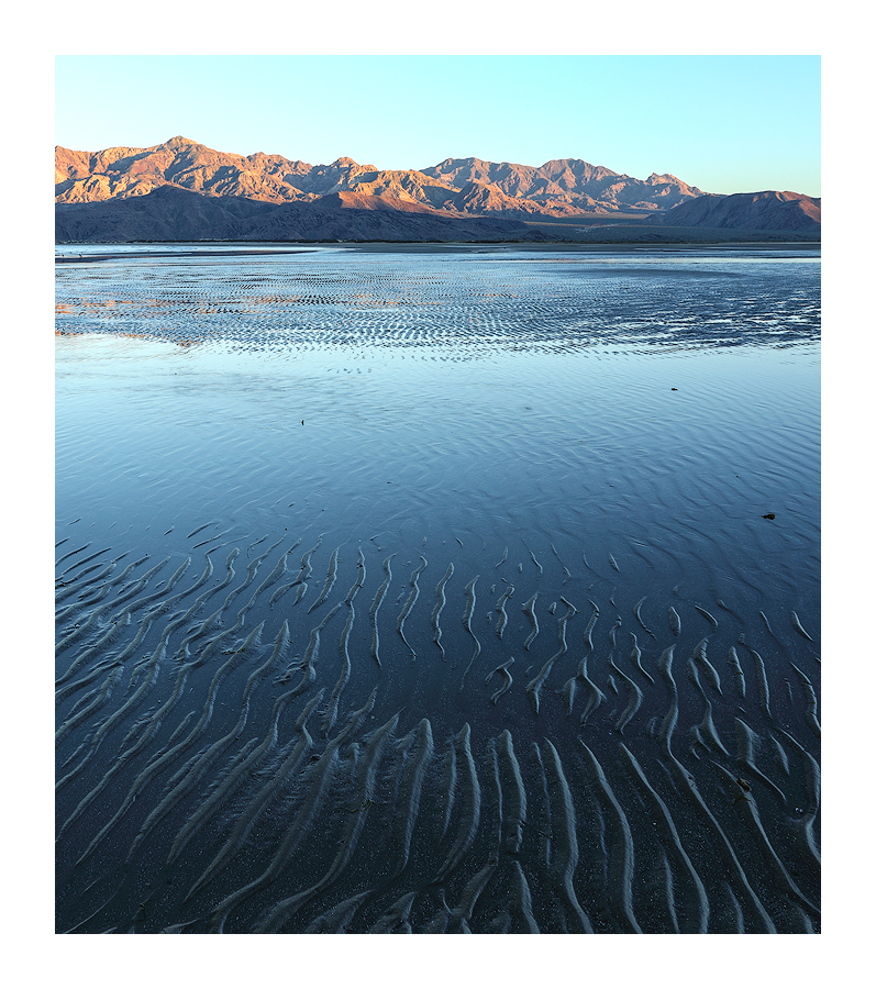
Igor, I'm loving this one! What a great looking landscape scene and I'm really glad you rushed to get it while the sun was still on the mountains. Wouldn't be quite the same without it. The blue tones are wonderful and very appealing to me. This comp with all the foreground ripples throughout the sand adds so much interest and I'm really enjoying that look. I never realized there was so much difference in detail by clicking on the black arrow instead of just clicking on the image for a larger view until I read one of your recent comments. At least it sure seems to make a difference when I view them that way or is it just me...
Nick Bristol
Lone Rock, WI.
|
|
|
|
Comment posted by Harry Lichtman on 12/06/17 at 8:01 pm EST
Registered on 09/17/10, 304 Posts, 3507 Comments
|
Just love all of the ripples leading to the peaks. Essentially blues and shades of yellow, the mix works well together for me. Not just if you were able in the short time you had, but a tighter view of the ripples mixed with the mountain reflection might be interesting as well. I can see a hint of this mid ground, but looks like it has some great potential for a subject in itself.
|
|
|
|
Comment posted by Jim Hansen on 12/06/17 at 10:32 pm EST
Registered on 05/05/11, 161 Posts, 908 Comments
|
Igor, I love those low tide sand ripples, the water color, and the light on the background ridge. Not sure where in Baja this was taken, but reminds me of the extreme tides around San Felipe that I experienced a number of years ago. Very effective image.
|
|
|
|
Comment posted by Ed Lowe on 12/06/17 at 11:05 pm EST
Registered on 02/07/04, 414 Posts, 7115 Comments
Gorgeous work, Igor. I love the light across the water, but what I find really intriguing is the way the ripples in the sand channel me back to the BG mountains and the warm light along their peaks. I hate to mention it because no one else did, but the sky looks a touch cyan to me. Either way this is wonderful.
Ed
|
|
|
|
Comment posted by gary phillips on 12/07/17 at 02:47 am EST
Registered on 10/24/13, 185 Posts, 4136 Comments
|
I think Harry is on to something here, Igor. My favorite part of the image is the metallic sand ripples. I sure hope you had time to do some abstract work. I like this as presented as well. To me this image is about the expansiveness of the fore leading to the lit mountains. I think I would clone the bits of debris and let the smoothness of the sand stand uninterrupted. There is a sensor spot just above the right edge of the mountain. It also seems a little under exposed, but I do like the understated colors. Again, the fore ripples are killer.
|
|
|
|
Comment posted by Igor Doncov on 12/07/17 at 03:50 am EST
Registered on 11/22/14, 189 Posts, 2733 Comments

|
I don't have any pure abstracts. I have a tighter view of this subject which I took later but I don't like it as much anymore. I find it harsh, almost brutal. It's too underexposed for my taste and the shadows can't be recovered effectively. Two years ago I thought it was pretty good but now it bores me.
|
|
|
| |
|
"If you want to make more interesting pictures, become a more interesting person" - Jay Maisel. |
|
|
Comment posted by Mark Seaver on 12/07/17 at 08:10 am EST
Registered on 01/23/11, 1103 Posts, 17270 Comments
|
The mass of long thin lines leading from the frame to the distant mountains are a great effect, Igor. I much prefer the original post with all those leading lines.
|
|
|
|  |
|
Mark Seaver
Burtonsville, MD & Emigrant, MT
seaverphotos.com
Weekly Challenge Moderator
Macro/Close Up Moderator |
|
|
|
|
|
Comment posted by Ed McGuirk on 12/07/17 at 10:54 am EST
Registered on 11/29/17, 19 Posts, 260 Comments
|
Nicely done, the contrast of the warm and cool tones works well here. I agree with Harry, the ripples in the sand are the most interesting element within the scene,I think you should compose to maximize their impact. As an alternate composition, I would suggest trying this as a vertical crop, leaving all of the ripples as presented in the horizontal. I would center this vertical crop around the more prominent peak that is about one third of the way from the left in the horizontal.I think a vertical composition would impart more of a sense of depth as well. The mountains are very nice, and I can see why you shot this as a horizontal, but I think a vertical would really draw more attention to the ripples.
|
|
|
|
Comment posted by Igor Doncov on 12/07/17 at 12:14 pm EST
Registered on 11/22/14, 189 Posts, 2733 Comments
Comment last edited by Igor Doncov on 12/07/17 at 12:26 pm EST

|
Thank you for the suggestion of going vertical, Ed, and emphasizing the ripples more. I chose slightly more to the right instead and I cropped a bit off the sky. I would be interested in people's preference.
|
|
|
| |
|
"If you want to make more interesting pictures, become a more interesting person" - Jay Maisel. |
|
|
Comment posted by Lon Overacker on 12/07/17 at 12:32 pm EST
Registered on 11/24/06, 521 Posts, 19147 Comments
Igor,
At least for me, the original is best - it has everything. Excellent and very engaging near/far composition. The horizontal frame is perfectly suited for the beautifully lit mountains, and the vertical lines of the ripples are the perfect lead-in for the viewer. I also like the transition of hues in the sky. (although for personal tasted the cyan could be brought down a tad, minor, minor.)
The vertical is good too, but not as effective as the original post. For this one I would crop in a little more from the right just to eliminate the side of the right side mountain that is catching the light. The tighter version could work I think, but I think the exposure needs to be raised and a little pop given to the colors - even warming up the light on the mountains.
First impressions are usually the best and right ones, beautifully captured and presented.
Lon
|
|
|
|  |
|
To photograph is to hold one's breath, when all faculties converge to capture fleeting reality. It's at that precise moment that mastering an image becomes a great physical and intellectual joy. -Henri Cartier-Bresson
|
|
|
Comment posted by Igor Doncov on 12/07/17 at 1:32 pm EST
Registered on 11/22/14, 189 Posts, 2733 Comments
Comment last edited by Igor Doncov on 12/07/17 at 1:35 pm EST

Thanks for your suggestions, Lon. I applied most of them to the vertical and there was a marked improvement. What's good for the goose is good for the gander. So, I applied the same changes to the horizontal. I was surprised that to me it had lost some of it's genuinesness. It starts to look tawdry, contrived somehow. Now I know that I can subconsciously get attached to something and lose the flexibility to be open. So I will give it more time.
PS There is little I can do with the cyan in the sky as this is how the sky looks in baja near sunset. Reduce the saturation and there is no blue to replace it with (except in the corner). You just get a paler sky.
|
|
|
| |
|
"If you want to make more interesting pictures, become a more interesting person" - Jay Maisel. |
|
|
Comment posted by Ed McGuirk on 12/07/17 at 2:45 pm EST
Registered on 11/29/17, 19 Posts, 260 Comments
|
Igor, the section of mountains you included in your vertical re-post was my second choice for a cropping. I think the ripples are the nicest / strongest in the area you chose. My personal preference would be to have the tallest section of mountain dead center in the vertical crop, for symmetry purposes. In your vertical crop, the mountains get lower from left to right. But your vertical treatment is fine as presented.
|
|
|
|
Comment posted by Igor Doncov on 12/07/17 at 3:00 pm EST
Registered on 11/22/14, 189 Posts, 2733 Comments
Ed. There were several reasons why I chose this crop over your suggested one:
1. I wanted more detail in the water in that middle layer. I didn't want pure sky reflection.
2. I liked that break in the ripples at the bottom rather than all unbroken lines.
3. The ripples look better on the right side of image than left due to lighting.
4. I liked the ripples converging from the lower two corners.
The distant peaks looked better in your suggested crop. It was a compromise, as it always is in these compositions. To be honest, I didn't put a lot of time into the vertical composition but I had thought of the various pros and cons of the horizontal so I knew where to go.
|
|
|
| |
|
"If you want to make more interesting pictures, become a more interesting person" - Jay Maisel. |
|
|
Comment posted by Nick Bristol on 12/07/17 at 6:38 pm EST
Registered on 02/01/04, 752 Posts, 14140 Comments
Original post all the way for me... None of the others come close (IMO) to the wonderful look and feel of the first one. Nick None of the others come close (IMO) to the wonderful look and feel of the first one. Nick
|
|
|
|
Comment posted by Preston Birdwell on 12/08/17 at 12:59 pm EST
Registered on 11/01/03, 471 Posts, 5188 Comments
After looking at the original and the reposts, I vote for the original. It has a grandness and a variety of textures and color that truly show the mood of the day.. The sand ripples really make this work.
--P
|
|
|
|  |
|
Preston Birdwell
Columbia, California, USA
NPN 429 | California Nature Photographers (CANP) Moderator | 'NPN Discussion' Moderator
“If you want nice fresh oats, you have to pay a fair price. If you can be satisfied with oats that have already been through the horse, well, that comes a little cheaper" Author Unknown |
|
|
|
|
|
|
|