|
First installment in this series - Monochromatic Color Harmony
Second installment in this series - Complementary Color Harmony
Third installment in this series - Analogous and Triadic Color Harmonies
Fourth installment in this series - Cool and Warm Color Dominance
Fifth installment in this series - Split Complementary, Tetradic and Square Color Harmonies
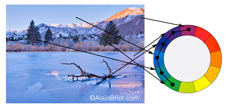
1 - Cool Colors Dominance Harmony
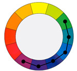
In a Cool Colors Dominance harmony we use colors that have a cool quality. These include blues, violets and greens.
This color harmony is useful to express feelings of cold or remoteness. It is also useful to represent scenes where you want the elements to recede away from the viewer and appear distant.
2 - Notes:
Creating a Cool Color Dominance Harmony does not mean there are no warm colors in the image. It only means that cool colors dominate.
- This harmony features a wide range of colors
- It is also different from a cool or warm color harmony because 4 colors are used instead of six
- It is therefore different from a Monochromatic Harmony
- Half of the colors on the color wheel are used
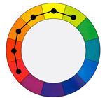
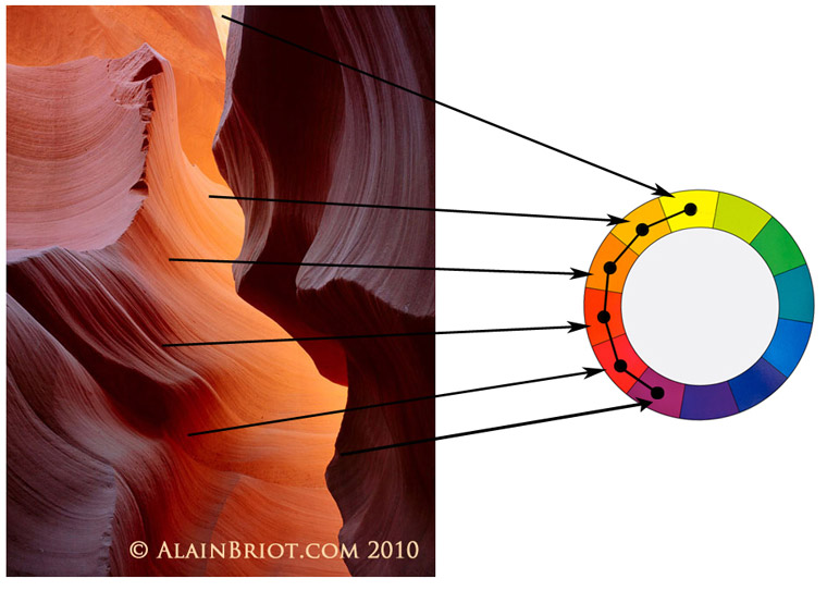
3 - Warm Colors Dominance Harmony
In a Warm Colors Dominance harmony we use colors that have a warm quality. These include reds, oranges and yellows.
This color harmony is useful to express feelings of warmth and comfort. It is also useful to represent scenes in which you want the elements to move towards the viewer and appear to be close by.
4 - Notes:
Creating a Warm Color Dominance Harmony does not mean there are no cool colors in the image. It only means that warm colors dominate.
- This harmony features a wide range of colors
- It is therefore different from a Monochromatic Harmony
- Half of the colors on the color wheel are used
5 - Exercises
- Create a photograph featuring a Cool Color Dominance Harmony.
- Create a photograph featuring a Warm Color Dominance Harmony
6 - Continuing Your Studies
Color harmonies are one of the most important aspects of a personal style. If you are working on developing your style take a look at my just-released Personal Style Master Class Workshop on DVD. A FREE 21 pages ebook table of content is available. All you need to do is email me at alain@beautiful-landscape.com with the words ‘Master Class’ in the subject line and you will receive the link to the free eBook immediately.
In the next, and last, essay in this series we will look at the Split Complementary, the Tetradic and the Square color harmonies. Stay tuned!
Alain Briot - NPN 2054
|
 Alain Briot creates fine art photographs, teaches workshops and offers DVD tutorials on composition, conversion, optimization, printing and marketing photographs. Alain is also the author of Mastering Landscape Photography. Mastering Photographic Composition, Creativity and Personal Style and Marketing Fine Art Photography. All 3 books are available from Amazon and other bookstores as well from Alain’s website.
You can find more information about Alain's work, writings and tutorials as well as subscribe to Alain’s Free Monthly Newsletter on his website at http://www.beautiful-landscape.com To subscribe simply go to http://www.beautiful-landscape.com and click on the Subscribe link at the top of the page. You will have access to over 40 free essays by Alain, in PDF format, immediately after subscribing.
Alain welcomes your comments on this essay as well as on his other essays. You can reach Alain directly by emailing him at alain@beautiful-landscape.com.