|
First installment in this series - Monochromatic Color Harmony
Second installment in this series - Complementary Color Harmony
Third installment in this series - Analogous and Triadic Color Harmonies
Fourth installment in this series - Cool and Warm Color Dominance
Fifth installment in this series - Split Complementary, Tetradic and Square Color Harmonies
1 - Analogous Color Harmony
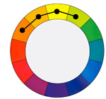
In an Analogous Color Harmony we use colors located next to each other on the color wheel. For example orange, yellow-orange, yellow, and yellow-green.
Analogous color harmonies are often found in nature because natural elements often feature colors that are close to each other. It is also a visually pleasing harmony.
To make this color harmony particularly effective, you need to first select a dominant color, second select a supporting color and third select an accent color.
2 - Examples
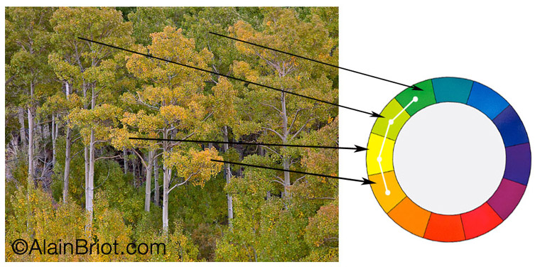
Example 1 - Aspen Forest, Eastern Sierra Nevada
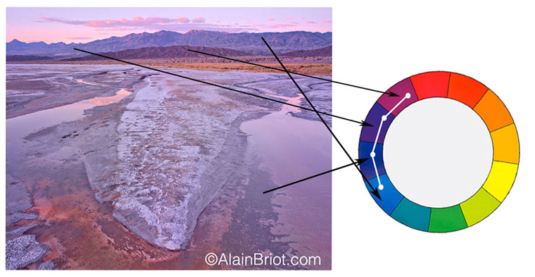
Example 2 - Mauve Playa, Death Valley National Park
3 - Notes:
At first glance this harmony may look similar to the monochromatic harmony (see 1st essay in this series). However:
- It is quite different because several colors are used instead of one
- It is also different from a cool or warm color harmony because 4 colors are used instead of six
- In this harmony the colors are closer together than in a cool or warm color harmony
- This harmony is located somewhere in between monochromatic and cool/warm harmony
- We will see what a cool/warm color harmony is in the next essay in this series
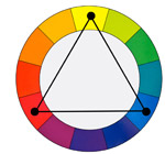
4 - Triadic Color Harmony
In a Triadic color harmony we use any three colors located at equal distance from each other on the color wheel. For example yellow, blue and red.
This harmony has a tendency to be quite vibrant, even if the hues are unsaturated. To be effective, the colors used in this harmony need to be well balanced. The best way to achieve this is to let one of the colors dominate and use the two other as accents.
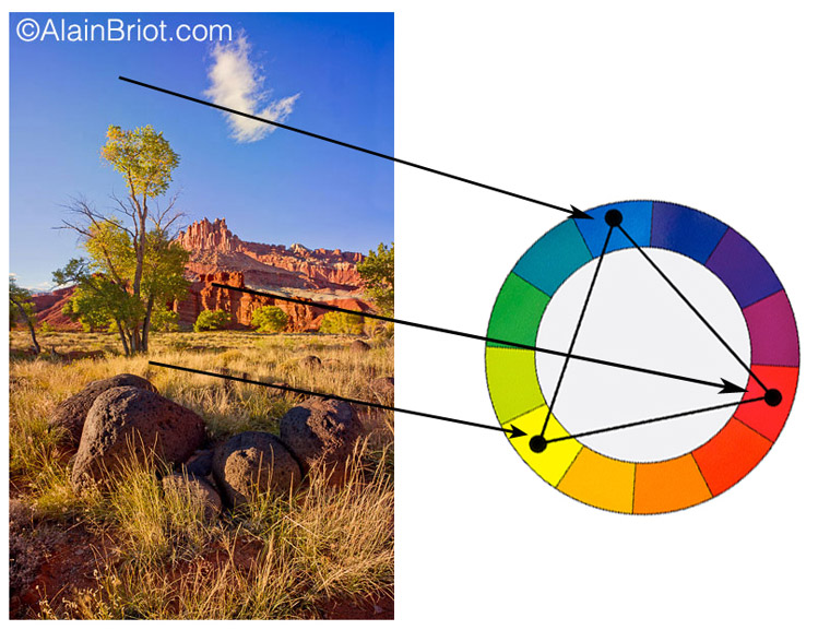
Example 3 - The Battleship, Capitol Reef National Park
5 - Notes:
This color harmony is characterized by having a widespread range of colors;
- Colors can be primary, secondary or tertiary
- It features colors that are very different from each other
- For this reason I find the Triadic harmony to be a less artistic and a ‘harsher’ harmony
6 - Exercises
Create a photograph that features a Triadic color harmony.
7 - Exercises
Create a photograph that features an analogous color harmony.
8 - Continuing Your Studies
Color harmonies are one of the most important aspects of a personal style. If you are working on developing your style take a look at my just-released Personal Style Master Class Workshop on DVD. A FREE 21 pages ebook table of content is available. All you need to do is email me at alain@beautiful-landscape.com with the words ‘Master Class’ in the subject line and you will receive the link to the free eBook immediately.
In my next essay we will look at two more color harmonies: the Cool and Warm Dominance Color Harmonies. Stay tuned!
Alain Briot - NPN 2054
|
 Alain Briot creates fine art photographs, teaches workshops and offers DVD tutorials on composition, conversion, optimization, printing and marketing photographs. Alain is also the author of Mastering Landscape Photography. Mastering Photographic Composition, Creativity and Personal Style and Marketing Fine Art Photography. All 3 books are available from Amazon and other bookstores as well from Alain’s website.
You can find more information about Alain's work, writings and tutorials as well as subscribe to Alain’s Free Monthly Newsletter on his website at http://www.beautiful-landscape.com To subscribe simply go to http://www.beautiful-landscape.com and click on the Subscribe link at the top of the page. You will have access to over 40 free essays by Alain, in PDF format, immediately after subscribing.
Alain welcomes your comments on this essay as well as on his other essays. You can reach Alain directly by emailing him at alain@beautiful-landscape.com.