|
|
First installment in this series - Monochromatic Color Harmony
Second installment in this series - Complementary Color Harmony
Third installment in this series - Analogous and Triadic Color Harmonies
Fourth installment in this series - Cool and Warm Color Dominance
Fifth installment in this series - Split Complementary, Tetradic and Square Color Harmonies
1 - Why use color harmonies?
I use color harmonies because the majority of my images are about form and color. Working with this framework means two things. First, I control form by focusing on composition, both in the field and in the studio. Second, that I control color by working on the color palette on my photographs, again both in the field and in the studio.
Controlling color harmonies is part of controlling the color palette of my photographs. In that sense color harmonies are a subset of color palettes. However, they are a dominant subset because creating a specific color harmony implies defining a specific color palette. The only reason why color harmonies are subsumed under color palettes is because the same harmony can be created with a variety of color palettes. For example, a complementary color harmony, the subject of this essay, can be done with any two opposite colors. So when we decide to create a complementary harmony, we have the freedom of doing it with yellow and purpose, or with orange and blue, or with green and red, or with magenta and yellow green and so on. Any two opposite colors will work, therefore the choice of which 2 colors we use is up to us. This means that many different color palettes can be used to create the same type of color harmony and this is why color harmony is subsumed under the larger field of color palettes.
2 - Creating Color Harmonies is a Manual Process
Color harmonies cannot be created through a menu item, a preset or any other other automated command. Color harmonies can only be created manually, by modifying the colors captured by the camera until the desired color harmony is achieved.
Several conclusions can be drawn from this statement:
- This means that creating an image that features a specific color harmony is more time consuming than creating an image in which the colors are not harmonized.
- This means that creating a color harmony is a deliberate, thought out and planned process. One has to know which harmony one wants to create and one must work deliberately towards creating this harmony by modifying existing colors. This means altering certain colors slightly or significantly, increasing and decreasing color saturation to a small or large extent, decreasing and increasing the brightness of individual colors, and occasionally removing a specific color altogether.
- This means that understanding how color works is required.
- It also means knowing how to modify the three variables of color: Hue, Saturation and Luminosity.
- It means that because learning how to do all this takes time and commitment, once we do learn it we will be part of a small group of photographers who have decided to go further than the majority of photographers.
- It means taking a significant step in the direction of developing a personal style.
- It means joining the ranks of all the other artists who have worked in color, meaning just about every artist out there from hundreds and thousands of years back.
- By implication it means giving an artistic direction to our work from the perspective of color.
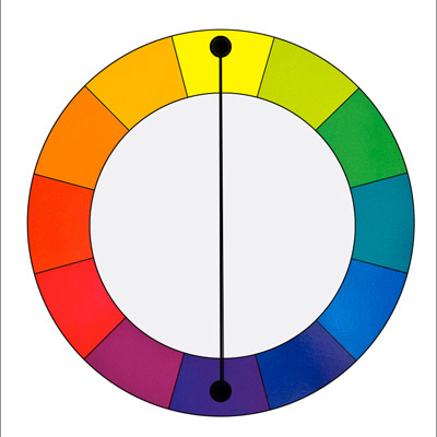
3 - The Complementary Color Harmony
In a Complementary color harmony we use two colors located directly across from each other on the color wheel. For example: yellow and purple.
This harmony creates a visually exciting effect when colors are used at full saturation. Therefore, it is necessary to control this harmony carefully so that the effect is not overdone or unpleasant to look at.
This harmony works well when you want something to stand out but it needs to be used carefully and in limited amounts.
4 - Notes
- This color harmony is frequently found in nature, for example in skies, in foliage, water and other subjects
- It is a simple and effective color harmony
- It lends itself to aesthetic and artistic effects
5 - Examples
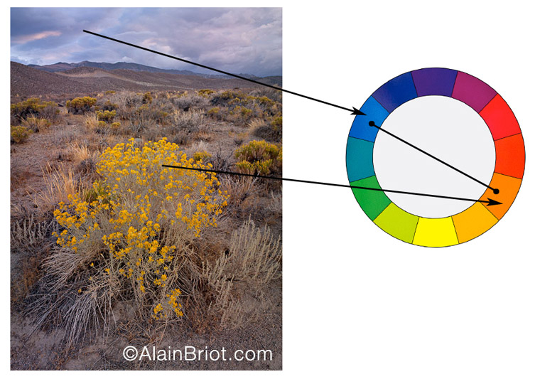
Complementary Colors Example 1: Easter Sierra Bloom
The photograph above of the Eastern Sierra Nevada shows a blue-yellow orange color harmony. The blue is found in the sky and the yellow orange in the flowering bush. Other colors are present, mostly browns and green-browns, but they act more as 'neutral' colors than as colors that could be used in a color harmony.
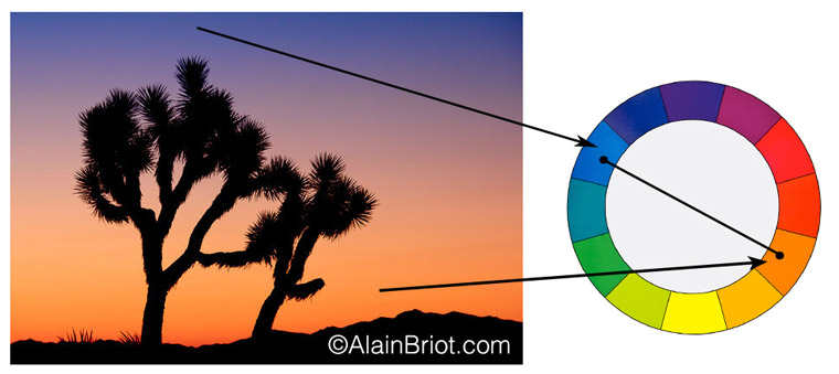
Complementary Colors Example 2: Joshua Tree Sunrise
The photograph above of Joshua Tree National Park shows a blue - orange color harmony which is frequently found at sunrise. In this particular instance those are the two only colors present in the sky. The third color is black and it acts as a neutral color, just like the browns do in the previous example. This is an easy color harmony to create because the colors are naturally harmonized. So much so that I did not have to change hardly at all when optimizing this photograph. I left it pretty much as it was captured, with only minor changes to adjust the color saturation and purity.
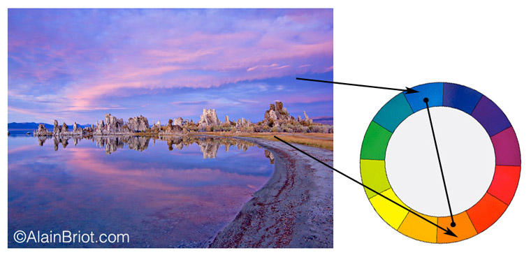
Complementary Colors Example 3: Mono Lake Dusk
This third example is from Mono Lake in the Eastern Sierra Nevada in California. It was taken about 15 minutes after sunset, and the light level was very low when I took the photograph. In fact, I did not see most of the colors visible in this image. What attracted me was the semi-circular shape in the clouds, shape that forms an oval composition because of its reflection in the water.??Because this was taken after sunset, the colors are mostly blue because the light level is shifting towards darkness. The only other color besides blue is the orange found in the dry grasses along the shore. I used those, shifting them towards a deeper orange than they originally were, in order to create this harmony. The third color is the purple of the cloud and its reflection. I decided to consider this color part of the blue color range, rather than try to create a tri-color harmony with it. We will, incidentally, see what tri-color harmonies are in the next essay in this series.
I find it interesting that these three images all use the same two colors, blue and orange, to create harmonies with widely different subjects matter. This shows that color harmonies can be created using the same colors even though the subject matter is different.
6 - Exercises
I decided to add exercises to each essay the way I do in many of my essay and in each of my books. ??The exercise for this essay is simple: create a complementary color harmony using one or several of your photographs. As you work your way towards this color harmony, refer to the information in this essay for guidance. You may want to look for photographs that naturally exhibit a complementary color harmony, or you may want to modify the colors of the original photography in the raw converter or in Photoshop as needed. As you work on this exercise, keep in mind that this is not about reproducing reality. Instead, it is about creating an aesthetic image with artistic qualities while following the requirements for a specific color arrangement.
7 - Continuing Your Studies
Color harmonies are one of the most important aspects of a personal style. If you are working on developing your style take a look at my just-released Personal Style Master Class Workshop on DVD. A FREE 21 pages eBook table of content is available. All you need to do is email me at alain@beautiful-landscape.com with the words ‘Master Class’ in the subject line and you will receive the link to the free eBook immediately.
Alain Briot - NPN 2054
|
 Alain Briot creates fine art photographs, teaches workshops and offers DVD tutorials on composition, conversion, optimization, printing and marketing photographs. Alain is also the author of Mastering Landscape Photography. Mastering Photographic Composition, Creativity and Personal Style and Marketing Fine Art Photography. All 3 books are available from Amazon and other bookstores as well from Alain’s website.
You can find more information about Alain's work, writings and tutorials as well as subscribe to Alain’s Free Monthly Newsletter on his website at http://www.beautiful-landscape.com To subscribe simply go to http://www.beautiful-landscape.com and click on the Subscribe link at the top of the page. You will have access to over 40 free essays by Alain, in PDF format, immediately after subscribing.
Alain welcomes your comments on this essay as well as on his other essays. You can reach Alain directly by emailing him at alain@beautiful-landscape.com.