Nature Photographers Network
This is the preserved archive of the original Nature Photographers Network. The community continues at naturephotographers.network.
Melt Down & Crop
‹ PreviousLandscape GalleryNext ›

Melt Down & Crop

by Harry Lichtman

Gallery: LandscapePosted March 5, 20185,360 views19 comments
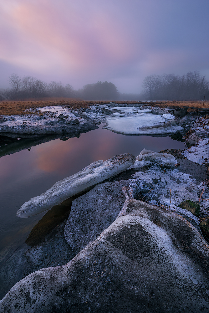
Another image from my recent marsh series just down the road from where I live. A muted sunrise to an otherwise foggy gray day on the seacoast of NH. The ice slabs are now long gone, though more snow on the way.  Could get interesting again.

Those are chunks of ice in the FG, though they have a bit of grit and small rocks imbedded in them.

D810, 16-35mm, f16, ISO 64, 1/6 sec.

Comments

19 comments
Comment posted by Harley Goldman on March 5, 2018 at 9:31 PM
Another great mood created by the fog and sky. I am on the fence about the prominence of the foreground rocks. Maybe a little crop off the bottom?
Registered on November 19, 2003, 586 Posts, 11271 Comments
Comment posted by Ronald Murphy on March 5, 2018 at 9:51 PM
While the broken ice of the previous image was appealing, this image got my attention even quicker. Maybe it's the colors. As for the cropping suggestion, perhaps, but just a little. Maybe up to where the foreground rock exits the frame on the left. I want to see this photo even larger than the large image.
Registered on March 13, 2012, 279 Posts, 975 Comments
Comment posted by Jim Gavin on March 5, 2018 at 10:04 PM
Great series of images. I do like the foreground ice but think a bit off left side?
Registered on August 14, 2008, 293 Posts, 1250 Comments
Comment posted by Harry Lichtman on March 5, 2018 at 10:08 PM
I did a left, bottom crop as suggested.
Registered on September 17, 2010, 304 Posts, 3507 Comments
Comment posted by Genny K. on March 6, 2018 at 2:58 AM
Those colors in the sky and water really make this for me.  I like the ice in the FG, it seems perfectly natural to me.sad  We have lots of that!  Original crop was Ok for me, but I like your re-crop even better.
Excellent treatment of a difficult subject. Well done.
Registered on June 5, 2006, 132 Posts, 2001 Comments
Comment posted by Aaron Feinberg on March 6, 2018 at 7:29 AM
Well thats pretty neat.  Nicely done.
Registered on October 26, 2009, 399 Posts, 2789 Comments
Comment posted by Harley Goldman on March 6, 2018 at 7:51 AM
The crop version is working for me. I like the change. 
Registered on November 19, 2003, 586 Posts, 11271 Comments
Comment posted by Doug Koepsel on March 6, 2018 at 8:04 AM
Preference to the original. In the second, I feel the point of the middle ie slab gets too close to the edge and the image loses some of the room to flow diagonally.  Minor nits, but a couple of the golden twigs along the center right edge are a smidge bright.  I like the blue and charcoal color of the ice slabs.
 
Registered on April 1, 2010, 196 Posts, 1592 Comments
Comment posted by Preston Birdwell on March 6, 2018 at 12:11 PM
I like both, Harry, but I lean toward the original because it is more spacious and the lines are better realized. The light is gorgeous, and the processing looks very good.
--P
Registered on November 1, 2003, 471 Posts, 5188 Comments
Comment posted by Jim Gavin on March 6, 2018 at 1:34 PM
Although both are wonderful, I like the second because it lessened the space between the tree on the left and the left side of the image.
Registered on August 14, 2008, 293 Posts, 1250 Comments
Comment posted by Nick Bristol on March 6, 2018 at 5:36 PM
Harry, This is really nice and the mood is absolutely wonderful. I like these kind of images a lot and this one reminds me why that is. The colors look great! I liked the first post just fine but I do think the repost is even a bit better. Beautiful image and great processing too.

Nick Bristol
Lone Rock, WI.
Registered on February 1, 2004, 752 Posts, 14140 Comments
Comment posted by Anil Rao on March 7, 2018 at 4:56 AM
A strong near-far composition with excellent atmosphere. The foggy conditions provide a nice and soft backdrop to the fascinating rock and ice up close. 

Very nicely done, Harry.
Registered on November 15, 2003, 234 Posts, 4923 Comments
Comment posted by Ed McGuirk on March 7, 2018 at 9:42 AM
Harry, this image has a nice soft, ethereal feel to it. I love whats going on in the top 3/4's of the image, it just has a nice soft glowy feeling. This is just my personal taste, but in regards to the repost I would consider cropping even more away from the bottom. I like how there is a contrast between the softness in the upper section, and the sharpness of the foreground snow/ice formations. But for me the softness in the sky/water is the most appealing aspect of this scene. I think you can remove some more of the snow, which would retain the soft/sharp contrast, while placing even more emphasis on the softer parts of the image.

Given the lack of snow this winter, you did a great job thinking outside the box to create a really nice and unusual winter image here.
Registered on November 29, 2017, 19 Posts, 260 Comments
Comment posted by Paul Breitkreuz on March 7, 2018 at 11:07 AM
Harry, sometimes the vertical scenes do have a place and time, this is one of them for sure. The warm reflective light is a real plus here. Not sure the scene would have the same impact with total dark winter gloom. As always it seems to be about the light, even small amounts of warmth that we see here....laugh 

btw: just saw the repost. I kinda liked the original, but both work in the composition department.
Registered on February 25, 2006, 525 Posts, 8448 Comments
Comment posted by Mark Seaver on March 7, 2018 at 11:23 AM
The very subtle color in the clouds and their reflections make this image, Harry.  There's a very gentle, cool yet inviting feeling that sure makes me want to be there.  I'm fine with the original post.
Registered on January 23, 2011, 1103 Posts, 17270 Comments
Comment posted by David Schoen on March 7, 2018 at 5:20 PM
Incredible light with serene leading lines and diagonals into a foggy background that contrasts so well with the texture of foreground.  Terrific composition.  Both crops work for me.
Registered on November 6, 2006, 1213 Posts, 4587 Comments
Comment posted by Ian Cameron on March 9, 2018 at 5:28 AM
Lovely Scottish colours to that purply blue sky that are so familiar over the Atlantic divide but which are often questioned in the US.  I recall Kah Kit  visiting Scotland and being astonished by the purple hue of our Scottish Highland scenery.  Even the scene depicted looks like it could have been taken here, very pleasing to my eye.
Registered on August 6, 2004, 1125 Posts, 3318 Comments
Comment posted by Eva McDermott on March 9, 2018 at 9:57 PM
A very moody and somber scene Harry.  I like your second post best with a little less dark at the bottom.
Registered on January 4, 2009, 1015 Posts, 13229 Comments
Comment posted by Norma Tareila Matl on March 10, 2018 at 7:21 PM
Harry, peaceful, beautiful scene ... with all those earthly elements working together to create a perfect visual. I think I like the first image without the crop but both work just fine for me. The purple in the sky and the golden brown grasses on the horizon have a nice balancing effect. 
Registered on October 27, 2016, 229 Posts, 393 Comments