Gallery: POP PhotosPosted December 16, 201711,403 views5 comments
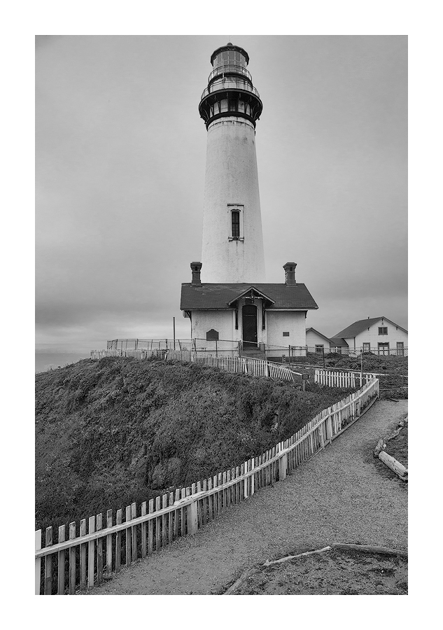
After shooting this lighthouse from numerous sides I decided that this was my favorite composition. There was little color that day so I decided to convert it to b&w.
Comments
5 comments
Comment posted by Jim Zablotny on December 17, 2017 at 9:44 AM
Hi Igor,
I like the path bordered with the fence that leads the eye through the comp. I can see why you placed the top of the lighthouse up tight against the frame Well done........................Jim
Registered on January 17, 2004, 705 Posts, 3594 Comments
Comment posted by Paul Breitkreuz on December 20, 2017 at 11:56 AM
Hey Igor, the B&W treatment was perfect here with the lack luster weather or overall sky that day. I do like the walkway and picket fence leading our eyes toward the main subject too.
Was there a bit more room to the right here to include the entire RH middle ground building as well as a bit more of the lead in on the RH walkway up front there? Only other item for thought is the keystone effect on the tall light tower itself. Not sure if any of that could be readjusted for in PS Lens Correction feature. I've not used that feature in a long time now. One of the pluses of using LF for an item like this is the tilts available. Regardless, I really like all lighthouse scenes like this one.
Registered on February 25, 2006, 525 Posts, 8448 Comments
Comment posted by Ed Williams on December 21, 2017 at 12:47 PM
I really like this one Igor. The fence leads you right into the lighthouse. Good work in B & W.
Registered on December 28, 2010, 636 Posts, 3499 Comments
Comment posted by Harley Goldman on December 23, 2017 at 9:16 AM
I really like the mood. The black and white adds to the stormy, weathered feel. The comp feels a little tight to me on the right and top. I would concur with Paul on doing a perspective fix. It kind of looks like the lighthouse is falling backward.
Registered on November 19, 2003, 586 Posts, 11271 Comments
Comment posted by Preston Birdwell on December 25, 2017 at 1:34 PM
I like the mood, here. I would like to see a bit more luminosity in the whites, otherwise, the contrast looks real nice. I agree with the others regarding the vertical convergence of the lighthouse. Not sure how easy it would be to correct. I am OK with the slight tightness on the right, but the top of lighthouse could use a little more breathing room. Nice image, Igor.
--P
Registered on November 1, 2003, 471 Posts, 5188 Comments

Comments
5 commentsI like the path bordered with the fence that leads the eye through the comp. I can see why you placed the top of the lighthouse up tight against the frame Well done........................Jim
Was there a bit more room to the right here to include the entire RH middle ground building as well as a bit more of the lead in on the RH walkway up front there? Only other item for thought is the keystone effect on the tall light tower itself. Not sure if any of that could be readjusted for in PS Lens Correction feature. I've not used that feature in a long time now. One of the pluses of using LF for an item like this is the tilts available. Regardless, I really like all lighthouse scenes like this one.
--P