Nature Photographers Network
This is the preserved archive of the original Nature Photographers Network. The community continues at naturephotographers.network.
Firewood Revisited + Another Repost :)
‹ PreviousLandscape GalleryNext ›

Firewood Revisited + Another Repost :)

by Jim Zablotny

Gallery: LandscapePosted February 19, 2017144 views11 comments
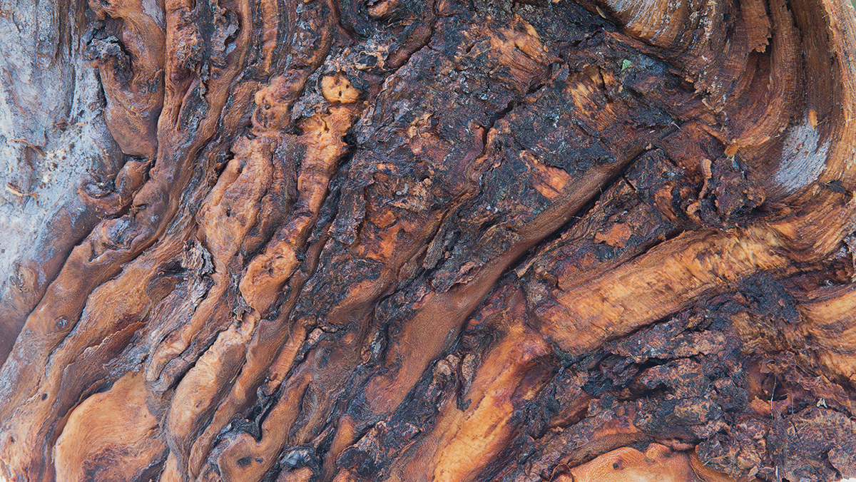
This is the same piece of firewood that I previously posted, but with some changes.  I used a Sigma 18-35 mm lens which allowed me to capture more of the scene than with a standard macro lens.  I am also posting a BW version of this image as well. K5 IIs 18-35 mm f1.8  (35 mm, 1.0 sec at f13, Iso 80) Levels, exposure, luminosity masks, brightness & contrast.......................Jim

Comments

11 comments
Comment posted by Jim Zablotny on February 19, 2017 at 12:36 PM
The black & white version.  An additional levels step was used to pull the range of tones from black to white........................Jim
Registered on January 17, 2004, 705 Posts, 3594 Comments
Comment posted by Lon Overacker on February 19, 2017 at 1:53 PM
Jim,

Most certainly a fascinating piece of wood. I like the balanced mix between the raw wood and the charred bark.  For me, the interest isn't the wider view, but the details, color and patterns of a more intimate.  If mine, I would crop left and right to eliminate the light blue patches; I don't think they add to this intimate view.

The only other suggestion would be a gentle burn of the bottom section of the image to even out the tonality/exposure a bit.

I think with some tweaks this could be an excellent intimate and nature abstract - heck, can't really tell it's wood either.

The b&w isn't doing much for me.  What I like about the color version (color, detail texture difference between the wood and char is lost in the b&w.  I think you'd have to go to some more extreme processing.  Just my .02.

Lon
Registered on November 24, 2006, 521 Posts, 19147 Comments
Comment posted by Harley Goldman on February 19, 2017 at 2:31 PM
I would agree with Lon on all points. The light gray areas throw me off a bit and I think it would tighten up nicely without them. The image really works with the rich colors and loses impact for me in B&W. 
Registered on November 19, 2003, 586 Posts, 11271 Comments
Comment posted by Jim Zablotny on February 19, 2017 at 4:28 PM
Thank you Lon and Harley. I cropped the original  image to remove the blue areas, and burned in  the bottom of the image slightly with a 90% opacity layer.  Hard to say if it improved the image, but will wait for the verdict. 
Registered on January 17, 2004, 705 Posts, 3594 Comments
Comment posted by Mark Seaver on February 19, 2017 at 10:50 PM
Jim, you've got a fine sense of movement here, with the curving lines of texture.  The colors in the original also add a lot of interest and especially warmth.  That makes it a big improvement over the b&w version in my book.  Well seen.  Interesting that I don't get nearly as strong a sense of movement in the latest repost...
Registered on January 23, 2011, 1103 Posts, 17270 Comments
Comment posted by gary phillips on February 20, 2017 at 3:18 AM
It's very interesting to read the comments here, Jim.  Lon and Harley had the same reaction I did to the greys in the original.  I also think the b/w has potential,  The histogram just needs stretched quite a bit.  Just too much middle grey.  A black point adjustment might also work very will.  As Mark pointed out, some of the perceived movement in the wood is lost in the tighter crop, but I do like it better without the grey.
Registered on October 24, 2013, 185 Posts, 4136 Comments
Comment posted by scott lanz on February 20, 2017 at 7:52 AM
I like the final color and cropped version the best, Jim. You lose a little of feeling that the wood is stretched that is conveyed in the original, but I like the edge to edge rich color and detail that becomes the focus in the cropped/color version.  
Registered on November 14, 2003, 840 Posts, 12902 Comments
Comment posted by Preston Birdwell on February 20, 2017 at 5:38 PM
I like the original, but have to go with the reposted color image. It is more dynamis, and the processing is a nice improvement.

I think the B&W version would work better with more contrast--deepening the blacks and raining the lights, as Gary mentioned.

It is always interesting to find things, literally in the backyard, that can make compelling images.
--P
Registered on November 1, 2003, 471 Posts, 5188 Comments
Comment posted by Ryan Shain on February 20, 2017 at 8:49 PM
Hi Jim,

The final repost works for me too. The processing looks better, and I like the cropped view as I stay in the presented image exploring the shapes, textures, and colors. 
Registered on February 20, 2007, 226 Posts, 4571 Comments
Comment posted by Alberto Patiño on February 22, 2017 at 12:30 AM
I think I prefer the color version - the colors are soft, pleasing and realistic.
Registered on December 2, 2014, 278 Posts, 1736 Comments
Comment posted by Harley Goldman on February 22, 2017 at 4:52 PM
For my money (all $0.02 of it), put me down for the cropped color repost. I agree you could pull a lot more out of the B&W, but I like the color version and its nice warm tones. 
Registered on November 19, 2003, 586 Posts, 11271 Comments