Nature Photographers Network
This is the preserved archive of the original Nature Photographers Network. The community continues at naturephotographers.network.
Meadow Melodies +alt
‹ PreviousLandscape GalleryNext ›

Meadow Melodies +alt

by Lon Overacker

Gallery: LandscapePosted November 29, 2016243 views17 comments
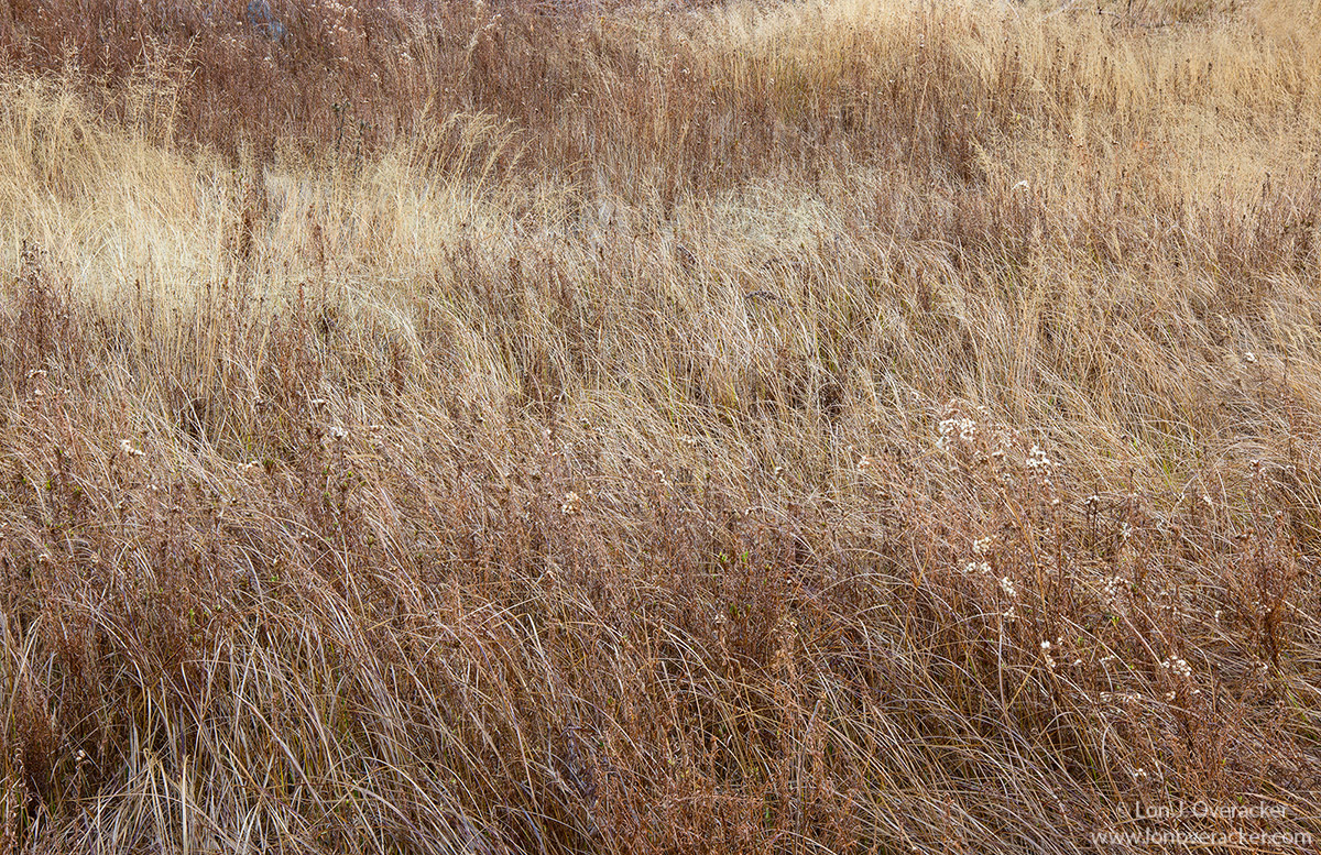
What would a trip to Yosemite Valley be without smoking a little grass... OOH, I mean photographing. sad  I think back and I can't really pinpoint what or who got me so inspired by something as simple as a field of grasses, but I've been enamored with and seeking these images out for at least 5 or more years now.

We spent some time around the Little Chapel where I spent some time in the small meadow.  This is a 4-image focus stack.  As always, would love to here your comments, critiques and suggestions.

Thanks!

Nikon D800E
Tamron 24-135mm
4 images @ f/13 1/4s stacked in PS

Comments

17 comments
Comment posted by Igor Doncov on November 29, 2016 at 4:57 PM
This is an interesting subject that you've captured here. I've thought about these and I think what makes these work are compositions of light and darker brown patterns that mix and flow into one another to form a gentle tapestry. The upper right quadrant is where it has worked the best. For me the grasses forming distinct strong lines at the bottom, particularly on the left bottom, go against what this image is about. If this is a crop I would be interested in adding more to the top to see how it goes, and I would crop from the bottom.

I am just voicing my opinion on my outlook on this subject. It may not be right or the only one. Take it as you wish. BTW there is a bluish are near the top you may want to clone out although it's barely noticeable.
Registered on November 22, 2014, 189 Posts, 2733 Comments
Comment posted by Ed Lowe on November 29, 2016 at 4:58 PM
This is so simple yet elegant, Lon. the large version does a superb job of showcasing all the wonderful details and textures in this lovely scene. I also like the subtle bands of color as they make for some nice layers in the image. I am glad you spotted this lovely scene as I would have missed it completely. BTW the stack looks great.

Ed
Registered on February 7, 2004, 414 Posts, 7115 Comments
Comment posted by Preston Birdwell on November 29, 2016 at 5:16 PM
I wondered what you were doing over there. :-) This looks real nice. I like the layers of red and the lighter grasses. The processing looks great, Lon. Sweet image.
--P
Registered on November 1, 2003, 471 Posts, 5188 Comments
Comment posted by Lon Overacker on November 29, 2016 at 6:10 PM
Thanks for the early comments folks.

Igor, I appreciate your thoughtful commentary on my, and everyone else's images. You take the time to think about and observe beyond the surface.  Opinions? of course - and there is no right or wrong, by definition that's what an opinion is.  So there's no need at all to qualify your comments, trust me, they are appreciated, and considered.

What attracts me to these scenes are those pattens of color, tone, light - and detail as well.  I do look for patterns, and even focal points to ground the image - if possible.  In this case the plants with the little white rice-puff tops caught my eye, as well as the variety of color interjected throughout the scene.  Also the taller yellow ones UL I thought helped balance the scene.

As far as cropping, I can see your crop, at least from the bottom.  This is nearly FF however with a very slight bit off the top where the edge of the frame was dark (grass no longer visible due to angles, etc.) So adding more up top isn't an option.

Good eye on the little blue thang up top.  I did see and know about that and forgot to clone it out.  Optionally, I could just remove the blue and that might mitigate it as well.

Thanks for the observations!
Registered on November 24, 2006, 521 Posts, 19147 Comments
Comment posted by Igor Doncov on November 29, 2016 at 7:34 PM
Lon,

I wrote that partially because I often change my mind about suggestions I myself make. For example, I suggested that Michael Lowe add more tonal range to the mist and after I saw it it was the wrong thing to say. The sky has become heavier and changed the mood of the image. It's hard to accurately predict something without doing it. I do believe the grasses are an issue, however, because they draw your attention to the edge of the frame and they're the most contrasty area on the canvas. But I could wake up tomorrow and have a different take on it. It happens to my own images at times.
Registered on November 22, 2014, 189 Posts, 2733 Comments
Comment posted by Harley Goldman on November 29, 2016 at 9:30 PM
I see the layering that attracted you to this scene. Nice sense of it, but overall, this one is not striking a chord with me all that much. Can't really put my finger on it, though. 
Registered on November 19, 2003, 586 Posts, 11271 Comments
Comment posted by Jake Alletson on November 29, 2016 at 10:40 PM
To me the real strength of this image lies, not in its excellent technicalities, but in the story it tells.  The dry brown grass speaks of a summer gone and the winter that will be closing in.  We are reminded of the finite time span of our lives.
Registered on May 3, 2016, 12 Posts, 163 Comments
Comment posted by Tony Kuyper on November 29, 2016 at 10:50 PM
Definitely like this subject and the possibilities it offers.  This maybe seems a bit confusing yet.  Even the larger version feels a bit homogenous.  I'm wondering about using some strategic dodging and burning to create a better flow of light and dark in this as the grasses seem to offer greater potential in tonal variation
Registered on November 1, 2003, 364 Posts, 22328 Comments
Comment posted by Mattia Oliviero on November 30, 2016 at 6:03 AM
I 've taken a look at this picture several times during this morning. The first time I would have suggested to crop a little bit from the lower right part to emphasize the contrast between the dark and the bright grass. I then realize that the image works well as presented due to the lovely contrasts in each part of the picture. The final suggestion would be to add a little bit of contrast to highlight the beautiful palette. 

Mattia
Registered on August 24, 2016, 43 Posts, 254 Comments
Comment posted by scott lanz on November 30, 2016 at 8:23 AM
Very nice, Lon. I like the excellent detail and textures. I think Tony's comment and suggestion about additional contrast is a good one. You might also try a just bit more saturation (in the exercise of artitistic interpretation). 
Registered on November 14, 2003, 840 Posts, 12902 Comments
Comment posted by Nick Bristol on November 30, 2016 at 4:09 PM
Lon, This is very enjoyable for me to look at. It reminds me of one of the images I shot for my November series last year except I had some background trees and sky too...so not quite like it I guess...cool This works very nice for me as it is here. Interesting to look at the with very natural colors and textures. As I look at it I start seeing several layers which I didn't see right at first and I like that. You are very good at these grass images and that is just what I remember in past images from you. Probably where I got the idea to try a few myself. 

Nick Bristol
Lone Rock, WI.
Registered on February 1, 2004, 752 Posts, 14140 Comments
Comment posted by Lon Overacker on November 30, 2016 at 4:59 PM
Thanks for the comments and observations folks!  I've re-worked this considering a few of the suggestions: a bit more contrast and saturation, as well as some targeted dodging and burning.  Interestingly Tony, I did that on another grass image I may, or may not post.  But the technique works well to highlight patterns.  I'm not sure this image has the best flow through of patterns and light through the image, but I'll toss this one out there.  Also a slight crop off the bottom.

Personally, I was fairly happy with my post. I say that because it already underwent at least one round of critique and I had added additional contrast and color to the original.  I could spend more time on this, but I think this one I've taken too far.  

What do you think?

Also adding the original image, no processing, just resized for the web.  It's also not share as it's just 1 of the 4 images used in the stack; but posting for content, original color and contrast.  Thanks!
Registered on November 24, 2006, 521 Posts, 19147 Comments
Comment posted by Lon Overacker on November 30, 2016 at 5:00 PM
unprocessed raw
Registered on November 24, 2006, 521 Posts, 19147 Comments
Comment posted by scott lanz on November 30, 2016 at 9:36 PM
Comparing the original with the repost, I think I actually prefer the original, Lon. The original certainly looks more natural. Looking at the raw file, I think you did well with the original. 
Registered on November 14, 2003, 840 Posts, 12902 Comments
Comment posted by Igor Doncov on November 30, 2016 at 11:18 PM
I understand where Scott is coming from. Perhaps you took the raw file in the wrong direction. A gentle subject, perhaps more contrast was not what was called for. I like the original over the repost. This may be a difficult one, but the seminal idea is a good one. For some reason this reminded me of some of Andrew Wyeth's egg tempura paintings. Christinas World. It may help to compare his depiction of fall grass with yours in terms of color scheme. 
Registered on November 22, 2014, 189 Posts, 2733 Comments
Comment posted by Alberto Patiño on December 1, 2016 at 2:27 PM
Lon,

I also think that I prefer the original - the subtler tones and colors make it more appealing to me. 
Registered on December 2, 2014, 278 Posts, 1736 Comments
Comment posted by Mark James Ford on December 3, 2016 at 8:24 AM
Hi Lon, a really thought provoking post.  I spent quite a while trying to pin down my own thoughts about the image - which at first glance could be easily dismissed. No doubt there are many different end points for this very subtle image - I prefer the higher level of contrast (and saturation) but don't like that the top left has become darker and no longer seems to harmonize so readily with the top right of the image ... There may be a globally less warm (but not less saturated) version based on the RAW which could be an interesting take ... perhaps exploiting a hint of cross processing ;-) ... 
Registered on January 16, 2015, 60 Posts, 430 Comments