Gallery: LandscapePosted May 17, 20163,258 views8 comments
Thanks you for your comments on my previous images. I really appreciate your comments and critiques.
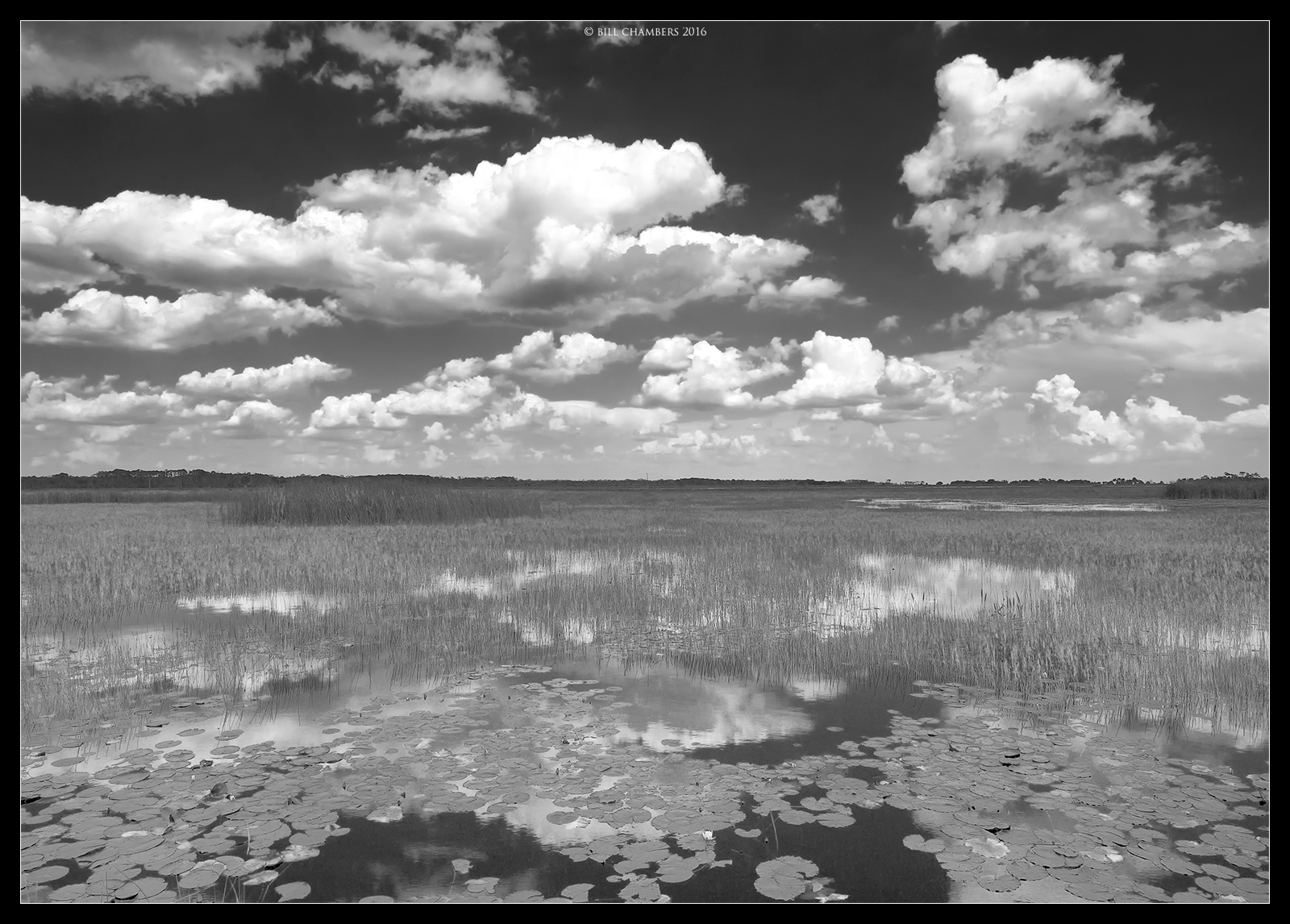
BEST VIEWED LARGE. Captured this beautiful afternoon on the marsh at St. Mark's Wildlife Refuge.
Comments
8 comments
Comment posted by Harley Goldman on May 18, 2016 at 9:32 AM
Beautiful white puffy day. I might be inclined to drop the mids a little bit? A fine scene.
Registered on November 19, 2003, 586 Posts, 11271 Comments
Comment posted by Roel Wijtmans on May 18, 2016 at 11:19 AM
Nice b+w scene with those lovely clouds! I do think the blackpoint could be adjusted a bit, it all seems a wee bit bright and I would like to see some more darker parts.
Registered on September 30, 2012, 116 Posts, 2257 Comments
Comment posted by Dave Dillemuth on May 18, 2016 at 12:28 PM
This is excellent. Love the layers and textures and those puffy clouds. I agree with comments that the contrast looks a bit flat. Perhaps raising the mid-tone contrast would make this pop a bit more?
Registered on December 10, 2015, 104 Posts, 1112 Comments
Comment posted by gary phillips on May 18, 2016 at 7:04 PM
This is very understated, Bill, and perhaps that was the intent of your presentation. I think you could push the contrast quite a bit in both the sky and water. Like others have mentioned, particularly the blacks and darker mids. It's a fine image to my eye and it certainly goes to individual tastes when it comes to contrast tolerance. It's very peaceful as presented.
Registered on October 24, 2013, 185 Posts, 4136 Comments
Comment posted by Mark Seaver on May 19, 2016 at 2:53 PM
What a classically beautiful summer sky, Bill. I also like all of the details in the long view across the marsh. The contrast difference between the sky/clouds (quite high especially up top) and the water/vegetation (fairly low) is striking and has me wondering how adding more contrast across the marsh would look.
Registered on January 23, 2011, 1103 Posts, 17270 Comments
Comment posted by Bill Chambers on May 19, 2016 at 11:17 PM
Thanks all for the critiques. Looks like it's back to the drawing board for this one.
Registered on April 10, 2005, 753 Posts, 21216 Comments
Comment posted by Kah Kit Yoong on May 20, 2016 at 8:31 PM
I like the composition and different patterns especially in the foreground which to me is rendered too much midtone grey to properly bring these out.
Registered on September 27, 2006, 636 Posts, 10682 Comments
Comment posted by Igor Doncov on May 21, 2016 at 11:44 AM
This is a very nice image, Bill. I like the idea and all the components are here for a fine image. It's clear to me that you didn't want the reeds and lily pads to be contrasty, but have a light quality. I'm wondering if lightening up the 'blue' sky at the top would help the image or give it a blah feeling. Actually, I don't think that would improve this. I like it just the way it is.
Registered on November 22, 2014, 189 Posts, 2733 Comments

Comments
8 comments