Nature Photographers Network
This is the preserved archive of the original Nature Photographers Network. The community continues at naturephotographers.network.
Pre-dawn on the Owens
‹ PreviousLandscape GalleryNext ›

Pre-dawn on the Owens

by Dave Dillemuth

Gallery: LandscapePosted January 21, 2016158 views11 comments
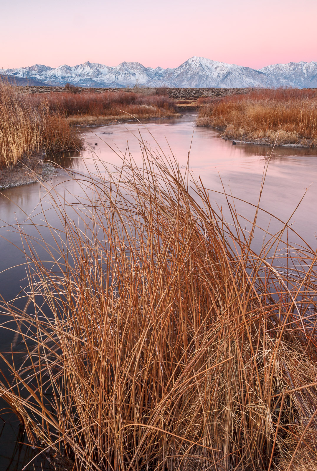
After pre-scouting I came to this location outside Bishop CA on a couple of mornings during my trip last December. The best lighting for my taste lasted only for about 5-10 minutes just prior to the sunlight hitting the Sierra. At this time there is a beautiful pink glow. The view here is directly West so lighting becomes flat very quickly and uninteresting after sunrise. 

This image is from my second attempt. On my first try I went for a more conventional composition placing this tuft of reeds to the right of the frame and utilizing the river as a leading line into the image. However, I had an idea to try and use the tuft of reeds themselves as the leading line. Be interested in views on whether this composition works or blocks the eye from moving into the frame. Thanks for your input.

5DII, 24-105 f/4L @ 28mm, 2 stop GND, TK masks
ISO 100, f/22, 5.0 sec

Comments

11 comments
Comment posted by Michael Lowe on January 21, 2016 at 3:12 PM
Works for me. There's still enough water visible to move your eye through. Beautiful pastel glow in the sky.enlightened
Registered on February 11, 2004, 777 Posts, 5252 Comments
Comment posted by Elizabeth Holbrook on January 21, 2016 at 3:36 PM
I like the colour and detail in the reeds.  The mountainous background works well with the sky.  The sky reflections in the river add to the overall image.  I like the reeds in the foreground.  They add to story and complexity of the river flow.
Registered on May 6, 2015, 43 Posts, 221 Comments
Comment posted by Jim Jirka on January 21, 2016 at 3:57 PM
My preference is I like to enjoy images that break away from all of the compositional rules. The image as presented seems to be forced to me. While the colors are nice and the image evokes a stillness, something is lacking for any emotion for me.
Thanks for sharing.
Registered on November 1, 2003, 254 Posts, 1620 Comments
Comment posted by D.A. Edwards on January 21, 2016 at 5:57 PM
Lovely muted palette, Dave, and I have no issues with the somewhat unusual comp. The river is still there as a leading line reinforced by the peak of the reeds to draw the eye to the distant mountains. There is an attractive symmetry front to back although my one nit would be the black spots in the water on each side. I would be tempted to clone them both away.
Registered on October 8, 2014, 226 Posts, 1187 Comments
Comment posted by David Schoen on January 21, 2016 at 6:40 PM
It is a different comp but the triangle formed by the reeds leads me into the river which nicely follows into the BG mountains.  Very nice lighting.
Registered on November 6, 2006, 1213 Posts, 4587 Comments
Comment posted by gary phillips on January 21, 2016 at 9:10 PM
Pretty cool Dave. I think that a prominent foreground element can be effective sometimes.  In my opinion this is one of those times.  The detail in the grasses works very well to introduce the rest of the frame.  I must admit my last trip to the Owens valley, I fished instead of taking pictures.  Your image reminds me that I may have made a bad choice.
Registered on October 24, 2013, 185 Posts, 4136 Comments
Comment posted by Roel Wijtmans on January 22, 2016 at 11:36 AM
The comp works very well for me, although a bit more separation between the foreground grasses and background grasses would have been the icing on the cake. But that was probably not a very realistic option. Light is very sweet, and I love the details in the mountains.
Registered on September 30, 2012, 116 Posts, 2257 Comments
Comment posted by Kathy Barnhart on January 22, 2016 at 1:23 PM
This is such a beautiful sunrise scene, and I love the colors and view. However, I do find the grasses a little too dominant for my taste and would like to push them aside with my arm to see the lovely pink reflection on the water. Maybe a crop from the bottom would make it a little less dominant, like about halfway up the photo. As I see it, the story is the river, mountains, lovely colors, and the grasses are secondary.
Registered on November 11, 2011, 404 Posts, 1639 Comments
Comment posted by Nick Bristol on January 22, 2016 at 4:55 PM
Dave, This is really nice! It is an interesting composition that works great for me. I enjoy the soft light and color and how I'm drawn back into the scene. Nice work on this!

Nick Bristol
Lone Rock, WI
Registered on February 1, 2004, 752 Posts, 14140 Comments
Comment posted by Lon Overacker on January 22, 2016 at 7:42 PM
Dave,

This part of the east side still remains on my bucket list.  Images like this are a big reason.  The soft pastel of the sky and reflected in the water is just wonderful.  Despite the heavy presence of the grass, the comp is open enough and the eye is able to meander up/down river leading to the beautiful snowy peaks of the range.

I don't mind the composition in the smaller view, and it's only a problem in the larger view cause I have to scroll...  and so it's difficult to really get a good look at how I feel about the comp.  If anything, I might suggest a 4:5 ratio crop coming up from the bottom.  Just a thought.

Colors and processing, gorgeous.

Lon
Registered on November 24, 2006, 521 Posts, 19147 Comments
Comment posted by Albert Darmo on January 22, 2016 at 10:55 PM
Hi  Davecrying   An interesting  symmetrical composition that  works  well with. the beautiful  pastel light reflected  on the water  through  the reeds


Albert Darmo
Canada
Registered on November 25, 2008, 1386 Posts, 11978 Comments