Nature Photographers Network
This is the preserved archive of the original Nature Photographers Network. The community continues at naturephotographers.network.
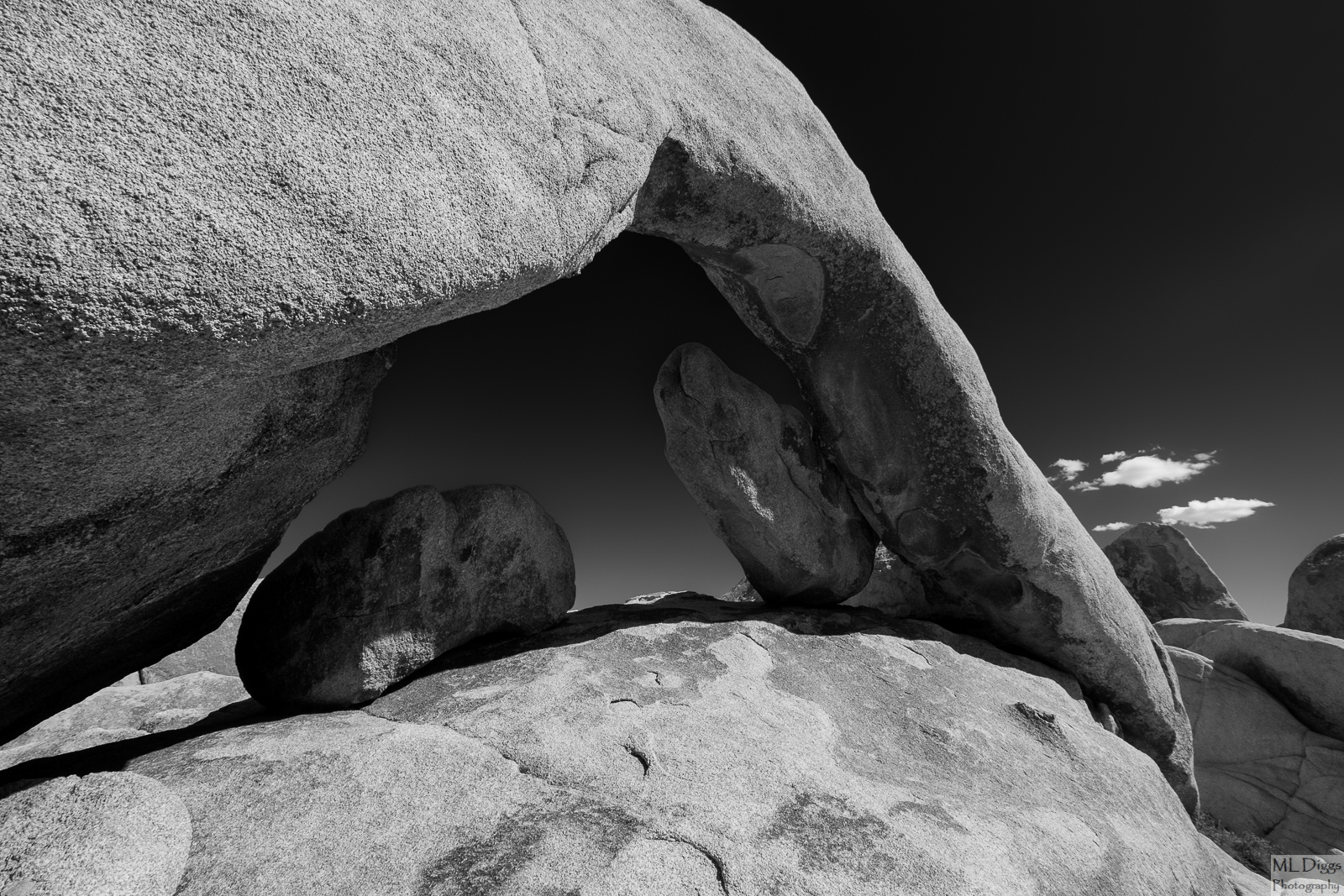
Arch Rock
‹ PreviousLandscape GalleryNext ›

Arch Rock

by Marylynne Diggs

Gallery: LandscapePosted December 16, 20152,121 views17 comments
Hi Folks,
Gee, I really do think I am down to 3 more b/w images, and this is the last of them for this gallery (others will be in close-up or man and nature).  This is a black and white conversion of Arch Rock, located near the White Tank campground in Joshua Tree.  The images is fairly satisfying in color (orange rock, blue sky and all), but I like the rock texture and tones in b/w as well. 

As usualy, let me know what you think about composition, contrast, etc.  I have improved this series immensely through everyone's feedback, and I am always open to suggestions of any sort, as well as declarations of utter boredom with an image, so please, don't hold back.

Canon 7D with sigma 10-20 at 10mm
ISO 100, f/11, 1/160s
processed in Nik SilverEfex

Comments

17 comments
Comment posted by Dietrich Gloger on December 16, 2015 at 12:32 PM
This has a very classy and classic feel, like the work of Ansel Adams, Edward Weston and the few others I can't even remember..;-)
Perhaps, in a perfect world, the clouds would not "sit" on that little rock on the right - or would be gone? But that's really just nit picking!

Certainly a very strong piece for the portfolio.

 
Registered on January 26, 2007, 360 Posts, 9876 Comments
Comment posted by Dave Dillemuth on December 16, 2015 at 1:38 PM
Marylynne.
Very nice!. B&W processing looks good. Not sure if my pad is a good judge but I might suggest lightly dodging the prominent rock underneath the arch to gain a bit more seperation from the sky.
Registered on December 10, 2015, 104 Posts, 1112 Comments
Comment posted by Roberto Facchini on December 16, 2015 at 2:48 PM
I really like the composition. Conversion to B & W is successful. 
As they have already written, maybe with the clouds not so close to the rocks would have been even better, but it's a detail. Beautiful picture!
Registered on November 15, 2012, 35 Posts, 202 Comments
Comment posted by Sharon Huvelle on December 16, 2015 at 3:19 PM
Marylynne,

I agree with Dietrich; it is so boldly classic like Ansel. I like the clouds and feel they give a soft contrast to the hard rocks. You have captured nature's amazing composition so well.

Sharon
Registered on December 7, 2015, 9 Posts, 9 Comments
Comment posted by Marylynne Diggs on December 16, 2015 at 3:32 PM
Thanks, everyone.  I would have waited for those clouds to move, but they were going the wrong way, heading for under the arch with a bigger cloud I did hide.  I took the picture on a vacation with a group that was not really into the 1 hour wait for perfect conditions.  In fact, the next shot was our creation of the perfect U2 Joshua Tree album cover, complete with bad-ass stances and rock n' roll scowls.  Quite fun actually, and I came away with a few good shots to boot.

I might be able to clone out the lower cloud, keeping just the one that does not intersect with rock.  If I'm successful with that, I'll share again.

I'll play with that rock.  I think I did a little dodging before, but noise resulted. With the noise brush much improved in LR, I might be able to handle it better now.
Registered on December 14, 2010, 122 Posts, 1034 Comments
Comment posted by David Schoen on December 16, 2015 at 4:28 PM
I really like the comp here but what I would like to see is a little more tonal separation between the potato like rock under the arch on the right in the upper right gap between the rock and the arch where the sky is really dark.  There is a tonal varietion in the sky diagonally from left to right.  I thing just a hair more brightness in the sky might outline the rock a tiny bit better.  But then again, that might not be your intention.  The image has a really nice feel to it.
Registered on November 6, 2006, 1213 Posts, 4587 Comments
Comment posted by Mark Metternich on December 16, 2015 at 6:20 PM
Nice image. I really wish I could see it A LOT bigger!  :) 
 
Registered on June 19, 2009, 276 Posts, 6240 Comments
Comment posted by Harley Goldman on December 17, 2015 at 9:55 AM
A real nice classic B&W image. Good choice to convert it and emphasize the graphics of the scene. Very nicely done.
Registered on November 19, 2003, 586 Posts, 11271 Comments
Comment posted by Ed Lowe on December 17, 2015 at 10:00 AM
Another fine image in your B&W series, Marylynee. I really like the range of tones you captured in the scene along with the textures of the rock. My only suggestion would be a bit more tonal seperation of those two rocks under the arch.

Ed
Registered on February 7, 2004, 414 Posts, 7115 Comments
Comment posted by Marylynne Diggs on December 17, 2015 at 12:01 PM
Thanks for the feedback, everyone.  I played with the clouds and couldn't eliminate or separate them without it looking fake, so they stay, unfortunately.  I did play with the rocks under the arches a tish.  I'm not sure about the diagonal.  I can see it.  I think it might have been a very diffused contrail?  Or maybe we were looking a little NW through the arch in the late morning?

Let me know if this is an improvement.
Registered on December 14, 2010, 122 Posts, 1034 Comments
Comment posted by Roel Wijtmans on December 17, 2015 at 12:02 PM
An interesting collection of rocks, and nicely captured as well! Can't think of a nit.
Registered on September 30, 2012, 116 Posts, 2257 Comments
Comment posted by Igor Doncov on December 17, 2015 at 11:10 PM
I think Dietrich's comments are spot on. This is a marvelous image that comes close to the Death Valley dune image. A study of shapes and forms, this is very much like an Edward Weston image. I really like how you processed the sky, giving it a gradient from almost black to neutral gray. It really enhances that nice edge of the lighted rock. Regarding the clouds I think that your eyes are drawn to them but I'm not sure that that's such a bad thing. They do add a bit more interest to the image and are not entirely a distraction. I don't think removing one cloud will solve the problem, although it helps. I initially thought that those light patches would be a problem but in the larger version they add a lot to the image. All except the light wedge between the arch and the round rock touching it in the middle right. I would clone that to make it the same tone as the area below which provides a nice edge to the round rock.
Registered on November 22, 2014, 189 Posts, 2733 Comments
Comment posted by Preston Birdwell on December 18, 2015 at 11:39 AM
Very nice, and dramatic image, Marylynne. Honestly, the clouds don't bother me because the other elements are so strong. The tonal separation here is excellent. It does remind of more of Brett Weston's work, and some of Saint Ansel's. Nicely done!

--P
Registered on November 1, 2003, 471 Posts, 5188 Comments
Comment posted by Marylynne Diggs on December 18, 2015 at 2:32 PM
Thanks, everyone.  You are too kind!  I can't express enough my gratitude for all of your help.
 
Registered on December 14, 2010, 122 Posts, 1034 Comments
Comment posted by Patrick O'Healy on December 18, 2015 at 3:28 PM
Marylynne, I am glad I read the other comments and saw your re-post before commenting.  I think the first image is wonderful and your re-post is even better.  My eye wanted some of the shadows under the arch to go away.  Now that the arch and rock beneath are more visible, my eyes relaxed.  You have a wonderful body of work with these B/W photos. 
Registered on March 13, 2011, 326 Posts, 1679 Comments
Comment posted by Albert Darmo on December 18, 2015 at 3:45 PM
Hi   Marylynne crying     Excellent    creative capture  of     form and light .

Albert Darmo
Canada
Registered on November 25, 2008, 1386 Posts, 11978 Comments
Comment posted by Lucy Aron on June 9, 2016 at 10:21 PM
Stark b & w works well in terms of greyscale and lines.  Powerful.
Registered on February 25, 2011, 189 Posts, 1160 Comments