Questions ...
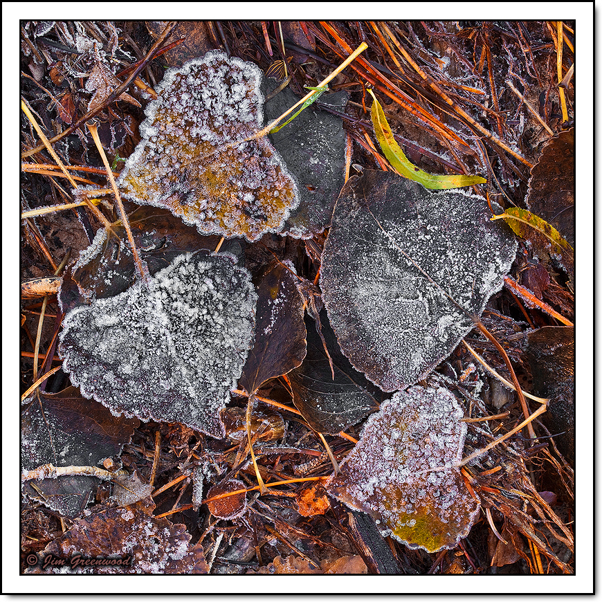
- Do the brighter oranges and yellows seem too intense/saturated? I remember it this way in my mind's eye because the surfaces that weren't still frosted were very damp with recently melted frost (or with moisture which hadn't froze), and those brighter colors looked so vibrant intermingled among the darker colors and the white frost.
- Does the composition seem too chaotic? I cropped a slight amount from the top and about 30% from the bottom of the original vertical full-frame image to achieve this square format, in order to eliminate more chaotic and less appealing elements, and to make the four large frosted leaves the primary element of the composition.
Canon 5D II
Canon 100mm f/2.8L Macro IS
100mm, f/20, 1.6 seconds, ISO 50

Comments
10 commentsAs for the comp, I like it. The four leaves are nicely shaped and arranged, the frost is great, and the entire comp is well balanced. I don't think it's too busy or cluttered, but toning down the stems will help in that regard anyway. You could clone out the small protruding stick in the llc if you were so inclined. I like leafscapes with frost, and I find this image very attractive.
I love these intimate leafscapes, and this is a great one. Not even close to being too chaotic; in fact it's rather organized with the 4 main leaves keeping order here. There is lot's of small detail, but that is countered by the frosty leaves. Works beautifully for me.
I would say from this web presentation that the orange/reds ar a bit heavy and saturated, especially the stems in the UR area, and that little orange leaf at the bottom - a bit of an eye magnet, If it were mine I would pull back on the saturation. The frosted leaves are the story.
Lon
The composition is wonderfully seen and captured in this fine image. All the elements work in cohesion to make a very interesting scene. I for one like the saturation levels in this image. The vibrant colors help to separate all the fascinating elements.
Wonderful work
Albert Darmo
Canada