Gallery: LandscapePosted November 22, 2015268 views11 comments
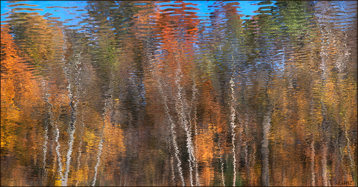
Thank you for your comments on Autumn Impressions. This one, also flipped 180 vertically, is a little more abstract, as it includes ripples in the "sky." Comments again appreciated, including which version is preferred.
Comments
11 comments
Comment posted by gary phillips on November 22, 2015 at 10:53 PM
I got a postcard from a guy in Atlantis and the fall there looked just like this. As much as I like this, I think I like first image because I find the detail where the blue sky meets the tree line fascinating. Both are very nice.
Registered on October 24, 2013, 185 Posts, 4136 Comments
Comment posted by Harley Goldman on November 23, 2015 at 9:55 AM
Another nice one, Scott. I prefer the first, as it has fewer ripples and I find it closer to an Impressionist look at a scene. An enjoyable series.
Registered on November 19, 2003, 586 Posts, 11271 Comments
Comment posted by Jim Jirka on November 23, 2015 at 10:03 AM
I tend to like this one better. It conveys the impressionism more in my opinion. With the ripples that are more well defined creates a more visual feast.
Jim
Registered on November 1, 2003, 254 Posts, 1620 Comments
Comment posted by Albert Darmo on November 23, 2015 at 10:21 AM
Hi Scott At first glance , the two posts look quite similar. but the more vibrant color and more intense ripples of the last post seperates the two. i prefer the more tranquil mood of the first post. both are beautifully presented
Albert Darmo
Canada
Registered on November 25, 2008, 1386 Posts, 11978 Comments
Comment posted by Roel Wijtmans on November 23, 2015 at 11:04 AM
I liked the more even and impressionistic nature of the other one, but I must say I really enjoy the vertical gradient in the patterns in this one as well. Especially where the blue sky is included you have captured some sweet patterns!
Registered on September 30, 2012, 116 Posts, 2257 Comments
Comment posted by Richard Teller on November 23, 2015 at 1:09 PM
Very nice abstract image. The colors and lines work ver well to create a image that is abstract yet recognizable.
Registered on August 23, 2010, 1162 Posts, 6692 Comments
Comment posted by Lon Overacker on November 23, 2015 at 2:07 PM
Scott,
This one is beautiful as well and just as impressionistic, imho. I prefer the first, and here's why. You did a great job with the sky in the previous version; color, brightness, etc. all relative to making the flip work very well. Here, at least for me, I'm not sure t here is enough sky for the same impact as before. But also, the color/saturation is too strong for me. Interesting effect on the color too; the blues up top have slightly different hues in different places, and I'm guessing because the color is influenced by additive color from the surround leaf colors? Not a big deal overall, but just that the blue in this one doesn't work as well. Having said that, I really like the ripples fading from big to small, or small to big... ;-)
Lon
Registered on November 24, 2006, 521 Posts, 19147 Comments
Comment posted by Preston Birdwell on November 23, 2015 at 7:18 PM
I like this one, too, Scott. It's certainly more abstract. I do agree with Lon's observation about the hue/sat in the blues: It looks too strong relative to that of the warmer colors.
Nice series yu've got going.
--P
Registered on November 1, 2003, 471 Posts, 5188 Comments
Comment posted by Mark Metternich on November 23, 2015 at 8:30 PM
Always love shots like this. Nice job.
Registered on June 19, 2009, 276 Posts, 6240 Comments
Comment posted by Mark Seaver on November 24, 2015 at 11:26 PM
Both are excellent reflection images, Scott. The cropping of the sky and the extra ripples makes for a very different image. After considerable back and forth, I like this version better because of the extra warmth and color as well as the extra sense of abstraction that the rippled water surface adds here. Sure does look like a fun outing.
Registered on January 23, 2011, 1103 Posts, 17270 Comments
Comment posted by Bill Fach on December 6, 2015 at 5:07 PM
Scott: You certainly got a bunch of keepers from this session. This works for me with the inversion as it meets our expectations of how things should look. Many kudos. >=))>
Registered on November 1, 2003, 1805 Posts, 26981 Comments


Comments
11 commentsJim
Albert Darmo
Canada
This one is beautiful as well and just as impressionistic, imho. I prefer the first, and here's why. You did a great job with the sky in the previous version; color, brightness, etc. all relative to making the flip work very well. Here, at least for me, I'm not sure t here is enough sky for the same impact as before. But also, the color/saturation is too strong for me. Interesting effect on the color too; the blues up top have slightly different hues in different places, and I'm guessing because the color is influenced by additive color from the surround leaf colors? Not a big deal overall, but just that the blue in this one doesn't work as well. Having said that, I really like the ripples fading from big to small, or small to big... ;-)
Lon
Nice series yu've got going.
--P