Gallery: WildlifePosted October 19, 201581 views4 comments
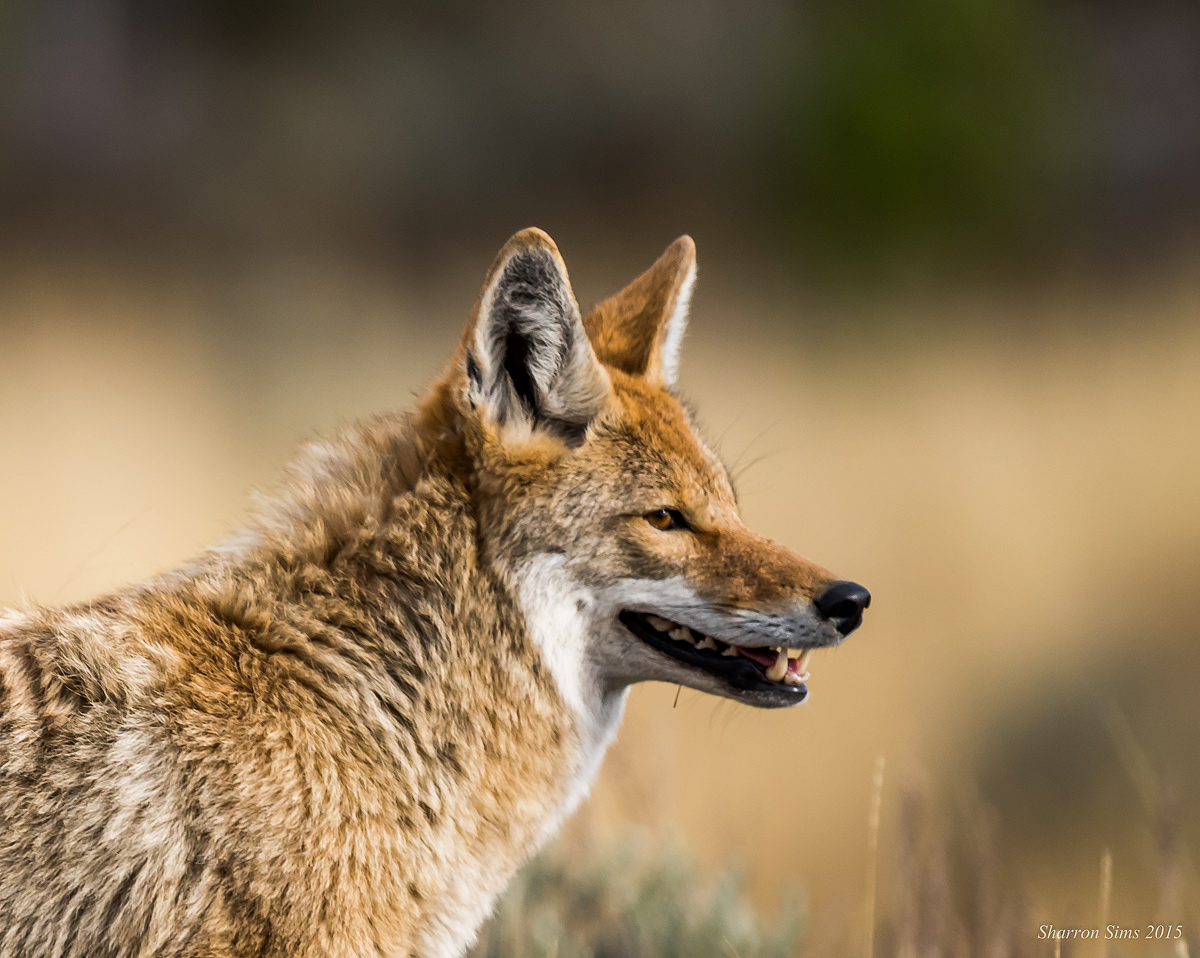
Another look at the coyote I saw in Yellowstone with his head turned slightly toward me. I thought his teeth were amazing.
D810, 500mm f/4. 1/1250, f/4, ISO 360
Comments
4 comments
Comment posted by John Tobias on October 19, 2015 at 10:34 PM
Very nice portrait of this coyote. I like the color and detail you have in this image as well as the position of the coyotes head. Thanks for sharing.
Registered on September 12, 2009, 2120 Posts, 6455 Comments
Comment posted by Gary Minish on October 21, 2015 at 2:51 AM
Very nice coyote capture, Sharron! It definitely has an impressive set of teeth!
Registered on February 4, 2006, 625 Posts, 3583 Comments
Comment posted by Lon Sharp on October 23, 2015 at 3:29 PM
Yes the teeth are eye catching! I like the angle of his gaze, separating the ears and giving a good look at the eye. You also achieved a nice low (his eye level) perspective, which is an important feature in not minimizing the subject. Careful inspection of the larger edition shows that the most crisp focus is on the top of his shouilder, with the face a little soft. This makes me wonder where the original focal point is located. Perhaps you were able to make a large crop from the big 810 file, but depth of field was shallow and you were more centered on his body?
Registered on December 9, 2007, 258 Posts, 9892 Comments
Comment posted by Brad Hill on October 25, 2015 at 8:49 AM
Hi Sharron,
The pose, subject separation from background, lighting, and subject pose and "demeanor" are all excellent here. I do tend to agree with Lon re: the issue of softness in the head of the subject. To my eye the presentation of the image feels a bit off in that there seems to be excessive space ABOVE the coyote. If this were mine I'd probably take it back to a 3:2 aspect ratio (mostly via removing space from the top).
Thanks for sharing this...
Brad
Registered on May 29, 2007, 431 Posts, 6061 Comments

Comments
4 commentsThe pose, subject separation from background, lighting, and subject pose and "demeanor" are all excellent here. I do tend to agree with Lon re: the issue of softness in the head of the subject. To my eye the presentation of the image feels a bit off in that there seems to be excessive space ABOVE the coyote. If this were mine I'd probably take it back to a 3:2 aspect ratio (mostly via removing space from the top).
Thanks for sharing this...
Brad