Nature Photographers Network
This is the preserved archive of the original Nature Photographers Network. The community continues at naturephotographers.network.
Bakken's Pond + rp.
‹ PreviousLandscape GalleryNext ›

Bakken's Pond + rp.

by Nick Bristol

Gallery: LandscapePosted March 20, 2015258 views16 comments
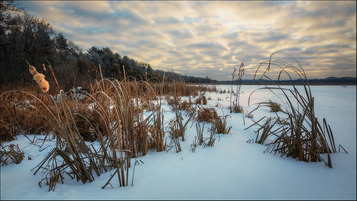
This is a picture I made this past January on a cold (20 below zero) morning. I headed out to Bakken's Pond for the sunrise and even though it was very cold the quiet and peaceful feel was wonderful. After looking around for a composition I liked I settled in on this one and made a few shots. After processing this I was thinking I posted it here but I guess I never got around to it then. Larger version included for best look and thanks for any thoughts you may have.
5D3, 24-105L @24mm, ISO 400, F/16 at 1/160 sec. 2 or 3 stop GND used but I don't remember which one.

Comments

16 comments
Comment posted by gary phillips on March 20, 2015 at 12:52 PM
Really nice, Nick. I like the quilted sky and the low perspective. The reeds have a wonderful soft glow as does the suface of the snow. You portrayed the calm feeling very well.
Registered on October 24, 2013, 185 Posts, 4136 Comments
Comment posted by Bill Reid on March 20, 2015 at 2:19 PM
A very nice feel to this scene and wonderful details throughout Nick. I find the foreground relly nice with your low POV. A very nicely done scene.
Registered on January 27, 2013, 65 Posts, 2460 Comments
Comment posted by Dietrich Gloger on March 20, 2015 at 2:29 PM
I like the scenery. Looks like what could be found in austria too. The low camera angle renders the reeds in the fg a quite effective subject.
Registered on January 26, 2007, 360 Posts, 9876 Comments
Comment posted by Mark Seawell on March 20, 2015 at 3:53 PM
Love the composition and the beautiful pastel colors. Gorgeous capture!

Mark
Registered on December 5, 2011, 197 Posts, 237 Comments
Comment posted by Alberto Patiño on March 20, 2015 at 4:26 PM
Beautiful depth, given by both the clouds and the reeds. It also has just the right amount of color :smile:
Registered on December 2, 2014, 278 Posts, 1736 Comments
Comment posted by Harley Goldman on March 20, 2015 at 4:37 PM
Real nice understated image. It has a fine "being there" feel to it. It is personal taste, but I would be inclined to pull the cyan out of the snow.
Registered on November 19, 2003, 586 Posts, 11271 Comments
Comment posted by Tony Kuyper on March 20, 2015 at 11:30 PM
As usual, nothing to recommend. The low perspective does a great job of adding interest to the composition.
Registered on November 1, 2003, 364 Posts, 22328 Comments
Comment posted by Bill Chambers on March 21, 2015 at 12:32 AM
Minus 20, huh? A little chilly for my blood!! The low perspective is excellent as is the overall composition. Wonderful clouds and I really like the browns in the cattails. IMHO, the snow is a bit too colorful, I might reduce that somewhat, but still a great image.
Registered on April 10, 2005, 753 Posts, 21216 Comments
Comment posted by Paul Breitkreuz on March 21, 2015 at 9:08 AM
Nick, this one that requires seeing the larger version. The thumbnail did not get my attention, but the larger version really does come across very impressive. Nice work with the grads too. Nice to see some old school field work over blending to cure the exposure shortcomings. As it is the exposure is perfect without any grad line either.

I do think I might be tempted to remove the blue in the snow a bit, but that is just a minor preference thing and can go either way IMO. :cool:
Registered on February 25, 2006, 525 Posts, 8448 Comments
Comment posted by Nick Bristol on March 21, 2015 at 10:23 AM
Thanks much to all of you for your comments! I did a version here with less cyan cast in the snow. I though it was close to what I was seeing but it probably was a little to much cyan. I didn't want to get rid of all of it but think this version is probably even closer to what I was seeing while there. Thanks for the suggestions! Cheers, Nick
Registered on February 1, 2004, 752 Posts, 14140 Comments
Comment posted by Paul Breitkreuz on March 21, 2015 at 11:22 AM
:toast: Nick, the re-post looks better to me. However, we know the blue or cyan is there in many shots like this. It's not wrong, it's just a preference thing in the end. To me, in my own shots many times, I find the "cast" of any color where the image leans toward a certain hue can kill off the other more subtle colors. Hence, it can take another set of eyes or playing with it to get a better final look overall.
Registered on February 25, 2006, 525 Posts, 8448 Comments
Comment posted by Igor Doncov on March 21, 2015 at 10:22 PM
I agree, the cyan in the repost looks better than the original. More natural.
Registered on November 22, 2014, 189 Posts, 2733 Comments
Comment posted by R.Bill Moser on March 22, 2015 at 3:01 PM
Nick this is a wonderful image. Beautiful light and the sky is just fantastic. I also love your comp a lot. Personally I'd prefer the original post. Great job as always :toast:
Registered on January 29, 2010, 285 Posts, 4281 Comments
Comment posted by John Williams on March 22, 2015 at 9:14 PM
Cattails and winter makes for an interesting mix.I like the angle you took on this; the grass makes a strong foreground.
Registered on September 6, 2007, 221 Posts, 5985 Comments
Comment posted by Mark Seaver on March 24, 2015 at 9:53 AM
Nick, guess I was missing in action. I'm glad I went back and found this. It's a lovely intimate winter scene. I especially like the light catching that cattail head and the long mottled sky. Without seeing a larger version, I can't say if the reduced cyan is better or not...both look very good to me.
Registered on January 23, 2011, 1103 Posts, 17270 Comments
Comment posted by Nick Bristol on March 25, 2015 at 1:56 PM
Thanks much to all of you for the comments and suggestions on this. Cheers, Nick
Registered on February 1, 2004, 752 Posts, 14140 Comments