Nature Photographers Network
This is the preserved archive of the original Nature Photographers Network. The community continues at naturephotographers.network.
Hot & Cold
‹ PreviousLandscape GalleryNext ›

Hot & Cold

by Bill Fach

Gallery: LandscapePosted February 7, 2015280 views10 comments
Sony A77
Sony 70-400G @ 280mm, CPL
ISO 200, 1/400 @ f5.6
Great Sand Dunes NP

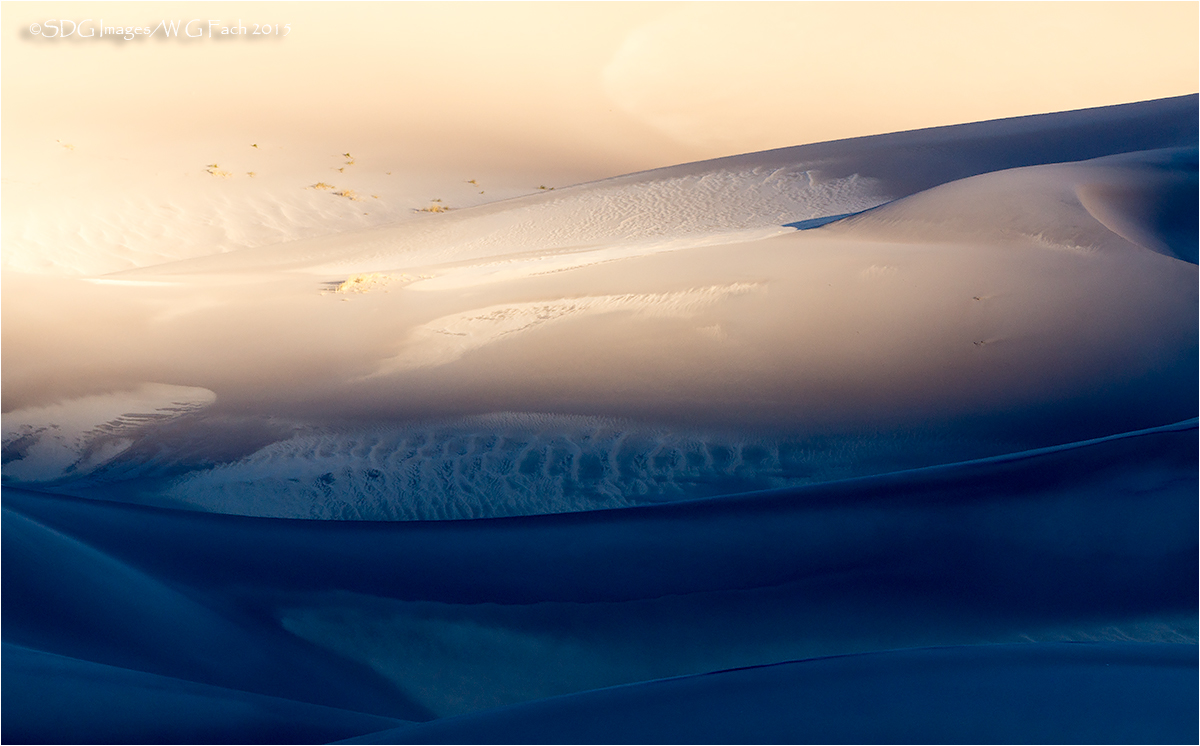
Revisiting some of my GSDNP shots from November and recall how I was attracted to the extreme color temperature difference between the early sunlit dunes and those in the shadows. Also playing with a conversion but not quite ready to post it. All comments welcome.>=))>

Comments

10 comments
Comment posted by Ian Cameron on February 7, 2015 at 1:32 PM
Lovely Bill perhaps the blue is a little rich but it is very enjoyable
Registered on August 6, 2004, 1125 Posts, 3318 Comments
Comment posted by Louis Pattis on February 7, 2015 at 5:47 PM
I feel the cold, but I am also lost in the whole spectrum of the picture, cropped from the right about down the middle makes this take sing, or crop the top third panorama style, I love the white pattern in the sand, looks like sea turtle skin.
Registered on March 30, 2012, 0 Posts, 164 Comments
Comment posted by Eva McDermott on February 7, 2015 at 6:15 PM
Stellar light here Bill. I like the mix of warm and cool tones as well as the abstract qualities.
Registered on January 4, 2009, 1015 Posts, 13229 Comments
Comment posted by Alberto Patiño on February 7, 2015 at 6:37 PM
Gorgeous light!!! No complaints! :toast:
Registered on December 2, 2014, 278 Posts, 1736 Comments
Comment posted by Chris Chamberlain on February 8, 2015 at 11:46 AM
Very nice color and light contrasts here!

Chris
Registered on March 13, 2007, 500 Posts, 8365 Comments
Comment posted by Ryan Shain on February 8, 2015 at 1:57 PM
A very nice sand dune image because of the contrast in warm vs blue tones to create a beautiful image to enjoy. I like how the layers progress from such a rich shadow and blue, to a lighter shadow, to beautiful warm light.

Good work on this one Bill
Registered on February 20, 2007, 226 Posts, 4571 Comments
Comment posted by Preston Birdwell on February 8, 2015 at 3:01 PM
Nice abstract look to this, Bill. I do think the blues are tad too strong. Also, the bright area on the left draws my eye. I do like progression from cool to warm.

--P
Registered on November 1, 2003, 471 Posts, 5188 Comments
Comment posted by Nick Bristol on February 8, 2015 at 3:04 PM
Bill, This is really an interesting image to look at and I like it very much. The cool to warm tones are very eye catching and I'm enjoying the feel this has. I like the lines, shapes and wonderful textures as well. The blue is probably a little strong but I do enjoy the effect it has. Nice work!

Nick Bristol
Lone Rock, WI
Registered on February 1, 2004, 752 Posts, 14140 Comments
Comment posted by John Launstein on February 8, 2015 at 6:38 PM
Extraordinary image, Bill. Love the tones, textures, highlights and shadows...pretty much the whole darn thing. Looking forward to seeing your conversion, but the colour palette here is awfully attractive.
Registered on April 5, 2011, 223 Posts, 1193 Comments
Comment posted by Sandro Bisotti on February 11, 2015 at 5:51 PM
Fantastic image for my tastes! I like much this "on-the-edge" demi-abstract, but where we can find the natural shape and origin.
Great chromatic effect, well thought and managed, and masterful composition.
All the best,
sandro
Registered on February 8, 2015, 30 Posts, 265 Comments