Nature Photographers Network
This is the preserved archive of the original Nature Photographers Network. The community continues at naturephotographers.network.
The Whole Shooting Match
‹ PreviousLandscape GalleryNext ›

The Whole Shooting Match

by Wayne Jones

Gallery: LandscapePosted November 18, 2014188 views11 comments
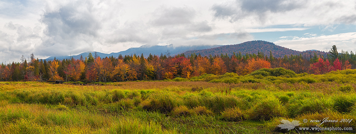
The title phrase was not coined by people thinking of a photo shoot, but it still fits here. I was not looking for a long panorama when I shot this, but I just could not bring myself to crop it. As a result, I included the whole, broad scene that stretched before me. After a long dry spell, the stream that made nice leading lines and reflections was dry. As I walked around the dry flood plain, every composition hid the mountains behind the nearby forest. My only option was to balance on top of the tallest grass hummock I could find, making my tripod useless. As a result, this panorama is made from two hand-held horizontal images.

Canon 5D Mark III; Canon 24-105mm.; Circ. Pol.
1/160 sec. @ f/7.1; ISO 160
Two hand-held horizontal images stitched in PS CC

Please see the larger version. A 720 pixel panorama is a postage stamp.

CROPPING? The best more compact view I could find is in my comment below. Which version do you think is better? THANKS

Comments

11 comments
Comment posted by Wayne Jones on November 18, 2014 at 3:15 PM
Here's the best cropped version I could find. It's a 16x9 format. There is more sky in a 2x3 version, but that seemed too centered up and down, and I thought I needed to concentrate on either the sky or the foreground grasses, but not both. I still like long panorama more. What do you think?
Registered on April 18, 2007, 953 Posts, 6435 Comments
Comment posted by Preston Birdwell on November 18, 2014 at 5:15 PM
I like both, Wayne, but prefer the cropped image because the somewhat distracting very bright areas of the sky in the pano aren't there. I like the pano because of the expansive view, so I think if you could tame the sky, it would really sing.

--P
Registered on November 1, 2003, 471 Posts, 5188 Comments
Comment posted by Nancy Lea Sandy on November 18, 2014 at 5:36 PM
I like the pano best, Wayne. The multiple layers of color make this an eye-catching image for sure.
Registered on January 24, 2011, 576 Posts, 6942 Comments
Comment posted by Wayne Jones on November 18, 2014 at 6:06 PM
Thanks Preston -- Just what I needed! (What would I ever do without NPN?)

Is this enough to fix the sky? (I have seen so many overdone grads that I shy away from darkening the sky. Guess I just need to do it in moderation. I used a gradient mask so this effects mostly the top half of the sky, staying clear of the mountains.)
Registered on April 18, 2007, 953 Posts, 6435 Comments
Comment posted by Nick Bristol on November 18, 2014 at 6:13 PM
Wayne, The repost works very nice for me. A wonderful scene with beautiful color and I really like the panoramic view. Very nice!

Nick Bristol
Lone Rock, WI
Registered on February 1, 2004, 752 Posts, 14140 Comments
Comment posted by scott lanz on November 18, 2014 at 10:39 PM
Wayne, my thoughts were the same as Preston's. I like the original image very much except for the bright areas of the sky. I think the repost is an improvement but it's hard to say at this size.
Registered on November 14, 2003, 840 Posts, 12902 Comments
Comment posted by Peter Cross on November 19, 2014 at 1:12 AM
I like the pano the best. Hands down. I don't care about the bright sky, the view is really something else. The colors are wonderful and the scene isn't spectacular like some areas of our country, but the total scene is a joy. Well done. :toast:
Registered on April 3, 2010, 271 Posts, 1342 Comments
Comment posted by David Chauvin on November 19, 2014 at 8:44 AM
This has the look of those Cibachrome prints we used to get back in the day. I think Preston's comment on taming the sky in the first version would be my suggestion also.
Registered on August 5, 2004, 1007 Posts, 5595 Comments
Comment posted by Ryan Shain on November 19, 2014 at 9:57 AM
Wayne,

The large Pano view works very well for myself. This capture displays a beautiful fullness of the region you gave us through photography, and I really feel Autumn in this capture.

The sky is looking better in the re-post Wayne,and this is such a sweet view, great vision.

Maybe a slight crop in pano could work as well too. Just enough in the sky to get below the dark cloud on the right? I kind of like the whites in the clouds in the original. They look a bit more grey in the re-post.
Have you tried using TK's masks for this image?


I am being awfully nit picky on this one Wayne, just so you know.


Registered on February 20, 2007, 226 Posts, 4571 Comments
Comment posted by D.A. Edwards on November 19, 2014 at 1:20 PM
I really have no problem with the clouds in the original posting other than the white one just above the horizon if I was real nit picky. I wouldn't change the overall brightness of the entire sky just to deal with that. Beautiful image, Wayne.
Registered on October 8, 2014, 226 Posts, 1187 Comments
Comment posted by John Tobias on November 20, 2014 at 12:25 PM
Like the second repost best, but to be honest, I like the post in Man and Nature best between the two images. Thanks for sharing these images.
Registered on September 12, 2009, 2120 Posts, 6455 Comments