Nature Photographers Network
This is the preserved archive of the original Nature Photographers Network. The community continues at naturephotographers.network.
Dayspring (+)
‹ PreviousLandscape GalleryNext ›

Dayspring (+)

by Jared Warren

Gallery: LandscapePosted August 31, 2014447 views20 comments
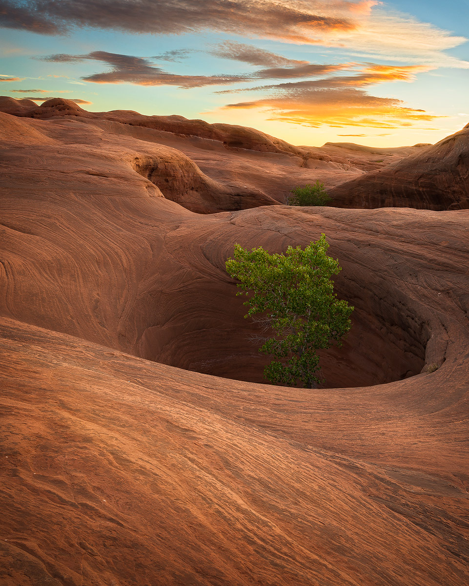
I was fortunate to get some nice light and clouds on this morning from a couple weeks ago. Three other sunsets or sunrises teased me but didn't deliver :frown: , but this area of undulating sandstone on the Colorado Plateau is fascinating to explore with or without the golden light.

For this image I blended two exposures (f/13) for the fore- and mid-ground, and another for the sky. I used a few different contrast adjustments using TK luminosity masks, selective dodging/burning, and other minor refinements. Your thoughts? Nit picking encouraged!

Comments

20 comments
Comment posted by Dan Kearl on August 31, 2014 at 3:39 AM
I love the rock and tree and the DOF and 3d look to the bottom 2/3 of the image.
The sky is a bit too stylized for me, the clouds need a softer to them.
Excellent PP on the rock, a lot of texture and nuance.
Registered on September 2, 2013, 209 Posts, 1514 Comments
Comment posted by Patricia Brundage on August 31, 2014 at 7:46 AM
Excellent subject, composition and detail. Even though the sloping horizon is probably accurate, I would be tempted to put a counter clockwise rotation on the horizon line or eliminate the sky.
Registered on March 23, 2006, 1111 Posts, 6531 Comments
Comment posted by scott lanz on August 31, 2014 at 9:22 AM
Outstanding, Jared. I love the way the clouds match the sandstone in color and texture. :toast:
Registered on November 14, 2003, 840 Posts, 12902 Comments
Comment posted by Pat Sampson on August 31, 2014 at 10:07 AM
Nothing for me to nitpick in this Jared. I like the composition a lot and the post processing is perfect for my tastes. Gorgeous image.

pat
Registered on May 19, 2007, 953 Posts, 15989 Comments
Comment posted by gary phillips on August 31, 2014 at 12:54 PM
Another excellent take on the Colorado Plateau, Jared. I can't wait to explore that country. I like the way you handled the slick rock and cottonwoods and the sky. Processing looks right on to me. Really nice work. :wavey:
Registered on October 24, 2013, 185 Posts, 4136 Comments
Comment posted by Ben Horne on August 31, 2014 at 2:37 PM
Looks great to me. I really like how some of the clouds mimic the shapes of the foreground sandstone.
Registered on August 27, 2009, 51 Posts, 959 Comments
Comment posted by Daniel & Loana on August 31, 2014 at 3:43 PM
Great shot, Jared. I like the composition and the light a lot.

Congrats.
D&L
Registered on October 7, 2008, 166 Posts, 3044 Comments
Comment posted by Thomas Haney on August 31, 2014 at 4:04 PM
Beautiful shot Jarred. I'm torn about the comp because although the texture in the foreground rock is one of my favorite aspects of the image, it feels like there's too much empty space at the bottom and the hole and tree and centered. Anyhow, definitely a beautiful shot.
Registered on April 7, 2013, 138 Posts, 537 Comments
Comment posted by Ed Williams on August 31, 2014 at 6:27 PM
Love the curves in the rock offset by the peaking tree Jared. I would almost rather there was no sky since the light is a bit overpowering and bright. The colors and the details of the rock are really rich.
Registered on December 28, 2010, 636 Posts, 3499 Comments
Comment posted by Preston Birdwell on August 31, 2014 at 7:27 PM
Jared, I think this works just fine as-is. You did a great job with this one!

--P
Registered on November 1, 2003, 471 Posts, 5188 Comments
Comment posted by Bill Reid on September 1, 2014 at 8:32 AM
Great shot Jared with beautiful tones and textures in the fore ground. Also nice to see a different take on this scene. I like it with the sky with the matching colors in the clouds. Only nit is the clouds appear a bit too sharp but that's minor. Great job. :toast:
Registered on January 27, 2013, 65 Posts, 2460 Comments
Comment posted by Catherine Reilly on September 1, 2014 at 5:51 PM
I can tell you that my jaw dropped when this image popped up. So, what's to nit? I love it! Mysterious, exotic and profound. How can tree survive and grow in a place like that! Phenomenal.
Registered on August 16, 2006, 603 Posts, 9192 Comments
Comment posted by Navin Sarma on September 2, 2014 at 3:53 PM
Really nice sharpness and texture throughout. Colors looks very naturally saturated. I like the sky as-is, but as a nit would consider a crop right above the low cloud formation. I would also play with some highlight/color recovery in the brightest part of the horizon to see what I could pull out
Registered on July 17, 2011, 233 Posts, 1373 Comments
Comment posted by Harley Goldman on September 2, 2014 at 5:53 PM
Beautiful image. No nits from me.
Registered on November 19, 2003, 586 Posts, 11271 Comments
Comment posted by Tony Prower on September 3, 2014 at 10:47 AM
Nice observations! Great lines and proportions in this.
Registered on February 5, 2012, 24 Posts, 167 Comments
Comment posted by Jared Warren on September 3, 2014 at 5:39 PM
Thanks for the helpful comments and feedback. Just playing around with a couple things for this repost: Mainly, I cropped to see if excluding the top layer of clouds might be an improvement (keeping the same 8x10 ratio). Better or worse?

I also brought down the cyan a little in the sky and backed off some of the sharpening in the clouds. Probably hard to tell a difference at this size. Thanks for any further thoughts on this. :wavey:
Registered on May 11, 2012, 84 Posts, 931 Comments
Comment posted by Navin Sarma on September 3, 2014 at 10:45 PM
definitely prefer the crop Jared! can't see much cyan difference but the colors look very nice!
Registered on July 17, 2011, 233 Posts, 1373 Comments
Comment posted by Bill Chambers on September 4, 2014 at 1:51 PM
Beautiful Jared. The PP looks good to me overall with the possible exception of the tree looking slightly oversharpened.
Registered on April 10, 2005, 753 Posts, 21216 Comments
Comment posted by Bill Chambers on September 6, 2014 at 5:15 PM
I like the original version best showing more clouds. Love the texture in the rocks.
Registered on April 10, 2005, 753 Posts, 21216 Comments
Comment posted by Nick Bristol on September 7, 2014 at 6:57 PM
Jared, This is really nice! Love the shapes, swirls and wonderful textures. I like your comp in the original with more of the clouds showing. Very nice light and color in this as well. Has a nice natural look to me. Nice work! :toast:

Nick Bristol
Lone Rock, WI
Registered on February 1, 2004, 752 Posts, 14140 Comments