Nature Photographers Network
This is the preserved archive of the original Nature Photographers Network. The community continues at naturephotographers.network.
Weathered Juniper + RP
‹ PreviousLandscape GalleryNext ›

Weathered Juniper + RP

by Preston Birdwell

Gallery: LandscapePosted August 17, 2014192 views16 comments
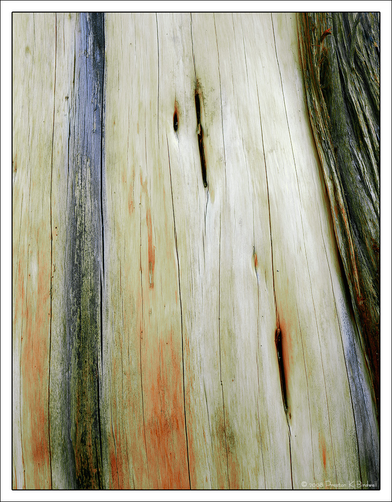
This is a very old and weathered Western Juniper I found near our campsite in the Sonora Pass country of the Sierra. The exposed wood was extremely smooth; polished by the winds of many winters.

I went back a few years later to see if I could find a different composition, but someone had cut this section of wood from the tree. To say I was upset by this is a gross understatement, as it was so beautiful.

I did do a bit of further tweaking to this, and so would appreciate your thoughts.

Tachihara 4x5
180 Fujinon
Astia 100F

Please see the large version. Thanks!

--P

Comments

16 comments
Comment posted by Nick Bristol on August 17, 2014 at 6:34 PM
Preston, This is wonderful! I like everything about it. The large version is fantastic with such nice light, color and texture. The smooth feel of the exposed wood is almost like finished boards. Excellent work with this! :toast:
What a shame someone had to ruin this for you and others.

Nick Bristol
Lone Rock, WI
Registered on February 1, 2004, 752 Posts, 14140 Comments
Comment posted by Bob Miller on August 17, 2014 at 7:00 PM
Sad story. Glad you got the image while you could. Well presented.
Registered on January 24, 2005, 152 Posts, 405 Comments
Comment posted by Harley Goldman on August 17, 2014 at 7:13 PM
Nice hunk of dead wood. Sweet colors. I might be tempted to warm it up and and even pull out some blue and cyan to get a more neutral gray. Very personal preference though.

The old Tachihara. This one does go back a few years.
Registered on November 19, 2003, 586 Posts, 11271 Comments
Comment posted by Ed Lowe on August 17, 2014 at 8:26 PM
This is a beautiful understated image, Preston. I really like the lines along with the fantastic color palette. I do not blame you for being upset, unfortunately there are plenty of dumb asses in the world.

Ed
Registered on February 7, 2004, 414 Posts, 7115 Comments
Comment posted by Paul Breitkreuz on August 17, 2014 at 8:27 PM
Gorgeous piece of wood here, Preston. Looks like you had some nice light hitting it also. You might try this a bit warmer, but it does have a nice appeal just as it is. Very nice work...... :cool:

Too bad about the destruction, lots of abusers and takers roaming the land anymore. :frown:
Registered on February 25, 2006, 525 Posts, 8448 Comments
Comment posted by Pat Sampson on August 17, 2014 at 10:14 PM
Very painterly Preston. I like the cool colors and probably wouldn't warm it. One of your best IMO.

pat
Registered on May 19, 2007, 953 Posts, 15989 Comments
Comment posted by Richard Teller on August 17, 2014 at 10:32 PM
Nice texture and colors. Also good detail and sharpness.
Registered on August 23, 2010, 1162 Posts, 6692 Comments
Comment posted by Preston Birdwell on August 17, 2014 at 10:44 PM
Thanks for your comments, everyone.

Here's a slightly warmer version with blues and cyans dropped some. I also dropped some yellow from the bark on the right.

It's fun to experiment based upon the great suggestions I receive here.

--P
Registered on November 1, 2003, 471 Posts, 5188 Comments
Comment posted by Pat Sampson on August 17, 2014 at 11:36 PM
I like the repost also Preston but still prefer the first. Both are very nice though.

pat
Registered on May 19, 2007, 953 Posts, 15989 Comments
Comment posted by Ronald Murphy on August 18, 2014 at 8:45 AM
Excellent image to enjoy. I prefer the color of the first, but only you can tell us which better represents what you saw.
Registered on March 13, 2012, 279 Posts, 975 Comments
Comment posted by John&Patty Benway on August 18, 2014 at 10:29 AM
Tough call Preston, I would be happy with either one. love the color platter, almost looks like finished wood, yup ,definitely a beauty in my opinion. Beautifully seen and presented.
John
Registered on May 12, 2006, 626 Posts, 8700 Comments
Comment posted by Paul Breitkreuz on August 18, 2014 at 10:54 AM
Preston, the second warmer one works better IMO. I like both, but now seeing them together I see a bit of an olive look in the upper portion of the tree on the first post. Not a bad thing, just prefer the much more white look to the second in that area.
Registered on February 25, 2006, 525 Posts, 8448 Comments
Comment posted by Mark Seaver on August 18, 2014 at 3:41 PM
I love the flow in the bare wood from the colors and the cracks, Preston. I find myself wishing that the rough bark in the upper right weren't there, but cropping it out creates as many problems as it solves. Definitely a shame that somebody cut this up.
Registered on January 23, 2011, 1103 Posts, 17270 Comments
Comment posted by Dan Kearl on August 18, 2014 at 7:50 PM
You have such an eye for these, it is tough to critique.
I would have maybe liked to see a bit more of the dark bark on the right included in the comp.
Nice PP and natural color...
Registered on September 2, 2013, 209 Posts, 1514 Comments
Comment posted by Harley Goldman on August 19, 2014 at 11:41 AM
I like the blue/cyan taken out of the gray tones, but I might back off the warming just a touch. But it is such a matter of personal preference you can't go wrong with any version.
Registered on November 19, 2003, 586 Posts, 11271 Comments
Comment posted by Bill Chambers on August 20, 2014 at 2:26 PM
Beautiful Preston! I do like the repost a bit better than the original but both look great. The streaks of red at the bottom are great.
Registered on April 10, 2005, 753 Posts, 21216 Comments