Nature Photographers Network
This is the preserved archive of the original Nature Photographers Network. The community continues at naturephotographers.network.
Gloomy Sedona
‹ PreviousLandscape GalleryNext ›

Gloomy Sedona

by Jake Case

Gallery: LandscapePosted May 21, 2014319 views8 comments
Hi everyone,

I just renewed my membership within the last week, I haven't been an active member for over two years. I've been receiving critiques here and there on other sites, but decided that it would be valuable to reconnect here with all the brilliant photographers on NPN!

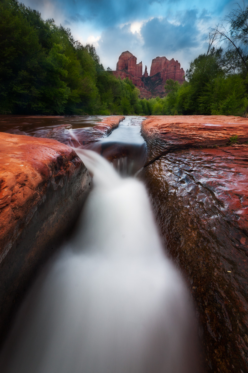
This photograph I took at the obviously iconic location of Red Rock Crossing in Sedona. It was a cloudy afternoon and the sun never made an appearance. There were some other landscape photographers on a private tour that seemed very disappointed with the lack of direct sunlight, but it was still nice light, and I felt that it would actually make for a somewhat unique image of extremely popular place. I hand-blended 3 exposures in Photoshop after doing the RAW conversions in Lightroom, and then did some standard contrast adjustments and color balance tweaks. Because of the intense contrast between the sky and the trees, the exposure blend was a bit rough, but I added a Glow/Orton effect which I think smoothed that out a bit. This is probably the best creek shot I've ever gotten a Red Rock Crossing, but I'd love to have critiques and other comments. Thanks all!

Canon T1i, Sigma 10-20mm @ 10mm
ISO100
f/16
5 seconds, 2 seconds, a 1 second exposures
polarizing filter

Comments

8 comments
Comment posted by Paul Breitkreuz on May 21, 2014 at 7:44 AM
best creek shot I've ever gotten a Red Rock Crossing.


Jake, as your comment also reflects a somewhat return to NPN, so welcome back.
I've only been to this location at Red Rock once over my years as a photog and don't recall this exact spot you've shot from, or even recall seeing other photos from this exact spot out there. So, with that said I'm enjoying a different perspective from this site. I do like the composition, but as always trying to view the larger vertical on line with scrolling up and down is never as nice as seeing a full size print.

I do like the lower take from this POV and again a fresh look for me anyway. With the neat stormy sky in the BG I might drop that cyan saturation somewhat, but that's minor adjustment and always personal taste in the end...... :cool:
Registered on February 25, 2006, 525 Posts, 8448 Comments
Comment posted by Ronald Murphy on May 21, 2014 at 8:28 AM
Very engaging perspective. I prefer a bit more detail in the water, though.
Registered on March 13, 2012, 279 Posts, 975 Comments
Comment posted by Pat Sampson on May 21, 2014 at 11:14 AM
Beautiful water and a strong composition. For my tastes I might drop the saturation just a touch but I'm not working with a calibrated screen and when printed this may be perfect. It should be printer IMHO - gorgeous.

pat
Registered on May 19, 2007, 953 Posts, 15989 Comments
Comment posted by R.Bill Moser on May 21, 2014 at 1:01 PM
I love the composition and the perspective. Beautiful image but personaly I would love to see more details in the water.....I'm not a big fan of milky looking water...but a good image as is
Registered on January 29, 2010, 285 Posts, 4281 Comments
Comment posted by gary phillips on May 21, 2014 at 1:44 PM
Welcome back to NPN, Jake. I pretty new here myself and have been enjoying it immensely . I like the comp a lot and think with just some minor tweaks you have a winner. I would tone down the sky for starters as it looks a little unnaturally. I would also add some light in the left side foliage and as has been mentioned a slight tweak to the sat slider. I'm looking forward to a trip to the Sedona area in July . Hope it is as enjoyable as your image looks. :wavey:
Registered on October 24, 2013, 185 Posts, 4136 Comments
Comment posted by Daniel Rappaport on May 21, 2014 at 7:57 PM
Definitely engaging perspective/composition. I would only decrease the blue in the clouds a bit. Otherwise strong but not unnatural colors. I think that the darkness of the foliage on the left looks like a purposeful vignette to emphasize the flow of the image to the background rocks. Well done.
Registered on September 9, 2009, 294 Posts, 2006 Comments
Comment posted by Aaron Feinberg on May 21, 2014 at 8:06 PM
Pretty solid indeed. Strong comp :)

aF
Registered on October 26, 2009, 399 Posts, 2789 Comments
Comment posted by Mark Seaver on May 21, 2014 at 10:43 PM
Neat take on an oft visited location. I like your comp. a lot with the strong emphasis on the foreground rocks and water, but the cathedral towers defining the location. It does feel to me like you've pushed the saturation too far, both in the orange of the foreground rocks and in the cyan in the top half of the sky.
Registered on January 23, 2011, 1103 Posts, 17270 Comments