Gallery: LandscapePosted May 21, 2014262 views10 comments
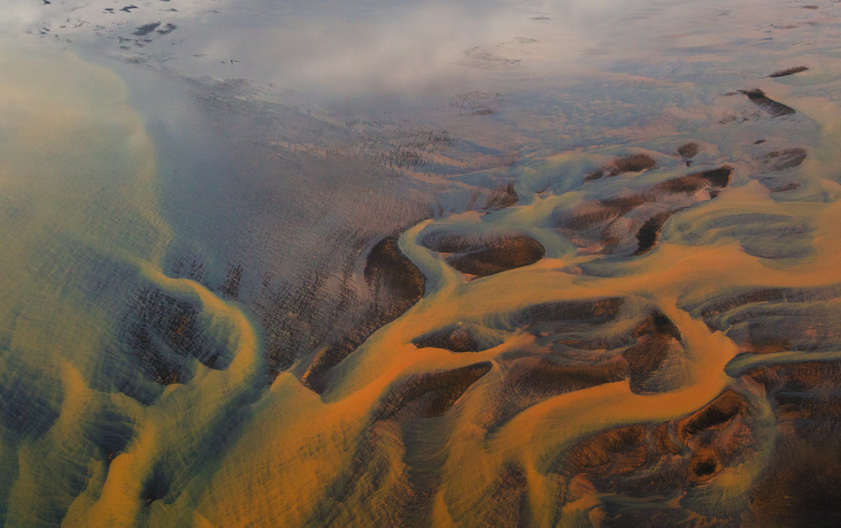
@ Iceland, April 2014
1DX 16 - 35 mm f/2.8 II
FL 35 mm
1/2000
f/8
Handheld from helicopter
Thank you for looking, your C & C are appreciated.
Comments
10 comments
Comment posted by R.Bill Moser on May 21, 2014 at 12:51 PM
I love the abstract quality of this image. To fully apreciate it you must see it big
Registered on January 29, 2010, 285 Posts, 4281 Comments
Comment posted by Dietrich Gloger on May 21, 2014 at 1:29 PM
These shots from iceland never cease to amaze me. Great abstract Basri!
Registered on January 26, 2007, 360 Posts, 9876 Comments
Comment posted by Karsten Wrobel on May 21, 2014 at 1:45 PM
stunningly beautiful, wonderful colours
in case you want to further enhance the abstract nature of the shot, I would think about cropping 1/3 from the top
Registered on November 1, 2008, 117 Posts, 851 Comments
Comment posted by gary phillips on May 21, 2014 at 2:31 PM
Sweet abstract , Basri. Iceland got to be one of the craziest places on the planet. I agree with Karsten about a crop from the top. I might even take abit of the left.
Registered on October 24, 2013, 185 Posts, 4136 Comments
Comment posted by Harley Goldman on May 21, 2014 at 5:13 PM
Very cool abstract. It looks like a painting.
Registered on November 19, 2003, 586 Posts, 11271 Comments
Comment posted by Mark Seaver on May 21, 2014 at 10:21 PM
Very enticing mix of abstract and real. Due to the atmospherics, the top seems a bit faded and I assume that's where the crop suggestions come from. I think you could also "fix" that by local processing for more contrast in the top 1/4 - 1/3.
Registered on January 23, 2011, 1103 Posts, 17270 Comments
Comment posted by Jake Case on May 21, 2014 at 11:25 PM
Wonderful graphic leading lines along with beautiful colors. I agree with the crop suggestions, but definitely a most outstanding image as is!
Registered on December 13, 2010, 38 Posts, 167 Comments
Comment posted by Jake Case on May 21, 2014 at 11:25 PM
Wonderful graphic leading lines along with beautiful colors. I agree with the crop suggestions, but definitely a most outstanding image as is!
Registered on December 13, 2010, 38 Posts, 167 Comments
Comment posted by Alan LaFaver on May 22, 2014 at 10:03 AM
was just scanning the thumbnail posts. This one stood out. Just wanted to comment and say that I think this one is really nice. Very pleasing aesthetically. Now I'm no art expert, but I'd be interested if you have any 'artistic' comment explaining your abstract, it's meaning, etc.....
Edited content/comments......Ok. I just read the other comments. I like to post/comment before I read others as I don't want to be influenced. My take is this: I love the way it's composed. I like the top and wouldn't crop it at all. I assume that you included all the components on purpose and may have cropped already. Another reason I like to see original unprocessed images below the posted 'gallery' entries. I think it should be mandatory for this site in the critique galleries.
Anyway, in an abstract image, whether it's paint, photo, other media, I try and take the image for what the artist posted, and get meaning from that. I know it's hard to draw the line, but I feel that critiquing an abstract is different than a typical nature shot. You aren't necessarily trying to recreate reality. Whats more important is what the image means to you, and the feeling/emotion you're trying to get across, right?
My 3 cents.......
Registered on February 28, 2014, 18 Posts, 147 Comments
Comment posted by Basri Akcasoy on May 23, 2014 at 9:35 AM
Thank you for all comments..
Alan, Thank you very much for your comment. I immediately changed the name of the photograph.
Actually I don't care the name, I just like the shapes and colors, thanks god I was there with my camera.
I enclosed the original uncropped copy.
Again thank you so much.
Registered on February 16, 2012, 118 Posts, 767 Comments

Comments
10 commentsin case you want to further enhance the abstract nature of the shot, I would think about cropping 1/3 from the top
Edited content/comments......Ok. I just read the other comments. I like to post/comment before I read others as I don't want to be influenced. My take is this: I love the way it's composed. I like the top and wouldn't crop it at all. I assume that you included all the components on purpose and may have cropped already. Another reason I like to see original unprocessed images below the posted 'gallery' entries. I think it should be mandatory for this site in the critique galleries.
Anyway, in an abstract image, whether it's paint, photo, other media, I try and take the image for what the artist posted, and get meaning from that. I know it's hard to draw the line, but I feel that critiquing an abstract is different than a typical nature shot. You aren't necessarily trying to recreate reality. Whats more important is what the image means to you, and the feeling/emotion you're trying to get across, right?
My 3 cents.......
Alan, Thank you very much for your comment. I immediately changed the name of the photograph.
Actually I don't care the name, I just like the shapes and colors, thanks god I was there with my camera.
I enclosed the original uncropped copy.
Again thank you so much.