Nature Photographers Network
This is the preserved archive of the original Nature Photographers Network. The community continues at naturephotographers.network.
Frozen Hands+ RP
‹ PreviousLandscape GalleryNext ›

Frozen Hands+ RP

by Navin Sarma

Gallery: LandscapePosted January 29, 2014252 views19 comments
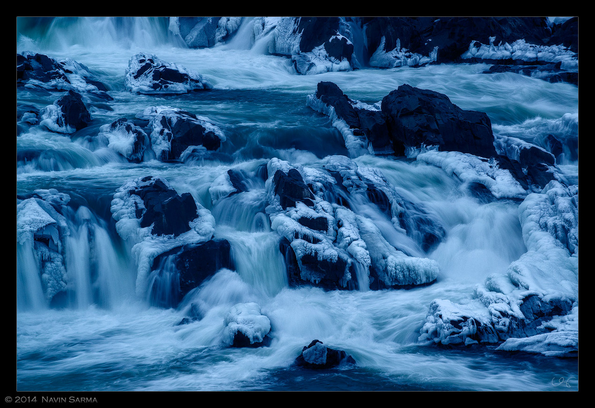
An image from the freezing cold Great Falls Park yesterday evening (5 deg F). I fired off a few quick shots before my hands stopped working (I need me some warm gloves that still allow decent dexterity -- any thoughts?)

Any C&C is appreciated!

REPOST - LARGE

Comments

19 comments
Comment posted by Dan Kearl on January 29, 2014 at 3:40 PM
I like al the frozen chaos here and the SS is about perfect for me.
I think the blue could be reduced for my taste
Registered on September 2, 2013, 209 Posts, 1514 Comments
Comment posted by gary phillips on January 29, 2014 at 3:50 PM
Holy frigid blueness, Navin. I kinda like the blue here(maybe toned down a bil). This definitely says cold. I just returned from the high desert in S. Utah. Temps only dipped to 14, but way to cold for me. I use fly fishing mittens. they are fingerless with a mitten flap that folds over when you don't need your fingers. When it's real cold I use hand warmers(the chemical type) and place them on the backs of you hands inside the gloves. Works for me.
Registered on October 24, 2013, 185 Posts, 4136 Comments
Comment posted by Ronald Murphy on January 29, 2014 at 3:50 PM
Very interesting detail of the falls. I might try to pull a little more out of the dark areas, and the blue IS a bit electric.
Registered on March 13, 2012, 279 Posts, 975 Comments
Comment posted by R.Bill Moser on January 29, 2014 at 3:51 PM
This sure feels cold. I love the textures and also the details in the water. I like it as is but I'm not queit sure about the blues - though I like them and it sure help one feel the cold I think you might reduce them a little bit.
Registered on January 29, 2010, 285 Posts, 4281 Comments
Comment posted by Ronald Murphy on January 29, 2014 at 3:59 PM
There are gloves with fingertips that can be folded back. See Adorama, etc.
Registered on March 13, 2012, 279 Posts, 975 Comments
Comment posted by Morris McClung on January 29, 2014 at 4:23 PM
You know the guys around here are going to want a little more natural color, and not quite so much blue, but I bet the buying public will love the fantasy feel in this. Beautiful.
Registered on May 7, 2007, 670 Posts, 19650 Comments
Comment posted by Chet Dowell on January 29, 2014 at 4:57 PM
Very nice, Navin. The larger version must be seen to appreciate the frosty detail. Great work!! Chet
Registered on December 3, 2012, 237 Posts, 1171 Comments
Comment posted by Navin Sarma on January 29, 2014 at 5:38 PM
Thanks, guys for your comments. I actually didn't touch the color at all but the contrast adjustments (even in luminosity blend mode) definitely emphasized them. Here's a redux with a smidgen more detail in the dark darks as well:

LARGE
Registered on July 17, 2011, 233 Posts, 1373 Comments
Comment posted by Ed Lowe on January 29, 2014 at 11:37 PM
This is a beauty, Navin. Lots of details and textures to enjoy along with different avenues of flowing water. I use a pair of silk gloves covered by a wool fingerless glove with a flap that folds over like a mitten when you don't need your finger dexterity. Pop in a hand warmer and you should be good to go.

Ed
Registered on February 7, 2004, 414 Posts, 7115 Comments
Comment posted by Joseph Campisi on January 30, 2014 at 1:11 AM
Less blue would work better for me as well Navin, and B&W would be a good option as well I think. Nevertheless, stunning inage! :toast:
Registered on November 24, 2008, 304 Posts, 3211 Comments
Comment posted by Bill Reid on January 30, 2014 at 9:31 AM
Wonderful motion, details and texture in the large version Navin. The new version looks great to me but I also like this one too. Really like the cold mood to this. Really nice.
Registered on January 27, 2013, 65 Posts, 2460 Comments
Comment posted by John Williams on January 30, 2014 at 10:40 AM
That ice is really special. I too like the original, but slightly prefer the version you linked to.
Registered on September 6, 2007, 221 Posts, 5985 Comments
Comment posted by Nancy Lea Sandy on January 30, 2014 at 10:53 AM
That's amazing. I like the strong blue tones but would really like to see more highlights in the ice on the rocks. Beautiful as is, though
Registered on January 24, 2011, 576 Posts, 6942 Comments
Comment posted by Mark Seaver on January 30, 2014 at 5:07 PM
I sure like your comp. and ss choice for contrasting the water with the ice. This version is too blue for my tastes (obviously a personal decision) with the Flickr version letting the ice shine better and seeming less blue. As for gloves, I have a pair of medium weight polyester gloves that provide decent warmth and decent sensitivity. For temps. like you had here (and I was on the other side Sunday AM at similar temps.), I have a heavy weight pair of sheepskin mittens that slip easily over the gloves. I've been very comfortable with the mittens/gloves combo down to -15F and can slip them off for a few minutes at a time for camera adjustments and shooting.
Registered on January 23, 2011, 1103 Posts, 17270 Comments
Comment posted by Eva McDermott on January 30, 2014 at 10:01 PM
Fantastic action Navin but I be one who would lie a little cyan/blue. Have you tried B&W?
edit: I actually like the toned down Flickr version.
Registered on January 4, 2009, 1015 Posts, 13229 Comments
Comment posted by Bob/Charly Nelson on February 1, 2014 at 10:19 AM
I love the cold feel of this Navin. I agree with Morris, I think the buying public would eat this up.
Bob
Registered on January 29, 2014, 35 Posts, 398 Comments
Comment posted by Kah Kit Yoong on February 2, 2014 at 8:46 AM
Prefer the repost. A stark and frigid landscape well presented.
Registered on September 27, 2006, 636 Posts, 10682 Comments
Comment posted by David Edwards on February 5, 2014 at 5:29 AM
I can't see any difference in the repost, but I love the dark and cold atmosphere of this shot. Love the blue toning. Image looks slightly better (sharper/contrasty) on the flicker, but it may be the darker bg. Nice one for sure!
Registered on December 6, 2008, 142 Posts, 2623 Comments
Comment posted by Tim Mulholland on February 8, 2014 at 5:34 PM
I like what you've done with this image, Navin. You've created some very emotive feeling in the capture and processing - cold, ethereal, solitude...

Tim!
Registered on April 24, 2006, 14 Posts, 139 Comments