Nature Photographers Network
This is the preserved archive of the original Nature Photographers Network. The community continues at naturephotographers.network.
Film Photography I
‹ PreviousLandscape GalleryNext ›

Film Photography I

by Jim Greenwood

Gallery: LandscapePosted December 8, 2013671 views33 comments
Something new ... at least for me. I've seen photographs similar to this occasionally. But I guess I never realized the potential of this subject matter with respect to landscape photography, or my interest in it, until recently when I was introduced to it during a workshop in Zion last month. It helped me to delve a little more into macro photography, which I've been more interested in doing lately, but haven't yet had much success at.

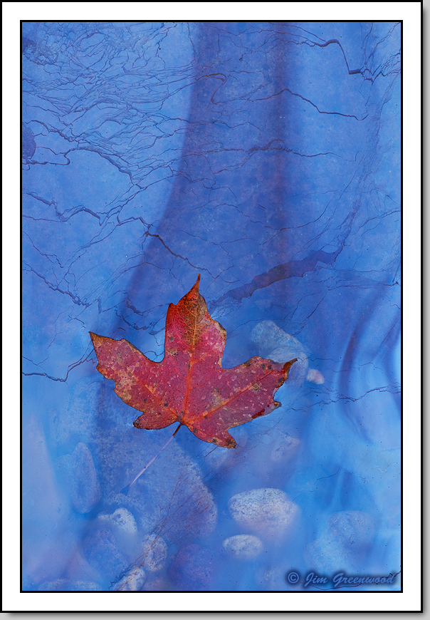
Natural oils from decaying leaves and other plant material collect on the surface of small puddles and stagnant pools, mostly along rivers and streams, creating elaborate and highly varied reflections due to the phenomenon of thin-film interference.

Sometimes it's possible to find appealing compositions which include leaves or other objects. But sometimes Mother Nature's creative hand can use a little assistance too. This composition is an example of the latter. This tiny bigtooth maple leaf was placed in this location along Pine Creek. The leaf is only about an inch or so wide. I found this minute scene quite fascinating ... the intricate lines and patterns, and the small pebbles under the surface.

Canon 5D II
Canon 180mm f/3.5L Macro
180mm, f/32, 3.2 seconds, ISO 50

Comments

33 comments
Comment posted by Harley Goldman on December 8, 2013 at 8:58 AM
Beautiful, Jim. Real nice warm and cool tones and interesting patterns in the background, too.
Registered on November 19, 2003, 586 Posts, 11271 Comments
Comment posted by Tony Kuyper on December 8, 2013 at 9:17 AM
Wonderful color contrasts. Really captures the eye.
Registered on November 1, 2003, 364 Posts, 22328 Comments
Comment posted by Matt Anderson on December 8, 2013 at 10:14 AM
Very nice indeed. It reminds me of some work Guy Tal has done.
Excellent work.
Registered on September 6, 2007, 346 Posts, 2696 Comments
Comment posted by David Chauvin on December 8, 2013 at 11:01 AM
This is awesome, Jim. The depth created by the gauzy film over the pebbles and cracks makes the imagination kick in. My first thought when seeing the thumb was also Guy's work and that is a high compliment indeed. Simply fantastic. :toast: :toast: :toast: I could see a crop from the top but would hate to lose any of those squiggles.
Registered on August 5, 2004, 1007 Posts, 5595 Comments
Comment posted by Joseph Campisi on December 8, 2013 at 12:05 PM
Beautiful colors and patterns in the ice Jim. Well done!
Registered on November 24, 2008, 304 Posts, 3211 Comments
Comment posted by Stan Rose on December 8, 2013 at 12:08 PM
This is a familiar subject to me too, but i love your version! Really like the subtle lines and of course the color contrast.
This may seem super-picky, but i would highly recommend a slight crop off the bottom to place the center of the leaf 'axis' at the exact 1/3 point. Placement of the subject is extremely important with this type of composition, and really i can think of no reason not to use thirds here.
Just read David's comment--i think he's reacting to the long aspect (as i initially did before i thought about a solution)--so i would be curious to see what he thinks of my suggestion.
Registered on September 15, 2005, 836 Posts, 17099 Comments
Comment posted by Jim Greenwood on December 8, 2013 at 12:10 PM
Joe, it's not ice. The effects are totally due to the oil on the surface of the water.
Registered on November 9, 2003, 229 Posts, 1523 Comments
Comment posted by Jim Greenwood on December 8, 2013 at 12:28 PM
Thanks for the comments thus far. The comparisons to Guy's work are indeed a high compliment.

Stan, what do you mean by the leaf "axis" ... with respect to the vertical placement of the leaf?
Registered on November 9, 2003, 229 Posts, 1523 Comments
Comment posted by Stan Rose on December 8, 2013 at 12:42 PM
Ok, Jim, i retract my original statement cause i gave this a bit more thought--here is what im getting at.
Here's your photo broken down. The red spot is the ideal 'rule of thirds spot'. I was originally thinking that should coincide with the blue spot here--the center of the leaf, where all the veins intersect, dead center (not coincidentally,the leaf has three sections--that's why it is such a strong comp in thirds!) But looking more closely, i think it really should coincide with the green spot--which is the middle of the left side 1/3 section, but is one third of the way along the length of that seciton--it's thirds within thirds and as such it is an extremely strong location. Our brains are always calculating these spots when we compose--we're just not aware of it! :biggrin:
Registered on September 15, 2005, 836 Posts, 17099 Comments
Comment posted by David Chauvin on December 8, 2013 at 2:36 PM
"Our brains are always calculating these spots when we compose--we're just not aware of it!"

Hey Stan,,,,,,if my brain is working that hard without my knowing it I'll have to start treating it better. :biggrin: :wink:
Registered on August 5, 2004, 1007 Posts, 5595 Comments
Comment posted by Aaron Feinberg on December 8, 2013 at 3:39 PM
NICE!
Registered on October 26, 2009, 399 Posts, 2789 Comments
Comment posted by Navin Sarma on December 8, 2013 at 4:03 PM
Gorgeous work, Jim. The contrasting temperatures and fine detail are phenomenal.
Registered on July 17, 2011, 233 Posts, 1373 Comments
Comment posted by Ant on December 8, 2013 at 4:08 PM
Beautiful, I like the color contrast and the composition. Somehow, I feel the 3:2 format a bit too
elongated for this subject, but it is a personal feeling...
Registered on April 13, 2009, 27 Posts, 474 Comments
Comment posted by Paul Gasior on December 8, 2013 at 5:27 PM
Beautiful image .Great color contrast
Registered on March 7, 2010, 99 Posts, 502 Comments
Comment posted by Kathy Barnhart on December 8, 2013 at 6:05 PM
Gorgeous colors and textures. Simple, but lots to look at.
Registered on November 11, 2011, 404 Posts, 1639 Comments
Comment posted by Jim Greenwood on December 8, 2013 at 6:12 PM
Stan, thanks for the explanation and the detailed analysis. I'll look through all of the exposures I took. Maybe there is one that more closely fits your suggestion. I will also try cropping this image. It seems like I could crop the left side without too much impact to the composition. But I'd then need to crop the top and/or bottom a little if I wanted to keep the 4:6 format, which would have a greater negative impact to the composition I think. So I'll see how this works out.
Registered on November 9, 2003, 229 Posts, 1523 Comments
Comment posted by Jeremy Kessler on December 8, 2013 at 10:22 PM
This is Beautiful Jim!

I thinks sometimes as photographers we over analyze things and try to find something to critique, even when we might be better off just enjoying the image.

I'll just enjoy this one :toast: :wink:
Registered on September 13, 2007, 36 Posts, 1283 Comments
Comment posted by Mark Seaver on December 9, 2013 at 5:04 AM
This is very interesting, Jim. I get a sense of a double exposure with the leaf overlaying a muted landscape. Very well seen and presented. I would crop this a bit.
Registered on January 23, 2011, 1103 Posts, 17270 Comments
Comment posted by John&Patty Benway on December 9, 2013 at 6:31 AM
Beautiful Jim, in every way.
John
Registered on May 12, 2006, 626 Posts, 8700 Comments
Comment posted by Dietrich Gloger on December 9, 2013 at 12:46 PM
I have also seen this photographed, but I have never seen it in person. I think you did a great job, the result is fascinating. I like that bit of extra visual information coming from the pebbles beneath.
Registered on January 26, 2007, 360 Posts, 9876 Comments
Comment posted by Preston Birdwell on December 9, 2013 at 1:30 PM
This just works! What a lovely image. This will make a nice print.

Good job, Jim! :toast:

--P
Registered on November 1, 2003, 471 Posts, 5188 Comments
Comment posted by Bill Chambers on December 9, 2013 at 1:43 PM
Great color combination Jim and wonderful details. Good job on the leaf placement too - every time I try something like that it appears so obvious and ruins the shot. This looks quite natural.
Registered on April 10, 2005, 753 Posts, 21216 Comments
Comment posted by Glenn Tunaley on December 9, 2013 at 3:15 PM
Amazing image! Love the color contrast and textures
Registered on March 1, 2013, 19 Posts, 93 Comments
Comment posted by Mark Metternich on December 9, 2013 at 3:31 PM
DANG!!!!!!!! :toast: :toast: :toast:
Registered on June 19, 2009, 276 Posts, 6240 Comments
Comment posted by Kory Lidstrom on December 9, 2013 at 4:28 PM
You're right: this type of shot has indeed been done before. But, so what? You did a great job. I have no issues whatsoever with you placing the leaf there -- sometimes you have to MAKE a shot work, and you did. Nice work.
Registered on November 19, 2008, 49 Posts, 1035 Comments
Comment posted by Jared Warren on December 9, 2013 at 6:40 PM
This is fantastic, Jim. The lines and layers really hold my attention. The comp feels right to me, but there may be other interesting variations as well. :toast:
Registered on May 11, 2012, 84 Posts, 931 Comments
Comment posted by Phil Pogledich on December 9, 2013 at 6:45 PM
Wonderful image, Jim. The color contrast is just remarkably beautiful, and I've alwasy much enjoyed images like this (still pretty rare, I'd say) that take advantage of the oily film on water you sometimes find in riparian areas.
Registered on August 24, 2009, 123 Posts, 3099 Comments
Comment posted by John Williams on December 9, 2013 at 9:58 PM
Elegance in the extreme Jim. One of my favorites of yours. The larger version is a joy to view. My only nit is that I didn't take it. :toast:
Registered on September 6, 2007, 221 Posts, 5985 Comments
Comment posted by Doug Koepsel on December 10, 2013 at 10:30 AM
Jim, I like everything about this image. :toast:
Registered on April 1, 2010, 196 Posts, 1592 Comments
Comment posted by Stan Rose on December 11, 2013 at 2:06 PM
I thinks sometimes as photographers we over analyze things and try to find something to critique, even when we might be better off just enjoying the image.

I know you're not referring to me, here, Jeremy :wink: but just to clarify a bit--i always go with my gut reaction in a comment, i never "look" for things to critique. Here, my gut feeling was that it's a sweet shot, but the long aspect bohered me a bit, so i looked for the reason that it was bugging me. My conclusion was just that it needed a very slight bottom crop to be 'perfect' to my eye, that's all. I'd rather give some evidence to back up my assertion though.
Registered on September 15, 2005, 836 Posts, 17099 Comments
Comment posted by Kah Kit Yoong on December 14, 2013 at 5:46 AM
Incredibly visual appeal to my eyes. Not sure how much the suggested crop improves it, great as presented really.
Registered on September 27, 2006, 636 Posts, 10682 Comments
Comment posted by Ken Smith on December 19, 2013 at 10:14 PM
I really like this… glad to see it in WP! Congrats. The soft hues of the leaf blend well with the blue ice. Those thread-cracks delight me with flow and etched designs - created art on this slab of blue-freeze. Great job!
Registered on September 5, 2008, 449 Posts, 2444 Comments
Comment posted by Jim Greenwood on December 19, 2013 at 11:46 PM
Thanks Ken! The effects are not due to ice, but to the thin film of oil on the surface of the water.
Registered on November 9, 2003, 229 Posts, 1523 Comments