Nature Photographers Network
This is the preserved archive of the original Nature Photographers Network. The community continues at naturephotographers.network.
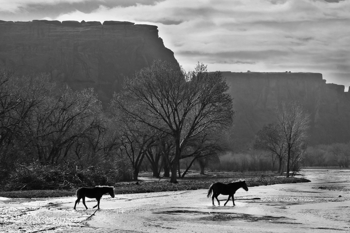
Navajo ponies
‹ PreviousWeekly Challenge GalleryNext ›

Navajo ponies

by Kathy Barnhart

Gallery: Weekly ChallengePosted September 22, 2013118 views8 comments
In Canyon de Chelly, New Mexico.

Canon 5d, Mk3, ISO400, f/8, 1/400 sec, 75mm. Hand held from a bouncy truck!

Thanks in advance for any comments or critiques. There wasn't a lot of color in this scene so I thought it looked best in B and W.

Comments

8 comments
Comment posted by Philip Hodgkins on September 22, 2013 at 9:01 PM
An interesting and different take. There is a lot to see here—the ponies, the braided stream, the mid-ground trees and the "table top" ghostly mesas. Yet the ponies, which are the subject, still hold my attention. Very imaginative work, wrapped up in a nice B/W conversion. :toast:
Registered on July 24, 2006, 2741 Posts, 12349 Comments
Comment posted by Scott Fricke on September 22, 2013 at 9:51 PM
Beautifully composed image Kathy! I also like how the light is hitting the water and backlighting the manes of the horses. I like the comp as is but also like cropping off the top down to just below the top of the mesa on the left.
Registered on January 19, 2007, 133 Posts, 1448 Comments
Comment posted by Karen Kane on September 23, 2013 at 2:40 PM
Love the rim light on the ponies manes and the overall composition. Very interesting photo - simple in some ways, but yet lots to explore. The B&W conversion works well too :toast:
Registered on August 4, 2012, 66 Posts, 726 Comments
Comment posted by Carolyn Derstine on September 23, 2013 at 2:52 PM
Great job for handheld on a bouncy truck. :smile: I usually like nature shots in color but this particular shot works well in B&W. The strong lighting, while it probably does wash out some of the color, does help highlight all the varying textures and shapes in this image. So, yes, B&W was a great way to go IMO. I like the sharply defined lines of the cliffs, the wispy look of the trees and bushes, and the dark silhouettes of the horses against the light gray of the water. The lighter gray areas on the top and bottom help direct our attention to the interesting darker-toned middle section. Good job making a nice picture from a less-than ideal situation, Kathy!
Registered on February 16, 2011, 610 Posts, 3684 Comments
Comment posted by Gary Minish on September 23, 2013 at 6:37 PM
I like the scene and the composition, Kathy. Even the horses being silhouetted is not a problem. I don't care for the washed out cliffs in the background though. I can see that you lightened them considerably but when you do that you need to increase the contrast along with the brightness to keep some shadow definition. Lightening a very dark color photo will result in a lot of chroma noise so converting to b&w was a good choice as it pretty much eliminates that problem.
Registered on February 4, 2006, 625 Posts, 3583 Comments
Comment posted by Mark Seaver on September 24, 2013 at 1:15 PM
Kathy, I think your b&w treatment works well here on a very interesting scene. I think there are some processing changes that could make this stronger. First, there's a dark rim/sky halo along much of the top and side of the butte on the left and there's haloing along the right side of the center tree. I don't know what your processing is, but I see this kind of halo on high contrast edges when I use Tony Kuyper's triple play or use unsharp mask in PS with a low value, high radius settings (say 30, 50, 0). I also think this image would be helped with some added contrast in the sides of the buttes. I like to do that using TK's luminosity masks and darkening through a darks mask or lightening through a lights mask.
Registered on January 23, 2011, 1103 Posts, 17270 Comments
Comment posted by Barbara Graham on September 24, 2013 at 10:36 PM
This looks like four layers here, and the shades of black and white seem just right for each layer. Then the ponies stand out from all four layers. I especially like the light on the trees and the foreground.
Registered on July 27, 2010, 1310 Posts, 5035 Comments
Comment posted by Paul Breitkreuz on September 25, 2013 at 11:31 AM
Kathy, this is a really neat take here on this view. Timing of the horses in the scene is excellent. I'm not good with B&W image processing, but I think some further adjustments here and there might enhance things overall. I wish I could give exact ideas, but the BG contrast in general looks like an item for a bit of review.
Registered on February 25, 2006, 525 Posts, 8448 Comments