Nature Photographers Network
This is the preserved archive of the original Nature Photographers Network. The community continues at naturephotographers.network.
WC 603 High Plains
‹ PreviousWeekly Challenge GalleryNext ›

WC 603 High Plains

by Scott Fricke

Gallery: Weekly ChallengePosted September 22, 2013929 views8 comments
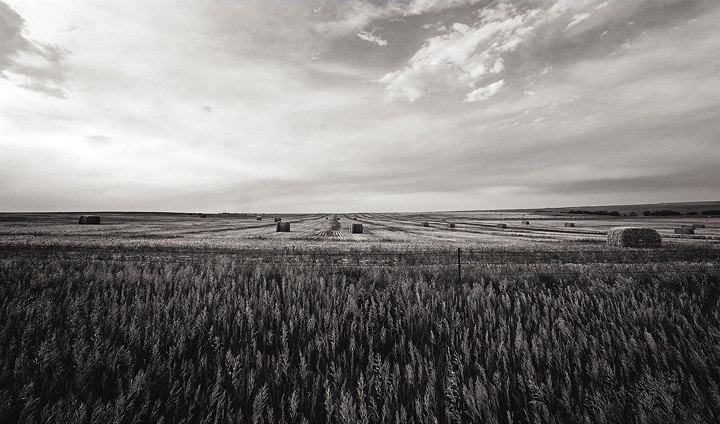
This was taken on the Eastern Plains of Colorado about a month ago. Certainly not the topography one usually associates with Colorado. The light wasn't great so I tried a B&W conversion using Silver Efex Pro 2. I'd appreciate any critiques you my have.

Canon 5DII, 16-35L II @ 16mm, f16, 1/100sec, ISO 200

Comments

8 comments
Comment posted by John Tobias on September 23, 2013 at 10:47 AM
Scott, nice photo! I think your conversion works well, but I would like to have seen a larger image. You are correct about how eastern Colorado looks, not what you think of when you think of Colorado, more like western Kansas. Thanks for sharing.
Registered on September 12, 2009, 2120 Posts, 6455 Comments
Comment posted by Philip Hodgkins on September 23, 2013 at 10:48 AM
The fifty-fifty split between sky and earth is a bit unusual, but I think it more or less works here. However, the sky is just not that interesting; I would at least look at cropping the sky back to a third, and possibly darkening it some. The hay field going almost to a vanishing point is good stuff!
Registered on July 24, 2006, 2741 Posts, 12349 Comments
Comment posted by Karen Kane on September 23, 2013 at 2:52 PM
Scott,

You have a really, really great foreground... the B&W conversion suits it very well too.

Unfortunately, the sky is not quite supporting the FG very well. I can think of a couple of ways that I would work with that (understanding your preferences might be different). The "easy" way would be to crop the sky severely - to a ratio somewhere between 2/3 and 3/4 foreground with 1/3 to 1/4 sky would be the line. Alternatively, if you're working in Photoshop, make a duplicate layer and try the "multiply" blend mode. You'll have to mask the foreground, but that blend mode can often add some drama to a sky.

True enough, not the classic Colorado image. Reminds me of around here :smile:
Registered on August 4, 2012, 66 Posts, 726 Comments
Comment posted by Carolyn Derstine on September 23, 2013 at 3:13 PM
What really stood out for me when I opened up the thumbnail was the interesting detail of the individual stalks in the foreground. Would loved to have seen that in a larger version! Very cool looking! I like vanishing point comp of the mid section too with the sporadically placed bales. As others mentioned, the sky doesn't add much to this image, except possibly near the top. While a crop down from the top would work, Karen also gave some good ideas. I use Nik Viveza software which can usually pull out more details in this kind of situation, using the structure slider. Another extreme idea would be to crop out all of the sky, leaving a pano of the detailed stalks with just a glimpse of the field beyond. Would definitely be more of an abstract, artsy image. You've got a good comp concept going here and worth experimenting more with. :smile:
Registered on February 16, 2011, 610 Posts, 3684 Comments
Comment posted by Gary Minish on September 23, 2013 at 6:40 PM
Nice detail in this shot, Scott. The rows in the background add perspective and consequently a lot of depth to the scene. I think the b&w conversion was a good idea.
Registered on February 4, 2006, 625 Posts, 3583 Comments
Comment posted by Mark Seaver on September 24, 2013 at 1:02 PM
I think the b&w treatments works very well here and you've done a good job of portraying the "goes on forever" sense of the high plains. The foreground is terrific, but a sky with scattered cumulus clouds rather than this near overcast would be a big improvement.
Registered on January 23, 2011, 1103 Posts, 17270 Comments
Comment posted by Scott Fricke on September 24, 2013 at 2:54 PM
Thank you everyone for your comments. I would agree the sky isn't the optimum and I actually pulled a lot more detail out of it during the B&W conversion than was there in the RAW file. I hesitate to crop the sky though as the sense you get being there is the land going on into infinity and the BIG sky. That's also why I chose a 50/50 split with the horizon. I have also personally grown to like the contrast between the very detailed bottom and the relatively featureless top. Another thing is the clouds have a subtle, maybe too subtle v- shape to them that mimics the converging lines in the field. It does make a difference looking at this larger and I apologize for not including the larger version, I promise to do so in the future. Thanks again for all the comments, I greatly appreciate the feedback from everyone here, it certainly has improved my work. :toast:
Registered on January 19, 2007, 133 Posts, 1448 Comments
Comment posted by Paul Breitkreuz on September 25, 2013 at 11:03 AM
Scott, this scene works nicely for the theme this week. I would apply the fix Karen mentions in her comment for a nicer looking sky. As long as pixels are in place the multiply will work just fine. Selecting the sky and using the Contrast -Brightness layer for fine tuning should work very well on a B&W processed image. Once multiplied a mere Opacity adjustment will get it close and then use the layer application to fine tune. To me, the scene looks to have no blow outs and should be an easy application overall. The composition is already there IMO. :cool:
Registered on February 25, 2006, 525 Posts, 8448 Comments