Nature Photographers Network
This is the preserved archive of the original Nature Photographers Network. The community continues at naturephotographers.network.
Luminance
‹ PreviousLandscape GalleryNext ›

Luminance

by Bill Chambers

Gallery: LandscapePosted September 2, 2013171 views6 comments
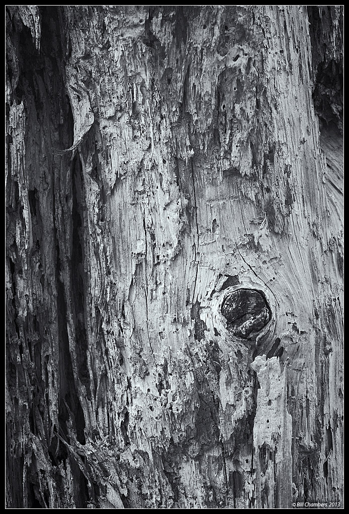
I was captivated by the way the light was reflecting off this rotten standing tree. Shot it from the gitgo with B&W in mind. Converted it and added a slight selenium tone to it. Captured this on Gulf Islands National Seashore, near Pensacola Beach, FL.

Please seem larger version for better detail.

I would love to hear your thoughts and comments. Thanks for looking.

Comments

6 comments
Comment posted by Navin Sarma on September 3, 2013 at 11:11 AM
Hi Bill -- this one is a little tough for me. Perhaps it is the conversion or maybe more likely the contrast, but the luminance and light you mention don't come across emphatically here. If you stick with B&W, maybe we you can push the dark a little darker and, especially, the brights a little brighter so that they are shimmering as you perhaps saw.

I have to qualify all that I've said with the fact that I'm using an uncalibrated laptop
Registered on July 17, 2011, 233 Posts, 1373 Comments
Comment posted by John&Patty Benway on September 3, 2013 at 11:26 AM
Bill, really enjoy the intimate scenes, and you do them so well, excellent subject for B&W, really like the tones, detail, and all the different patterns throughout this little scene. Actually I just got back from the local preserve with somewhat the same thing in mind. Like this very much, good eye Bill.
John
Registered on May 12, 2006, 626 Posts, 8700 Comments
Comment posted by Paul Breitkreuz on September 3, 2013 at 11:32 AM
Excellent rough wood detail in the larger version here, Bill. Looks like it has had some grooves and holes poked into it by a variety of worms, termites, and or woodpeckers over time. Let's just say it has a lot of "character" exposed to the world now.

I could also see a little more fiddling with contrast a bit as Navin mentions, I think the light and dark might see a bit more pop if pulled somewhat tighter there. Regardless, the structure is in place to fine tune as you might see fit overall...... :cool:
Registered on February 25, 2006, 525 Posts, 8448 Comments
Comment posted by Jeffrey Sipress on September 3, 2013 at 12:04 PM
Excellent tonalities in this image, Bill.
Registered on February 17, 2004, 236 Posts, 1197 Comments
Comment posted by Nick Bristol on September 4, 2013 at 3:38 PM
Bill, I think this made a really nice b&w image. I can see why you were thinking b&w when you shot this too. I especially enjoy the texture and fine detail in the large version. A could see trying a little more contrast to see how it looks but it works fine as is too. :smile:

Nick Bristol
Lone Rock, WI
Registered on February 1, 2004, 752 Posts, 14140 Comments
Comment posted by Preston Birdwell on September 5, 2013 at 12:32 PM
I love the composition and the texture, Bill. The contrast looks fine to me. I have looked at this several times, and I think where I'm having trouble is with the toning: I think it's a little strong. That's a minor nit for an otherwise nice image.

--P
Registered on November 1, 2003, 471 Posts, 5188 Comments