Nature Photographers Network
This is the preserved archive of the original Nature Photographers Network. The community continues at naturephotographers.network.
Gale Forces + REPOST
‹ PreviousLandscape GalleryNext ›

Gale Forces + REPOST

by James Fougère

Gallery: LandscapePosted September 3, 2013658 views18 comments
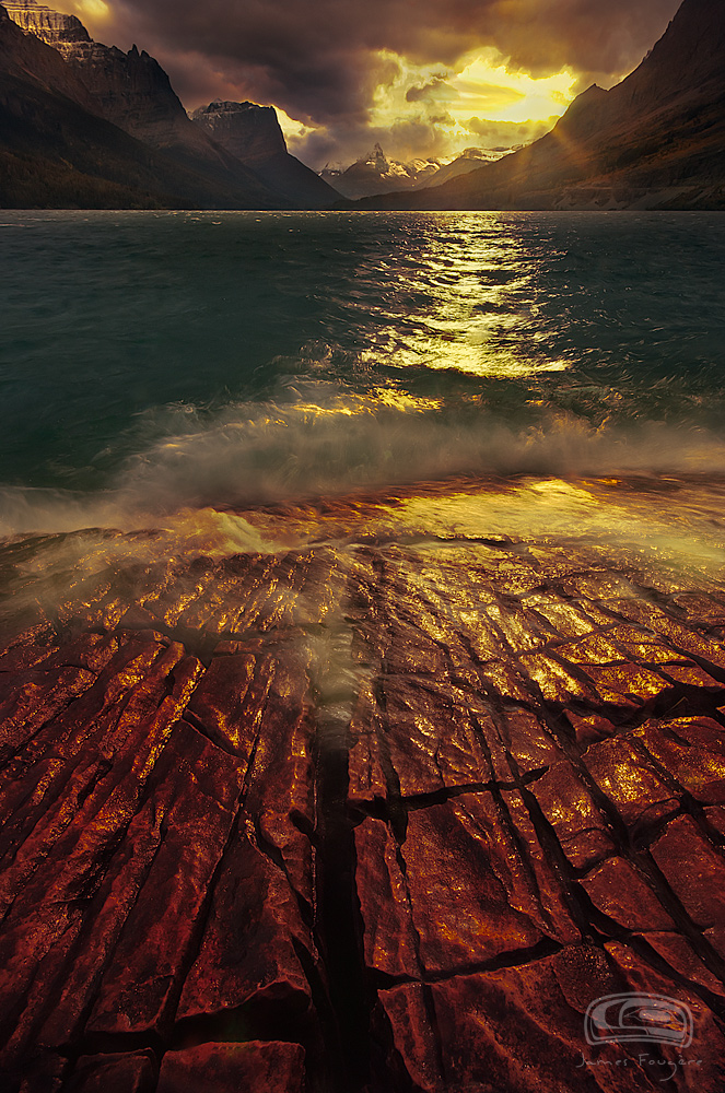
I captured this scene a few years ago out at St Mary's Lake in Glacier NP, and did nothing with it until now. This was a very challenging situation!

The wind was CRAZY in the face with constant spray from the lake on the lens. Plus the clouds were moving fast with the sun coming in and out of view. Trying to get the right shot with the waves crashing on the rock face foreground and getting the right light was NUTS! Anyway, I sacrificed the right exposure for the sky to get the lake and foreground illuminated. I tried to stop down as much as I could, but with the sun in full view, it was tough with very little time to do anything :biggrin:

I have had a few experiences with photography situations where it is like "flying a plane with no fuel and schizophrenically playing with switches to land safely!". Shooting a blazing aurora display is the same situation. Trying to capture different exposures and focuses in under 30 to 60 seconds, and in this situation getting pelted with water spray !!

I am on the fence about this image because the sky is blown out. I did try my best to get it under control and fill it in with some warm color. I also had to reprocess an image to get some detail in those distant mountains.

I noticed that the attached JPEG may be a bit dark for some monitors.

Be honest here guys, I find when I look to long at an image, I get stumped by over analyzing it :wink:


14mm shot. with my old Nikon D3s camera.

Comments

18 comments
Comment posted by Floris van Breugel on September 3, 2013 at 2:25 PM
I like the drama, and the processing has a certain appeal, but it does not look like a photograph to my eye - much more like a painting. Personally I'm finding I much prefer more realistic presentations these days. Have you tried a black and white? You might be able to get away with the blown highlights more easily that way.
Registered on December 19, 2008, 306 Posts, 4840 Comments
Comment posted by Peter Coskun on September 3, 2013 at 2:43 PM
The first thing I noticed was the strong yellow cast over the image. I think pulling back on the yellows would help bring a more natural light and even reduce the highlights a bit. The other thing is the foreground, I feel there is too much of that rock as it creates a 50/50 split between the image. A lower angle looking up to get more of the sky might have been more beneficial as well. There is also a spot in the lower left crack, not sure if it is lens flare or spray on the lens. There is definitely lots of potential here with a few tweaks.
Registered on October 31, 2011, 170 Posts, 1240 Comments
Comment posted by James Fougère on September 3, 2013 at 2:52 PM
Thanks Floris.

I did take a little artistic liberty with the processing for this image. I did not consider a B&W conversion since there was some interesting color here to work with. I also did not apply any blur that would send this image towards the "painting effect".

I will look at a B&W conversion :biggrin:
Registered on October 25, 2010, 41 Posts, 831 Comments
Comment posted by James Fougère on September 3, 2013 at 2:57 PM
Peter,

Thanks for the comments. There is a bit of a yellow cast, I did apply that to fill a bit of color in the highlights. I will consider to back it off some to see what it looks like, it looks ok on my end. Everyone is seeing something different out there in the monitor world :biggrin:

As for the angle of view, I was inches from the surface of this rock, laying down! There was not much to see above this view. I had other comps that did what you suggest, but this comp had the strong cracks and leading lines.

It was fun to shot, but I am not totally sold on the sky section of this image.
Registered on October 25, 2010, 41 Posts, 831 Comments
Comment posted by Jeffrey Sipress on September 3, 2013 at 3:19 PM
This is a tough image. I'm trying to like it, but failing to. Probably because of the strange lighting throughout and the general darkness. Tip: You could lose the uppercase with quotation marks in the title.
Registered on February 17, 2004, 236 Posts, 1197 Comments
Comment posted by James Fougère on September 3, 2013 at 3:35 PM
Jeffrey,

Thanks for your honesty, I somewhat agree with the changes in light here, and that it may seem odd. With all the dark clouds present in the sky and out of view overhead, plus there were shadow zones on the mountains and lake and with shooting directly into the sun had its challenges.

I just noticed that no one here uses uppercase titles and " marks on there around their titles. I personally do on my website. I was not aware that it was inappropriate here to do that. I really do not see what this "tip" does to improve this image. Point taken.. :biggrin:
Registered on October 25, 2010, 41 Posts, 831 Comments
Comment posted by Thomas Haney on September 3, 2013 at 7:06 PM
I think it's a really interesting image James, but I would say that the processing seems a bit heavy to me. I'm no master at it myself, but I would probably crop some off the bottom so it doesn't seem so bottom heavy, and the color of the rocks seems either too red or just over-saturated. It's a really interesting image as-is, but a few tweaks would make it appeal more to me personally. That does sound like a really challenging situation, and I think you did great with it.
Registered on April 7, 2013, 138 Posts, 537 Comments
Comment posted by Jeremy Kessler on September 3, 2013 at 7:17 PM
Fantastic Comp. I agree with Floris when it comes to the processing.
Registered on September 13, 2007, 36 Posts, 1283 Comments
Comment posted by Ben Horne on September 3, 2013 at 7:57 PM
It's hard to ignore the extremely stylized processing of this shot. To be honest, the strong yellow kind of kills it for me. I know that not everyone goes for a realistic interpretation of each scene, but the color here is so wild that it distracts from the beauty that is present in the scene. Though we don't always have the most ideal conditions work with, heavy processing is seldom a replacement for ideal lighting. I would second Floris' suggestion bout B&W. I would also crop a bit off of the bottom to avoid it feeling so 50/50.
Registered on August 27, 2009, 51 Posts, 959 Comments
Comment posted by James Fougère on September 3, 2013 at 11:04 PM
Thanks for all the feedback guys.

My monitors are calibrated to my Epson 9900 printer, and I do not see the strong overcast of yellow. I did add some to the blown out areas of the sky, but it is minor to what I see. As for the comp, I will try a crop off the bottom. The foreground rock was completely red in color, and was wet which gave it the slick red look. I did take some artistic liberties to accentuate the rock and cracks using some levels adjustments.

I will give this image another crack, but I can see why I stayed away from it, it was a hassle to process. It was a cool concept and capture but with challenging conditions.

I will post another version soon :biggrin:
Registered on October 25, 2010, 41 Posts, 831 Comments
Comment posted by Ben Horne on September 3, 2013 at 11:40 PM
James,

The highlights are extremely yellow, more so than one would ever see in such a situation. This is what I'm referring to. This also has an impact on the rest of the scene and it makes the dark tones go a kind of muddy magenta. If you back off on the yellow in the highlights, then brighten the mid-tones a bit, it might give the image a more natural appearance. It's difficult to edit a photo after you've been staring at it for so long. Sometimes it's good to open the original side by side with the edit, and see where the edit has taken you.
Registered on August 27, 2009, 51 Posts, 959 Comments
Comment posted by James Fougère on September 4, 2013 at 1:18 AM
Thanks for all your advice Ben. Your right, sometimes you lose perspective when looking at something to long. I can see what you are saying. I will redo this image.

I have to say I am more excited when taking images while exploring and enjoying the moment, compared to sitting on my ass processing in front of a computer :biggrin:
Registered on October 25, 2010, 41 Posts, 831 Comments
Comment posted by James Fougère on September 4, 2013 at 3:22 AM
I have made a few changes to this image. I have not tried the B&W conversion, but adjusted the yellows in the high lights, cropped the image, and backed off the color in the rock surface so it is more appealing :biggrin:

Please let me know if this works better for you guys.

Again I appreciate your input here :biggrin:
Registered on October 25, 2010, 41 Posts, 831 Comments
Comment posted by Chris Moore on September 4, 2013 at 12:54 PM
Repost works MUCH better for me. Nice job :toast:
Registered on January 12, 2010, 84 Posts, 388 Comments
Comment posted by James Fougère on September 5, 2013 at 12:30 PM
Thanks Chris.

I can see that adding the yellow to give color to the blown out sections did not work well.
Registered on October 25, 2010, 41 Posts, 831 Comments
Comment posted by Marylynne Diggs on September 9, 2013 at 12:15 AM
For what it's worth, I didn't have an immediate reaction against the yellow cast, and in the repost, the colors aren't as dramatic and I find myself wishing for a wee bit of that yellow glow. While it was perhaps a little over-processed originally, maybe there is a happy medium? I liked the golden sun's last rays on water. That felt true to me.
Registered on December 14, 2010, 122 Posts, 1034 Comments
Comment posted by James Fougère on September 9, 2013 at 12:20 AM
Thanks Marylynne :biggrin:

You are right, I prefer a little of that end of day sun glow from the first post. I did get a little carried away and over processed it. But in the middle as you suggested may be the way to go :wink:
Registered on October 25, 2010, 41 Posts, 831 Comments
Comment posted by Mark Metternich on September 19, 2013 at 11:33 PM
I'm with Floris's comments on this one. I think a more natural rendering I would prefer. Aside from that it is certainly amazing light and a moment you caught here.
Registered on June 19, 2009, 276 Posts, 6240 Comments