Gallery: LandscapePosted August 7, 2013484 views13 comments
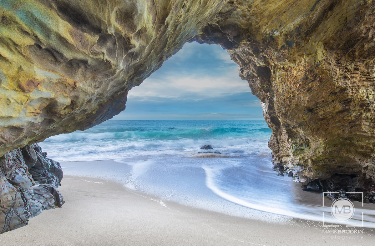
This image is a three shot composite blended for exposure. I shot this with a Nikon D800E at F16 with a 14-24 lens 19mm.
Comments
13 comments
Comment posted by Bill Chambers on August 7, 2013 at 9:56 AM
Very nice Mark. I love the mottled coloration and texture of the rock. Nice composition.
Registered on April 10, 2005, 753 Posts, 21216 Comments
Comment posted by Harry Lichtman on August 7, 2013 at 1:48 PM
The comp works very well for me, but there is an over-exposed look to the entire image. I'm not sure if this was blended manually or with software, but maybe increase contrast selectively. I would expect deeper shadows in the arch, which might give the entire image more depth. The sky and water make the image really inviting. Great job with this, just a little re-process adjustment needed IMO.
Registered on September 17, 2010, 304 Posts, 3507 Comments
Comment posted by SandyRichardsBrown on August 7, 2013 at 1:53 PM
Excellent lines and textures here - especially love the colours and textures of the rocks.
The peek at the ocean , framed by the rocks, is just beautiful.
Sandy
Registered on November 24, 2003, 3937 Posts, 12909 Comments
Comment posted by Ted Gore on August 7, 2013 at 2:39 PM
I'm not sure what it is, but the relationship between the rock and the ground looks unnatural... in both the sand portion and the water portion. It looks like it was cut out and placed on top. I'm guessing it's because of the blend and that you cut out the rock portion of the bright exposure. It's odd to me that the water is rushing by the rock, but not splashing on to the rock, and that there is no shadow between the sand and the rock on the left.
Registered on April 25, 2013, 36 Posts, 149 Comments
Comment posted by Luke Ormand on August 7, 2013 at 6:53 PM
I agree 100% with Ted. It's beautiful, colors are great and a fantasy inspiring image - but where the rock meets the sand/water it looks totally unnatural
Registered on February 4, 2009, 1093 Posts, 7035 Comments
Comment posted by Michel Lamontagne on August 7, 2013 at 8:33 PM
Superb Mark!
Registered on April 30, 2009, 9 Posts, 53 Comments
Comment posted by Mark Seaver on August 7, 2013 at 9:25 PM
The colors and view are lovely! The rocks in the upper left look very organic. I do agree that the rocks seem overly bright, since it seems like they should be in shadow.
Registered on January 23, 2011, 1103 Posts, 17270 Comments
Comment posted by Eva McDermott on August 7, 2013 at 9:41 PM
I like your comp Mark but feel there is a very HDRish feel to this which doesn't sit right with me. The arch should be much darker in my opinion.
Registered on January 4, 2009, 1015 Posts, 13229 Comments
Comment posted by Bill Reid on August 8, 2013 at 9:01 AM
Wonderful tones and textures in the rocks Mark but seems a little bright to me. Love the view to the ocean and sky. Agree with other comments about the sand and water but a very nice scene.
Registered on January 27, 2013, 65 Posts, 2460 Comments
Comment posted by Youssef Ismail on August 8, 2013 at 12:56 PM
Fantastic composition Mark. But like the others already mentioned, there is a contrast issue here that makes it look like it was cut out. The arch is too bright and over all the transition with the sand needs more contrast as well as in the shadows on the arch.
Another point that has not been mentioned yet, is that the water moving past around the arch does not show any water actually piling up on or around the protrusions of rock as one would expect.
Registered on November 1, 2003, 474 Posts, 5555 Comments
Comment posted by Mark Pelton on August 9, 2013 at 3:12 PM
striking overall scene, Mark, and the color is really nice. I like your comp and exposure.
Registered on November 25, 2003, 380 Posts, 4647 Comments
Comment posted by Ben Horne on August 11, 2013 at 11:30 AM
You have a very nice composition here, but I think the processing needs some work. It looks like you were trying to show detail through all of the shadow regions, but the net result is that there isn't any dark tone in your image. As it was pointed out, there really isn't any sort of shadow on the sand in the foreground, and that looks a bit odd. I would love to see a repost that restores some of the natural rich dark tone that provides a sense of mystery. Don't be afraid of the dark (tone), embrace it!
Registered on August 27, 2009, 51 Posts, 959 Comments
Comment posted by Vincent Grafhorst on August 15, 2013 at 1:50 PM
Very nice, very 'inviting' I should say, as if passing through here you are entering paradise.
Registered on February 24, 2006, 504 Posts, 7203 Comments

Comments
13 commentsThe peek at the ocean , framed by the rocks, is just beautiful.
Sandy
Another point that has not been mentioned yet, is that the water moving past around the arch does not show any water actually piling up on or around the protrusions of rock as one would expect.