Nature Photographers Network
This is the preserved archive of the original Nature Photographers Network. The community continues at naturephotographers.network.
Tree of Life (+alt.)
‹ PreviousFlora GalleryNext ›

Tree of Life (+alt.)

by scott lanz

Gallery: FloraPosted July 3, 2013218 views12 comments
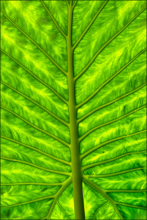
Thank you for your comments on "Red Radiance." Continuing with a theme, this is a backlit Elephant Ear leaf. The structure of the large Elephant Ear leaf looks like a tree, and also looks anatomical, so I called it "Tree of Life." There is a fly's shadow in the LR which I left in to provide scale. Nikon D600, 150 macro, tripod, f16, 1/320, iso 400. Comments, questions, and suggestions welcome. :wavey:

Comments

12 comments
Comment posted by scott lanz on July 3, 2013 at 9:20 PM
Thought I'd go ahead and post an alt. diagonal comp. Have a preference?
Registered on November 14, 2003, 840 Posts, 12902 Comments
Comment posted by Sanjay Sundaram on July 3, 2013 at 9:22 PM
Wow! This is stunning, Scott. It's a perfect leaf and you have seen and captured it very well. You're right, it looks like a tree. Very nicely done!

Sanjay
P.S: I prefer the straight treatment. But the angle looks very nice too (more artistic, I think).
Registered on April 9, 2013, 107 Posts, 725 Comments
Comment posted by Ramamohan Pai on July 3, 2013 at 9:42 PM
Scott - Is it possible to order one of each :biggrin: ?

In terms of overall impact I will give top marks to the original, Scott. The contrast there is superb and the leading lines many (to play magic on the eyes).

Terrific photo :toast:
Registered on November 1, 2003, 550 Posts, 9037 Comments
Comment posted by Dennis Plank on July 3, 2013 at 10:29 PM
Very cool and well thought out, Scott. I love the patterns in the leaf between the ribs. Given the title and just for aesthetics sake, I think I prefer the original version.

:toast:
Registered on January 28, 2008, 1767 Posts, 23192 Comments
Comment posted by Ian Wolfenden on July 4, 2013 at 7:17 AM
Love the original especially, Scott - for the greater definition of the main veins; also somehow the symmetrical composition seems just a touch stronger. Excellent images both !!
Registered on May 18, 2007, 1108 Posts, 7647 Comments
Comment posted by John&Patty Benway on July 4, 2013 at 8:05 AM
Scot, for the most part, I agree with Ram, but there is something about the diagonal comp that really appeals to me, in my opinion you have a winner with both. Beautifully seen and presented.
John
Registered on May 12, 2006, 626 Posts, 8700 Comments
Comment posted by Morris McClung on July 4, 2013 at 11:16 AM
I like the "straight up" comp of the first one. Both are very good, though. A little more glow in the first one and the added space seems to help. Gorgeous work! :toast:
Registered on May 7, 2007, 670 Posts, 19650 Comments
Comment posted by Gary Yeoh on July 4, 2013 at 11:16 PM
Scott:

A fine pair of images. Both are excellent and the vertical symmetry of the first is very appealing. Love the back light. :toast:
Registered on September 1, 2009, 588 Posts, 8184 Comments
Comment posted by Gary McGhee on July 5, 2013 at 8:24 AM
Both are really nice Scott but if I had to choose it would be your first post.

Gary.
Registered on April 15, 2010, 142 Posts, 2416 Comments
Comment posted by Mark Seaver on July 5, 2013 at 12:43 PM
This is terrific, Scott! The symmetry is awesome and your processing really has the leaf structure jumping off the page. While I think both versions are great, I prefer the original post, it seems to have a bit more contrast and the near vertical placement of the leaf emphasizes the symmetry (and I'm a huge fan of symmetry :biggrin: ).
Registered on January 23, 2011, 1103 Posts, 17270 Comments
Comment posted by Albert Darmo on July 6, 2013 at 10:12 PM
Hi Scott :wavey: Awesome detail color and light :jump: :eek: :jump: the patterns of lines and texture is amazing :toast:
Albert DArmo
Registered on November 25, 2008, 1386 Posts, 11978 Comments
Comment posted by Bill Fach on July 8, 2013 at 12:10 AM
Scott: Interesting how a slightly different POV and angle can produce such disparate results. I think I'll vote for the wider view; there's just more there for me to savor and enjoy. Well seen and captured. >=))>
Registered on November 1, 2003, 1805 Posts, 26981 Comments