Skeleton + Repost
by Youssef Ismail
Thanks for the feedback on my last image.
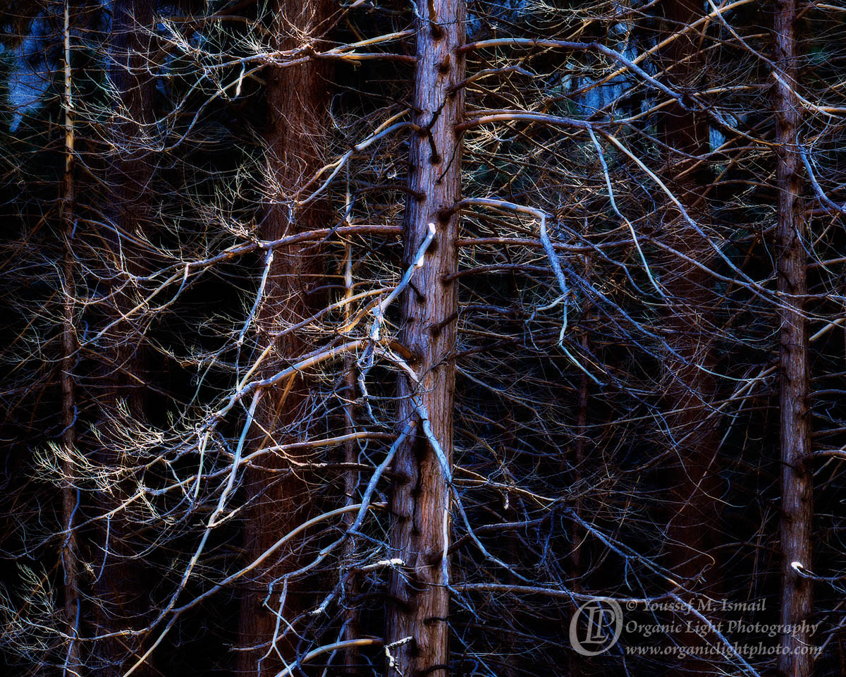
I made one more photo of these stark trees. This one is from what I thought was the most prominent tree in the stand. I was a little disappointed in that by the time I was set to make the photo, sunlight had creeped in and lit some of the more larger branches. I made the photo anyway, and in the end I am satisfied with the result. I processed this one similarly to the last one. Using an orton layer again to help isolate the FG branches from the chaos in the BG.
It is again a crop from a vertical frame, as what really interested me was the trunk and its outward extending branches. There was also a very brightly lit area near the top of the frame that I did not like at all.
4x5, Nikkor 300mm, f32, 1 sec, Fuji Provia 100F
Your thoughts much appreciated.

Comments
10 comments- Dan
Although I like the closer view and I think this one stands on it's own, I think I'm preferring your previous version, and especially the reworked version. Like the other post, I personally feel the blue in the bg is too much - at least if this is being presented as a straight landscape; I get blue in the shadows, but for me the bg blues are a distraction. Having said that, all is fine and good in terms of artistic license and artists choice in presentation.
What's interesting, and I think doesn't help, is that the smaller branches up front seem to have different colors. The reason is that some of the branches are stripped of their bark and so there is no blue, where as the gray or neutral parts of the branches that have bark are picking up the blue. On the surface that just makes is look like random branches are blue and others aren't. While I understand why, it just seems too much, especially with the blue so strong.
Don't mean to be so nitpicky either. I think this is one of those images where it could be processed a gazillion different ways and none of them would be right or wrong. This will make more sense when you see my rendition a bit later. ;-)
BTW, the little bits of direct light don't bother me at all.
Lon
Thanks for the quick feedback. I had already reduced the blue saturation in the original post. I liked how the blue branches stood out from the rest. But I can see how they appear to be randomly chosen even though those are the underlying tones those branches just happened to pick up.
In any case, I reduced the blue saturation further as a comparison. Any additional thoughts?
The repost works much better for me. Just remember though, it's just one opinion and might not match your vision. But you know that.
This ones growing on me too. And since, I noticed a bright spot in the LRC, I think some sunlight catching the branch. Might clone that out if you're thinking of printing.
Lon