Nature Photographers Network
This is the preserved archive of the original Nature Photographers Network. The community continues at naturephotographers.network.
Yosemite Moments#4+orig
‹ PreviousLandscape GalleryNext ›

Yosemite Moments#4+orig

by Lon Overacker

Gallery: LandscapePosted November 20, 2012478 views23 comments
Thanks folks for your comments on the previous image and for the series. I hope interest doesn't fade as I've got a long way to go.... :wink:

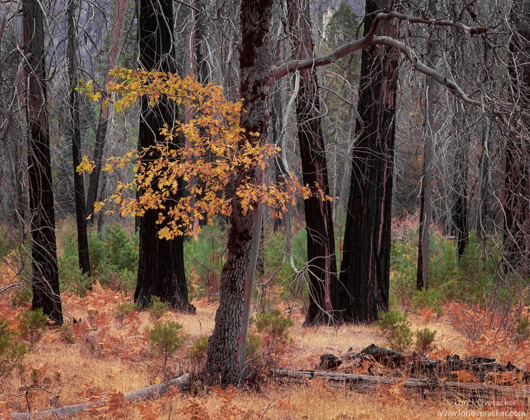
Still on the first day of the trip. Also still in this little forest of burned trees; now you can get the context of my previous post, although that tree is not in this frame. I was drawn here by the lone cluster of autumn black oak leaves against the starkness of the pine snags and the rebirth of the forest floor. Light was soft and diffused from an overcast sky and a very light rain.

This was an image that I struggled with and it took some time before I started liking it. And because of that, I also started playing with b&w. Doesn't b&w exist as the default choice when the color image sucks? JUST KIDDING! But seriously, I tried the b&w and I think it worked well to help calm down the chaotic nature of all the branches and mess of the forest.

You may notice the b&w version is a bit dreamier? Well, that's because the Orton effect is heavier in this one. Yes, a little splash of Orton in the color version too, but I'm trying to keep things as real - or believable as I can.

Did I succeed? Your honest thoughts and critiques always welcome.

4x5, Nikkor 300mm, V100f, f/45 @3s
Tony Kuyper's masks and actions.

Thanks!

Lon

Comments

23 comments
Comment posted by Lon Overacker on November 20, 2012 at 1:41 PM
Here's the Ortonized b&w version. Any preference?
Registered on November 24, 2006, 521 Posts, 19147 Comments
Comment posted by Chris Moore on November 20, 2012 at 1:50 PM
color works better for me, another great capture!
Registered on January 12, 2010, 84 Posts, 388 Comments
Comment posted by Youssef Ismail on November 20, 2012 at 1:56 PM
Lon i like both of them and the color version as it opened appealed to me right away. But then again I resonate with these kind of scenes, and recognize them in the field but have a limited success in capturing them. You did wonderfully here. I also find that with a little bit of Orton treatment to forest scenes actually conveys the forest feeling much better than a straight photo, and it worked wonderfully in both the color version and B&W. Just the amount that I think I would have applied.

I like the composition here a lot even though it is somewhat centered. There is just enough lean of the oak to the right and the color going off to the left that just gives it a nice balance. I also like the two branches on the ground the give the oak and photo a nice solid foundation to rest on.
Registered on November 1, 2003, 474 Posts, 5555 Comments
Comment posted by Nathan Apodaca on November 20, 2012 at 2:10 PM
Oh, I get so excited when the Orton effect isn't over-applied! It really compliments the image here, IMO.

Alright, well here's my thoughts... First, B+W or color? I'm leaning towards the color version, although I'm struggling to know how to explain why. What I can say, is that the connection between the golden forest floor and the golden leaves seem to bring a little 'life' to the scene, whereas in the B+W, the leaves up top only stand out, but may not communicate the same idea of re-growth. Perhaps I'm thinking about this too hard, and should just say, "eh, the color one is better..."!

Second, does it work? For me, yes it does, although it may not, to me, stand out as much as your other images (that was a lot of commas...). BTW, I have great interest in your new series, and am definitely looking forward to the next forty images, if that is the case! :smile:
Registered on November 16, 2011, 67 Posts, 1127 Comments
Comment posted by John&Patty Benway on November 20, 2012 at 2:27 PM
I like the b&w, but I love the color version, it has a very natural look, the colors are what I would expect, your composition couldn't be any better, this is exactly what I look for when I'm in areas like this, I very seldom get what I want, but you captured it to perfection. Beautiful work Lon.
John
Registered on May 12, 2006, 626 Posts, 8700 Comments
Comment posted by Peter Richter on November 20, 2012 at 3:14 PM
Lon, your image conveys the atmosphere of this scene beautifully to me. I really enjoy the comforting autumn colors in the foreground in the first version.

Personally I would prefer to see these works without the Orton effect, especially the b&w. But that might be purely a matter of opinion.

Peter
Registered on November 10, 2010, 218 Posts, 2723 Comments
Comment posted by Stuart Williams on November 20, 2012 at 3:22 PM
yes, orton application in b&w - not convinced. prefer the colour by quite a margin. the bigger version gets close to doing this some justice, the smaller one less so. i'm not minding the messy branches. some coherence to the mess. i like it all-in-all - well seen and well composed. you're having a good run ...
Registered on December 7, 2007, 247 Posts, 4792 Comments
Comment posted by Justin Richardson on November 20, 2012 at 6:04 PM
What great composition...i love both images but i think the color version does it for me as well. The forest growth contrasting the leafless background creates a striking visualization.
Registered on November 18, 2012, 28 Posts, 134 Comments
Comment posted by Morris McClung on November 20, 2012 at 6:28 PM
I think there is too much glow in the b&w, but what you have in the color version works well. Here I prefer the more organic color version. One thing that is very interesting is the green understory contrasting against the dark trunks and the gold leaves. A beautiful intimate.
Registered on May 7, 2007, 670 Posts, 19650 Comments
Comment posted by Nick Bristol on November 20, 2012 at 7:12 PM
I just love the color version here Lon! Really enjoy your comp along with the wonderful light and color. The b/w version looks great to me, but I have to take the color one here. :toast:

Nick Bristol
Lone Rock, WI
Registered on February 1, 2004, 752 Posts, 14140 Comments
Comment posted by Emmanuel Coupe on November 20, 2012 at 7:26 PM
Lon, I like the photo a lot.
There is something about the color that doesn't sit quite well (ever so slightly). The B&W version to be fair we can't see it bigger to enjoy the details and there is quite a lot of that here but seems like a good idea. I would just not use the Orton effect, I don't see here the need for it personally.

But again this for me is a good one.
Registered on March 17, 2007, 83 Posts, 341 Comments
Comment posted by Paul Breitkreuz on November 20, 2012 at 8:54 PM
Lon, I suspect the B&W might fit this scene better, but for me I really enjoy the contrasting colors against the dark burned tree trunks. The larger version provides excellent detail here too.
The small amount of yellow leaves that appear to be hanging in there adds to the story of the burned out area. Of course the ground cover seems to always come back very vibrant and in a short period many times. But, the leaf cluster provides a ray of hope for the tree still well enough to support that group. :cool:
Registered on February 25, 2006, 525 Posts, 8448 Comments
Comment posted by Tony Kuyper on November 20, 2012 at 10:30 PM
Love them both and had to look at the larger version just to look at it. You at Yosemite is like David Chauvin among the cypress trees. You're certainly in your element.
Registered on November 1, 2003, 364 Posts, 22328 Comments
Comment posted by Robert Dayton on November 20, 2012 at 10:48 PM
You succeeded with what you set out to do. Although I like them both, I personally prefer the color
version. I like the sharpness of detail and the color. It's also well composed with the fall foliage slightly
off center. Your wonderful tree photography is almost unrivaled in my opinion; however, I don't feel that
this measures up to your usual high standards. You certainly got the most out of it, but I simply feel
that the subject you worked with limited you somewhat in comparison to your other tree(s) postings
over the years. Nevertheless, it's a keeper and worth adding to your portfolio. Thanks for sharing.
Registered on November 11, 2008, 281 Posts, 3958 Comments
Comment posted by Nancy Lea Sandy on November 20, 2012 at 10:50 PM
My vote is the b&w --mostly because I like b&w when its well done and this one is. I have to admit that I don't usually care for the Orton effect but in this case it lends an artfulness I find appealing.
Registered on January 24, 2011, 576 Posts, 6942 Comments
Comment posted by Chris Chamberlain on November 20, 2012 at 11:08 PM
Well, I like them both a lot! Hard to say one over the other. I love the rich, earthy tones in the color version. AS much as I like bold vibrant color, I think this kind of color pallette is very appealling. It's busy, and chaotic, but holds together beautifully.

The b&w is great too, and I like the glow. A bit of a departure from documentary, but looks good to me.

Happy Thanksgiving!

Chris
Registered on March 13, 2007, 500 Posts, 8365 Comments
Comment posted by Eva McDermott on November 20, 2012 at 11:40 PM
The B&W has an almost infrared look but I sometimes like that. But if forced to pick between the two, I would choose the color version. I particularly like the golden leaves and the color of the foreground grass and shrubs. Each are beautiful in their own right though Lon.
Registered on January 4, 2009, 1015 Posts, 13229 Comments
Comment posted by Bret Edge on November 20, 2012 at 11:47 PM
I'm a huge fan of black and white photography but the color version of this one blows the monochrome out of the water. This is exceptional and, IMHO, portfolio worthy. The soft color palette and thoughtful composition - oh yeah!
Registered on November 1, 2003, 711 Posts, 6363 Comments
Comment posted by David Chauvin on November 21, 2012 at 6:28 AM
The richness of this image just draws me in,,,,,so inviting. Beautifully composed and presented. :toast: The b&w is also excellent but the color version gives such a sense of place it is hard to beat.
Registered on August 5, 2004, 1007 Posts, 5595 Comments
Comment posted by Dan Baumbach on November 21, 2012 at 8:40 AM
I love this image. It's my favorite of all the recent Yosemite images that you posted. I love it in color large and I love the b&w one too. If I had to pick, I'd probably pick the color one, but I'd want to see prints before really making a decision.

- Dan
Registered on November 1, 2003, 473 Posts, 7980 Comments
Comment posted by Lon Overacker on November 21, 2012 at 2:31 PM
I want to thank everyone for their honest and insightful comments. I agree with the consensus on the color version. Interesting though that most of process I spent not liking the color version. I'm attaching the raw scan file and you'll see why.

I agree the b&w is too much Orton - at least to the extent that it goes beyond reality and in to PA, IMHO. I can understand it being effective for some; it's simply about tone and contrast, as many b&w images are. The color version tells the nature story much better.

The trouble I had was all the gazillion of bright gray branches really made the scene more chaotic than the story or image that I was "seeing" in my head at the time. The visual contrast of the lone cluster of oak leaves against the mostly monochrome background was what drew my attention. The notion of the "rebirth" of the forest was honestly an after thought. The slight application of the Orton technique took the "edge" of the bg forest and allowed what I was seeing to come through.

Which brings me to the main reason I wanted to show the original. I wanted mention the notion of "developing" an image rather than "processing" one. Personally, there is more than just processing images, moving saturation sliders and color balance. It's more about developing an image to tell your story, the story of the moment, and your vision as a photographer.

Thanks for listening! Happy developing... ;-)

Lon
Registered on November 24, 2006, 521 Posts, 19147 Comments
Comment posted by Kyle L. Krause on November 21, 2012 at 7:38 PM
Nice capture Lon, I like both of them but the color one does it for me. You have a great eye for intimate images and all the details. Wonderful work! Have a great Thanksgiving!
Registered on June 15, 2010, 29 Posts, 605 Comments
Comment posted by Dietrich Gloger on November 23, 2012 at 9:49 AM
Ok, late to the party, but that gives me the opportunity to see all three versions. So, the color version is the winner for me. And I must say you did a great job with the color rescue work. That original scan looks quite awkward. This is also an example that lots of PS work does not mean lots of "manipulation. It is the scan that looks "unreal" to me, while the processed image has a very natural feel for me. Having said that, it comes acress as a bit flat - a tad more saturation would be "nice-to-have".
The composition is very strong, I like how the lines in this image somewhat lead to that main trunk. Not only the logs on the floor, but also the other trees left and right sort of point to the base of "that" tree that makes the difference.

Registered on January 26, 2007, 360 Posts, 9876 Comments