Gallery: LandscapePosted October 25, 2012518 views11 comments
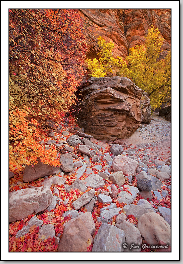
The color is great up on the east side this year ... IMHO. The possibilities are endless.
Canon 5DII
Canon 16-35mm f/2.8L II
16mm, f/22, 1/8 second, ISO 100
Comments
11 comments
Comment posted by Navin Sarma on October 25, 2012 at 11:42 PM
Outstanding comp and color. Love everything about it Jim!
Registered on July 17, 2011, 233 Posts, 1373 Comments
Comment posted by Patricia Brundage on October 26, 2012 at 7:01 AM
Good comp and techs, but just so much of one color that the elements lose their identity especially in the smaller image. Guess there justs needs to be more tonal range.
Registered on March 23, 2006, 1111 Posts, 6531 Comments
Comment posted by Gary McGhee on October 26, 2012 at 10:47 AM
I like it Jim, composition works really well and I love all the leaf litter.
Gary.
Registered on April 15, 2010, 142 Posts, 2416 Comments
Comment posted by Paul Breitkreuz on October 26, 2012 at 11:59 AM
I think what works best for me here Jim is the neutral or brown centered sandstone formation. To me all the very powerful colors seem to be drawn towards that location. A very nice find off the beaten path in a great area.
Registered on February 25, 2006, 525 Posts, 8448 Comments
Comment posted by Morris McClung on October 26, 2012 at 12:29 PM
Masterful placing of elements to make an excellent comp. Great color and the lighting allows the best of that to come through.
Beautiful work.
Registered on May 7, 2007, 670 Posts, 19650 Comments
Comment posted by Nancy Lea Sandy on October 26, 2012 at 3:31 PM
I really like the boulder and the way all the lines in this image seem to converge at that point. Excellent compositional skills. I wonder if it would be worth the effort to tease out just a little more contrast to help off set the predominance of warm tones? Just a thought. I like it quite well as is.
Registered on January 24, 2011, 576 Posts, 6942 Comments
Comment posted by Stuart Williams on October 27, 2012 at 1:01 AM
awash with warms - hardly a spot of cold colour to be seen. nice work
Registered on December 7, 2007, 247 Posts, 4792 Comments
Comment posted by Scott Smorra on October 27, 2012 at 12:30 PM
Beautiful image Jim. I really like the colors and the fallen leaves in the foreground.
Registered on November 2, 2009, 161 Posts, 2143 Comments
Comment posted by Tony Kuyper on October 27, 2012 at 2:05 PM
This is great, Jim. The comp and color just sing.
Registered on November 1, 2003, 364 Posts, 22328 Comments
Comment posted by Wayne Jones on October 27, 2012 at 11:11 PM
Hot colors, warm light, interesting textures, interesting POV and depth, all in a dynamic composition. What more could you want?
Registered on April 18, 2007, 953 Posts, 6435 Comments
Comment posted by Brian Schrayer on October 31, 2012 at 11:37 PM
I like this one a lot, Jim. I especially like the complimentary colors between the foliage and rocks. The composition is excellent as well. Beautiful image, Jim. Thanks for sharing.
Registered on May 28, 2004, 114 Posts, 2890 Comments

Comments
11 commentsGary.
Beautiful work.