Nature Photographers Network
This is the preserved archive of the original Nature Photographers Network. The community continues at naturephotographers.network.
Not Quite the Blues
‹ PreviousFlora GalleryNext ›

Not Quite the Blues

by Jaymes Dempsey

Gallery: FloraPosted August 28, 201268 views8 comments
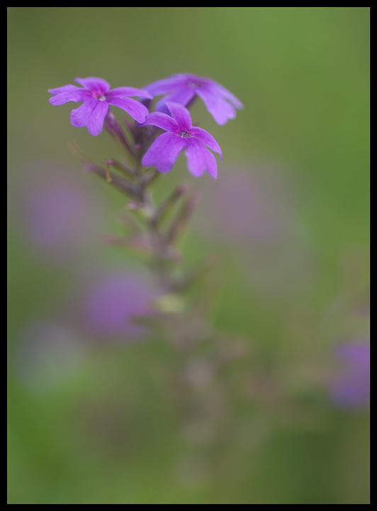
Here's a photo I took very recently, a couple of weeks back. I liked the slight sense of depth (at least, it felt to me as if there was), along with the colors. I always enjoy working when there are other flowers in the background...
I played around with the cropping for awhile, especially on the bottom, but ended up leaving a lot of space...it's just what seemed right at the time.

Nikon D200, 60mm, f/3.5, 1/125, ISO 200.

All comments and critiques appreciated.

Thanks in advance!
Jaymes :wavey:

Comments

8 comments
Comment posted by Ramamohan Pai on August 28, 2012 at 8:57 PM
Jaymes - I like your take on these tiny flowers - love the colorful background. I too like a few flowers in the background - they seem to work better for me than plain green background.

I might have liked a little more definition for the stem but I am not sure about it - it might mess up other elements in the frame, I think.
Registered on November 1, 2003, 550 Posts, 9037 Comments
Comment posted by Mark Seaver on August 29, 2012 at 9:02 AM
I like your "few among many" look. This is a very gentle and intimate look at these little flowers. I think the softness of the stem is about right; I know it's there, but I don't pay much attention to the spent flower stalks. My only suggestion is to possibly crop from the bottom to just below the oof bloom on the right. This removes a darker area while only changing slightly the sense of depth from the long stem.
Registered on January 23, 2011, 1103 Posts, 17270 Comments
Comment posted by Albert Darmo on August 29, 2012 at 7:07 PM
Hi jaymes :wavey: A beautiful composition, and the BG works very well with the main subject. the soft colors are a joy to behold, Agree with Mark about the size of the crop :smile:
Albert Darmo
Registered on November 25, 2008, 1386 Posts, 11978 Comments
Comment posted by scott lanz on August 29, 2012 at 8:22 PM
Jaymes, you have a real talent for the soft image. I think this is well done. I like the contrasting purple and green colors. I agree with Ram probably 90% of the time (with the other 10% of the time being when I am probably wrong), but I don't think I would want more definition in the stem given that the stem is made up of small stems with spent/lost blooms and probably not that attractive. I like the DOF and POF. My only (very minor) suggestion is to darken or clone the bright spot about 1/2 up the stem.
Registered on November 14, 2003, 840 Posts, 12902 Comments
Comment posted by Carolyn Derstine on August 29, 2012 at 8:57 PM
Beautifully soft image. I like your DOF choice to make the center of the front flower in focus and the rest fading into softness. The OOF flowers of the same color add nice harmony to this image. I also think a crop up from the bottom would be helpful.
Registered on February 16, 2011, 610 Posts, 3684 Comments
Comment posted by Gary Yeoh on August 30, 2012 at 4:48 AM
Jaymes:
This one is working out nicely. Like the softness all round and the few blurry ones in the bg. You have many suggestion on cropping and I will add my for your consideration. I agree with slight crop from the bottom but would also like to exclude the OOF one along the right edge (seems to draw to much attention to itself). A fine image.
Registered on September 1, 2009, 588 Posts, 8184 Comments
Comment posted by Nathan Buck on August 30, 2012 at 1:28 PM
I like the flower and the point of focus Jaymes. I also like the DOF. For me, there might be a tad too much room at the bottom.

Nathan
Registered on November 1, 2003, 1101 Posts, 13589 Comments
Comment posted by Lorna Taylor on August 30, 2012 at 8:01 PM
Just lovely, beautiful softness and wonderful BG work ! Love the colours ! :toast:
Registered on November 12, 2010, 254 Posts, 3083 Comments