Nature Photographers Network
This is the preserved archive of the original Nature Photographers Network. The community continues at naturephotographers.network.
Three sister's
‹ PreviousLandscape GalleryNext ›

Three sister's

by Peter Coskun

Gallery: LandscapePosted January 13, 2012360 views15 comments
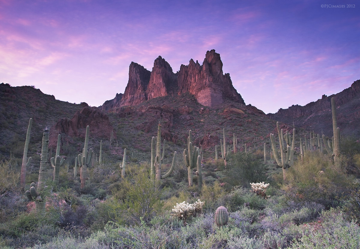
It's been a slow start so far this year in terms of finding a dramatic landscape. Well I turned that around today by exploring a new part of the superstition mountains. There were clouds in the sky so I decided to chance it and hit the road. I wanted to scout some new areas for an upcoming shot I've had in mind for a long time, and this seemed like the perfect place to start. I really didn't think anything was going to happen this evening even with the break in the clouds. I waited, and waited, and was accompanied by some cattle that spooked me a bit. And then some color came into the sky. This is a blend of two exposures for dynamic range. I also used both a 3 stop and 2 stop grad ND filter to allow a slower shutter speed. I did some dodging in the sky and a few layer masks to adjust the contrast. This is just how I saw this scene with my eyes (except the moving clouds of course but they aren't too noticeable anyways). Although I did boost the saturation five points to add just a little more punch. provided the large version which is a must see. Comments and critiques appreciated.

Canon 7d
Canon 17-40mm @17mm
F18
8 seconds
ISO 100
3 stop and 2 stop grad ND filters
Tripod
Two image blend for dynamic range

Comments

15 comments
Comment posted by Abdullaziz Bin Ali on January 13, 2012 at 7:57 AM
I really love the tone of the sky as well as the frame in general
what if you darken the bottom part of the image a little bit just to give the taste of reality :wink:

Thank you
Registered on May 31, 2009, 112 Posts, 1590 Comments
Comment posted by Marc Adamus on January 13, 2012 at 9:26 AM
Oh, I know this spot very well. I think this could be processed with much more drama, starting with more darkness/contrast/warmth/saturation below to bring out the glow on the Cactus, hide some of the brushy details and offer a more natural look. I would more or less forget about the grads if you were blending for DR anyhow. Sky colors can come from PS instead of 5-stops of grad too, and you'll have more control. The sky/light in this image was probably very similar to what you had here. Just a different processing approach.


Registered on September 17, 2005, 780 Posts, 8091 Comments
Comment posted by Michael J Greene, on January 13, 2012 at 10:48 AM
Hi Peter,

I am glad Marc chimed in and linked his image too, because the similarities are obvious. Anyways, I like the image real well. I do think the foreground needs burned down and there is obvious sharpening artifacts around the ridges of the mountains. No big deal though - this is a really nice shot. Thanks for sharing.

Michael
Registered on June 18, 2009, 86 Posts, 2317 Comments
Comment posted by Phil Pogledich on January 13, 2012 at 12:21 PM
I'd say you have some good raw material here that could benefit from some more post-processing along the lines of what has already been suggested. Marc has provided a nice template! Not that you should necessarily try to duplicate the look of his image, but the suggestions of increasing contrast, darkening the bottom part of the frame, and going for a bit more saturation are all very sound.
Registered on August 24, 2009, 123 Posts, 3099 Comments
Comment posted by Peter Coskun on January 13, 2012 at 12:33 PM
Thank you everyone. Marc, I have seen that image long ago when you first put it on your website and was amazed. I do have a version that is darker with more contrast and saturation (also some different frames with different sky), but wasn't sure if it was too much or not. I'll try to get that up for comparison. I was mostly concerned with having too dark of a shadow on the rock formation and losing some detail there. And as I mentioned, the grad's were mostly used to allow a longer exposure since I was going to blend anyways. I appreciate the feedback.
Registered on October 31, 2011, 170 Posts, 1240 Comments
Comment posted by Stan Rose on January 13, 2012 at 12:41 PM
Nice, Peter. After reading the comments, I'll offer a slightly different take. I don't think Marc's approach would work here because you'd be introducing 'drama' that wasn't necessarily there in the first place. Im guessing that looking at his shot, there was a lot more color in his cirrus clouds for him to work with. It may sound crazy, but personally, i would crop out the sky and mountain altogether in this shot, cause it's relatively mediocre (emphasize relatively) compared to the foreground scene, which I find fascinating with all the detail and balance. I think a lot of times, we get so fixated on 'the shot' that we overlook some great opportunities. I imagine a 3 shot stitch at 40 mm of just the fg here could have been mind-blowing. I like this shot, just responding to the comments :wink:
Registered on September 15, 2005, 836 Posts, 17099 Comments
Comment posted by Ed Lowe on January 13, 2012 at 12:42 PM
I really like what you have done here, Peter. The warm glow in the sky along with that on the peak is simply fantastic. I agree with the suggestion to darken the FG just a bit. Still a lovely image.

Ed
Registered on February 7, 2004, 414 Posts, 7115 Comments
Comment posted by Peter Coskun on January 13, 2012 at 12:46 PM
Thanks for you input Stan. While my purpose was to get the rock formation in the image, I did consider framing just the cacti below. In fact there are even better places in this general area to get that type of shot. I'll definitely be back at this location, so I will be able to try different compositions and look for new images.

Thank you Ed, I appreciate it.
Registered on October 31, 2011, 170 Posts, 1240 Comments
Comment posted by Peter Coskun on January 13, 2012 at 12:58 PM
Here is a repost of the darker version.
Registered on October 31, 2011, 170 Posts, 1240 Comments
Comment posted by Sebastian Kraus on January 13, 2012 at 2:36 PM
Really nice scene, however darker version is really close to be perfect! Nice shot any way! :toast:
Registered on March 17, 2011, 30 Posts, 132 Comments
Comment posted by Basil Greber on January 13, 2012 at 6:27 PM
Excellent. The large version is a must see indeed - there's so much detail to be seen and appreciated! Excellent composition and great colors. Your style shows very clearly in this one.
Registered on November 8, 2005, 219 Posts, 1340 Comments
Comment posted by Peter Coskun on January 13, 2012 at 6:43 PM
Thanks Basil. There is so much detail, that even in the large version you can not see everything. The print I'm making of this should do a pretty good job though.
Registered on October 31, 2011, 170 Posts, 1240 Comments
Comment posted by Dan Baumbach on January 13, 2012 at 8:35 PM
I like both versions. It depends what you're looking for. The darker version certainly grabs you more quickly but which version will hold your attention more over time?

- Dan
Registered on November 1, 2003, 473 Posts, 7980 Comments
Comment posted by Tony Kuyper on January 13, 2012 at 10:53 PM
I really, really like the comp. Very dramatic with the peak towering over the cacti. The bottom of the image seems less dramatic with it being so much lighter (maybe too light?) . The bottom edge especially seems like it would look better burned darker.

Edit: Oops, just noticed the repost. Bottom much better there. Maybe top is too dark now.
Registered on November 1, 2003, 364 Posts, 22328 Comments
Comment posted by Peter Coskun on January 14, 2012 at 1:01 AM
Thanks Tony, I've been working on different variations of this image and the processing. This is a slightly different frame (mostly just different clouds). This has some warmer light and I tried to do a better job with the burning/dodging.
Registered on October 31, 2011, 170 Posts, 1240 Comments