Nature Photographers Network
This is the preserved archive of the original Nature Photographers Network. The community continues at naturephotographers.network.
This is Utah - RE-POST
‹ PreviousLandscape GalleryNext ›

This is Utah - RE-POST

by Carol Hyman

Gallery: LandscapePosted September 28, 2011769 views10 comments
Folks, I would really like some feedback on this image and the changes I've made ...

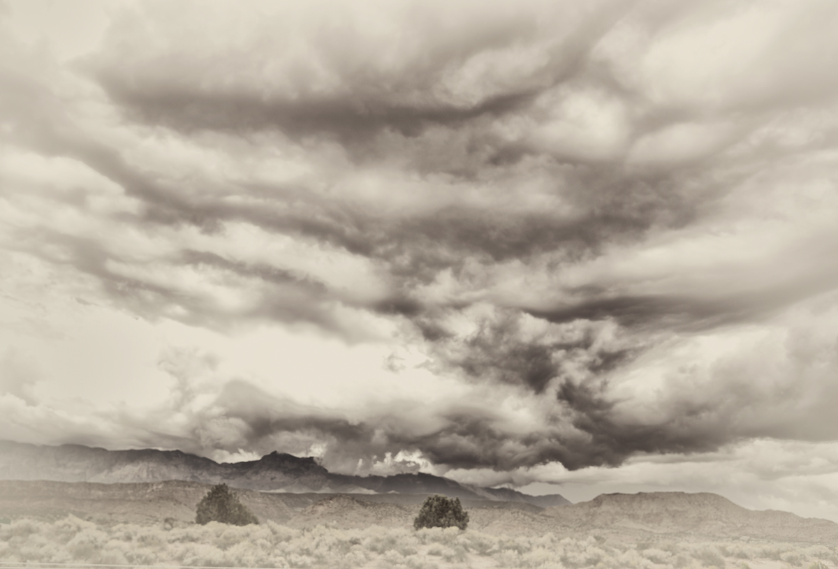
I went back to the drawing board and cropped the image differently, added a gradient in ACR to the left to help balance the clouds, and converted the image to black and white, using a vignette.

I'm not overly fond of images that show things in twos but in this case, I think the two bushes help direct the eye back to the knobs on the hill where the down flowing clouds and spilling through the crevices, and I think the patterns in the clouds as well as the vignette help direct the eye around the image.

Here is the image as I posted it on Sunday.

Thank you in advance for your feedback.

Regards,

Carol

Comments

10 comments
Comment posted by John Tobias on September 28, 2011 at 2:48 PM
Carol, I have to say I prefer the first posting. This version to me seems underexposed. If the original is in color I would like to see it. Thanks for sharing.
Registered on September 12, 2009, 2120 Posts, 6455 Comments
Comment posted by Nancy Lea Sandy on September 28, 2011 at 2:58 PM
My vote is also for the original post. The second version lacks the texture and drama of the first. The trees in the original still work to lead the eye back to hills but are less prominent. In this version, the trees could actually be the subject and I don't think that was your intent. I really like the drama in cloudscapes and the original version has plenty of that.
Registered on January 24, 2011, 576 Posts, 6942 Comments
Comment posted by Morris McClung on September 28, 2011 at 4:34 PM
One more vote for the original. This does look vintage, though. Like something one of the first photographers to see it might have done.
Registered on May 7, 2007, 670 Posts, 19650 Comments
Comment posted by Mark Metternich on September 28, 2011 at 7:28 PM
I think this is cool. Very original. Creative.

I think the reverse vignette could be reduced a tad, maybe.
Registered on June 19, 2009, 276 Posts, 6240 Comments
Comment posted by Rudy Ruberti on September 28, 2011 at 8:40 PM
This has an interesting vintage look, but I like additional contrast in the original. I find the bottom to be a little too bright, but really like the sky.
Registered on October 28, 2008, 179 Posts, 1875 Comments
Comment posted by Stan Rose on September 29, 2011 at 1:24 PM
The original. Better contrast. But the posterization is gone in this one :wink:
Registered on September 15, 2005, 836 Posts, 17099 Comments
Comment posted by Lon Overacker on September 29, 2011 at 4:08 PM
Hi Carol,

Nice to see you posting here - sorry I missed commenting on your previous version from here. But I might as well do it here since I'll have to agree with the others that I prefer the previous version. The drama and contrast of the other really help define that landscape. Here, while I think the processing and vignetting work well, the scene I don't think, is strong enough to hold up with the processing - if that makes sense. Where as previously, the contrast and drama in the sky are enough to hold things up.

Thanks for posting.

Lon
Registered on November 24, 2006, 521 Posts, 19147 Comments
Comment posted by Bill Chambers on September 29, 2011 at 4:28 PM
Of the two, I prefer the original best, but that doesn't mean I don't like this because I do; it's just different than the first. I think with a little more tweaking on the processing I might even like this version better. I think backing off the reverse vignetting a little and the addition of some grain might help it look even more vintage.
Registered on April 10, 2005, 753 Posts, 21216 Comments
Comment posted by Carol Hyman on September 29, 2011 at 4:51 PM
Thank you all for your comments both on this and the original version of the image posted earlier in the week.

I've continued to re-work the image going back to the original with each iteration until I was totally confused as to who or what was on first--so to speak ;^)

This is what I've finally come up with. (Sure hope I'm posting the correct image). I've added in a smidgeon of the original coloring and reduced the vignette. I've also darkened the shrubs so that no one will mistakenly think they are the subject. The sky and clouds are the primary subject and the far off hills and layers of low-lying clouds are the secondary subject.

Again, I do appreciate the feedback. It's been extraordinarily helpful.

I've continued to re-work this because I think it is so typical of skies in the state of Utah for 3/4ths of the year.

Thank you all.

Regards

Carol
Registered on January 18, 2007, 597 Posts, 8062 Comments
Comment posted by Youssef Ismail on September 29, 2011 at 8:25 PM
I have to agree with Lon. However as presented, this photo harkens to some of the early photographic work of the 19th century which is appealing.
Registered on November 1, 2003, 474 Posts, 5555 Comments