Nature Photographers Network
This is the preserved archive of the original Nature Photographers Network. The community continues at naturephotographers.network.
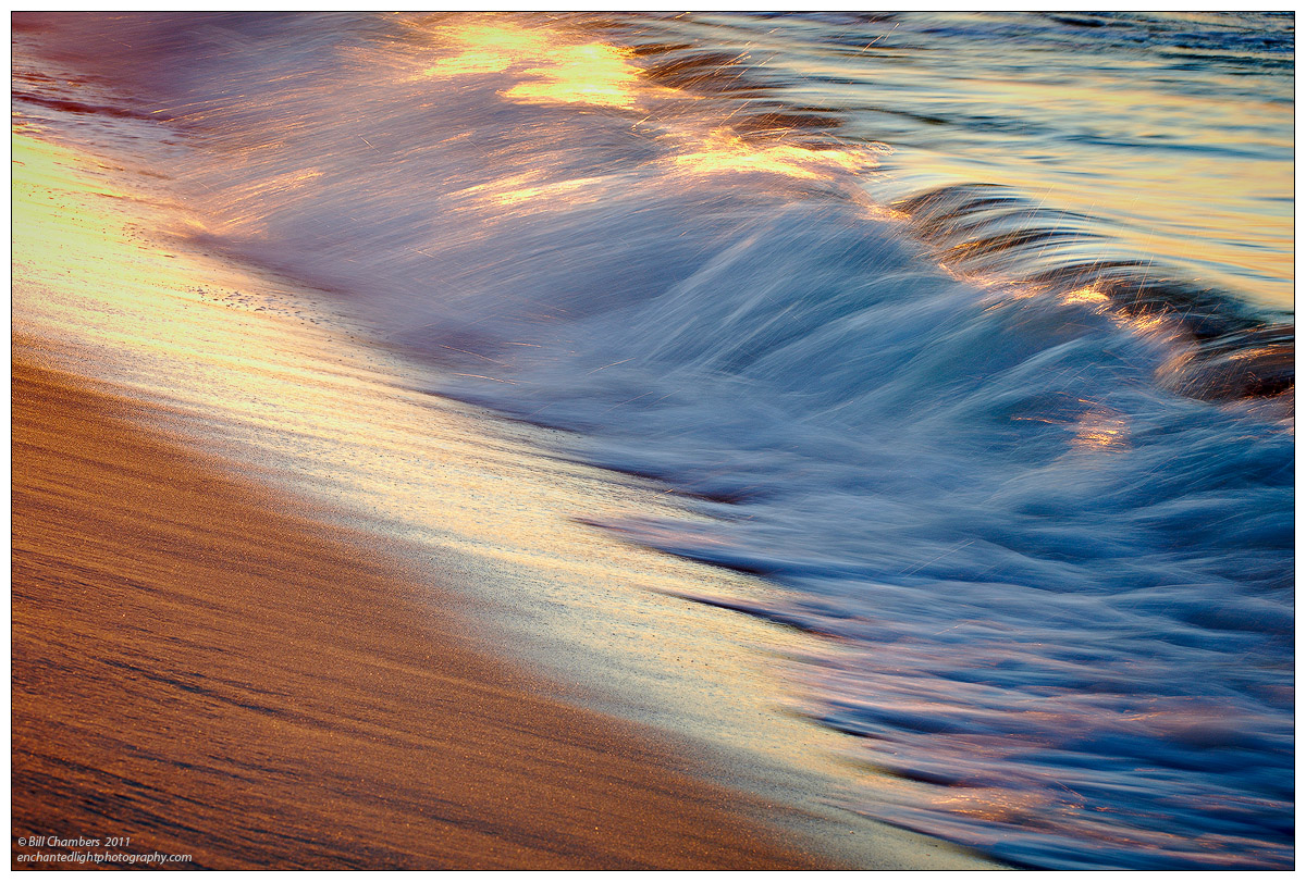
Awash abstract
‹ PreviousLandscape GalleryNext ›

Awash abstract

by Bill Chambers

Gallery: LandscapePosted September 15, 2011321 views18 comments
I'm a bit torm on this one - there's parts of it I really like, and other parts where I'm on the fence. Please let me know your thoughts - keep or trash?

D2x w/ 70-200 @ 125mm
1/15 @ f/15
100 ISO
No filters
tripod
Capture One 6, CS4, TK's actions

Thanks for looking and commenting.

Comments

18 comments
Comment posted by Tom Haxby on September 15, 2011 at 8:15 PM
What I like is that the sand has flow lines too and the pleasing color palette especially in the LRC. I am guessing that you are not as crazy about the bright highlight at the top. Overall, it is a keeper for me. Sometimes we can be our own worst critics, but this is well seen and well done.
Registered on July 6, 2006, 126 Posts, 647 Comments
Comment posted by Youssef Ismail on September 15, 2011 at 9:42 PM
Sorry Bill, not up to your level of image. I would not keep it. The composition is nice bu those highlights blow it for me.
Registered on November 1, 2003, 474 Posts, 5555 Comments
Comment posted by Rob Blakers on September 16, 2011 at 3:44 AM
Nice little design and image. Don't throw it away! Fine textures and colour and overall very pleasing to the eye.
Registered on February 26, 2011, 8 Posts, 67 Comments
Comment posted by Balan Vinod on September 16, 2011 at 5:45 AM
Bill ....beautiful diagonals ....beautiful concept too...well done ..

Balan Vinod
Registered on March 20, 2006, 889 Posts, 2312 Comments
Comment posted by Bob&Charly Nelson on September 16, 2011 at 8:13 AM
By all means DON'T trash it Bill. I like a crop just below the bright highlights on the crest. Thhis shows great motion in my opinion. I like it.
Bob
Registered on October 27, 2005, 289 Posts, 4202 Comments
Comment posted by scott lanz on September 16, 2011 at 8:57 AM
Striking image, IMO. Good lines, patterns, texture and colors.
Registered on November 14, 2003, 840 Posts, 12902 Comments
Comment posted by Bill Chambers on September 16, 2011 at 9:19 AM
Thanks guys for your opinions. I'm leaning toward trashing it. I think I agree with Youssef. I think cropping the bright areas out would chop it up too much - I think a return trip is called for - good thing the beach is only 5 minutes away.
Registered on April 10, 2005, 753 Posts, 21216 Comments
Comment posted by Nick Bristol on September 16, 2011 at 10:12 AM
Hi Bill, This really has some beautiful color and wonderful textures. I also like the overall feel of this, and it is quite pleasing to look at for me. The bright highlights do take away from it and I agree with you about cropping not working. I do enjoy looking at this anyways! Your shutter speed was perfect. I would go back, only 5 minutes away, that must be pretty nice!

Nick Bristol
Lone Rock, WI
Registered on February 1, 2004, 752 Posts, 14140 Comments
Comment posted by Michael R Reynolds on September 16, 2011 at 10:22 AM
Bill,
I'm enjoying the sense of movement in this image. The colors are also quite pleasing. The comp might be a little condensed, but I think it works. Best Regards.
Registered on February 26, 2008, 54 Posts, 812 Comments
Comment posted by Jorne de Bruin on September 16, 2011 at 12:56 PM
I like the lines in the sand and the movement in the water combined with the light, but I agree the highlights are not very appealing.
Registered on June 26, 2008, 178 Posts, 2136 Comments
Comment posted by Morris McClung on September 16, 2011 at 2:12 PM
I think it's a wonderful moment captured. There are a lot of compelling elements in this. I don't think I could bring myself to trash it. I wonder if we are looking for too much perfection sometimes. Show it to non photographers and see what they say. I'm betting they will like it.
Registered on May 7, 2007, 670 Posts, 19650 Comments
Comment posted by Jimmy Gekas on September 16, 2011 at 4:01 PM
Works for me! :toast:
Registered on July 26, 2007, 244 Posts, 2807 Comments
Comment posted by Thomas Miller on September 16, 2011 at 4:07 PM
I really like this image, but the highlights are a bit too high, but I still like it.
Registered on March 10, 2011, 56 Posts, 56 Comments
Comment posted by Chris Chamberlain on September 16, 2011 at 8:34 PM
It's a great comp, and vision to see this. Like you, there are a lot of things I like about it. Biggest issue for me are the hot spots. I think a crop could work?? But even better, the easy opportunity to try it again. It's worth the effort.

Chris
Registered on March 13, 2007, 500 Posts, 8365 Comments
Comment posted by Barbara Graham on September 16, 2011 at 9:18 PM
I like it, including the highlights.
Registered on July 27, 2010, 1310 Posts, 5035 Comments
Comment posted by Tony Kuyper on September 16, 2011 at 11:40 PM
As a large print, the highlights might stand out a bit, but for a web-sized image, it's works just fine, I think. Really like the colors and diagonals here.
Registered on November 1, 2003, 364 Posts, 22328 Comments
Comment posted by Hamed Musharbak on September 17, 2011 at 4:10 PM
is this a water brush :razz: :biggrin:

nice layers & motion

Hamed
Registered on June 1, 2009, 372 Posts, 2282 Comments
Comment posted by Lon Overacker on September 18, 2011 at 1:59 PM
Bill,

The simplicity of this really works. I don't think it has the impact as your previous image, but this is still dynamic and beautifully photographed. I'm a little torn about the highlights up top, but the nice golden color helps for sure. I certainly wouldn't discard this one!

Lon
Registered on November 24, 2006, 521 Posts, 19147 Comments