Gallery: LandscapePosted June 1, 2011246 views15 comments
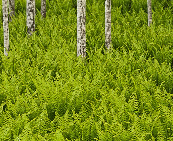
These were the greenest ferns I have ever seen. Took this in a ditch on the side of the road.
7D
f11
1/50 sec
iso 500
Comments
15 comments
Comment posted by Floris van Breugel on June 1, 2011 at 7:22 PM
Wow, that is incredible! I've never seen such a green and perfect monoculture of ferns like that. I love the white trunks for contrast too. I would take a slight crop off the right (or add more space on the left, if you happen to have a composition with that). Also the web sharpening looks like it could take quite a boost. Lastly, I think if you darken the image you could work a little more with the contrasts, creating some more tonal variations (using the subtle shadows in the ferns) to add more depth to the image. That might sound like a lot of nits - just ideas to consider, overall I really like this image!
Registered on December 19, 2008, 306 Posts, 4840 Comments
Comment posted by Eva McDermott on June 1, 2011 at 9:31 PM
Hi Todd - The imagrey is wonderful but the focus seems very soft. Greens also seem a little too bright for my taste. You may want to tone those down since the comp works for me as an abstract.
Registered on January 4, 2009, 1015 Posts, 13229 Comments
Comment posted by Steve Sieren on June 2, 2011 at 1:39 AM
Great eye Todd!
Registered on January 2, 2008, 360 Posts, 5321 Comments
Comment posted by Lon Overacker on June 2, 2011 at 2:20 AM
Todd,
Wonderful scene! I would just take Floris' comments and rubber stamp them; excellent suggestions on all counts. Makes my job easy.
Nice work, ditch or no ditch. Thanks for sharing.
Lon
Registered on November 24, 2006, 521 Posts, 19147 Comments
Comment posted by Todd Bielby on June 2, 2011 at 7:08 AM
Better?
Registered on March 10, 2011, 169 Posts, 392 Comments
Comment posted by Andreas Resch on June 2, 2011 at 7:21 AM
Wonderful, fresh and inspring. Love the contrast between the fern and the static trees. Overall the shot feels a bit heavier on the left and a crop might be worth a try. This shot deserves to be better sharpened for the web to see even more of the lovely details.
I like the first version better - it's more vivid.
Registered on November 14, 2007, 322 Posts, 6101 Comments
Comment posted by Guy Tal on June 2, 2011 at 8:23 AM
Superb intimate composition and wonderful use of color. It does look very soft in this version, though, and could use more sharpening (and/or less compression).
Guy
Registered on November 1, 2003, 566 Posts, 15507 Comments
Comment posted by Bill Chambers on June 2, 2011 at 8:29 AM
Very neat image. I agree with Floris on the crop suggestion and sharpening suggestion. The basic ingrediants are certainly here for a great image, just needs a little refinement IMO.
Registered on April 10, 2005, 753 Posts, 21216 Comments
Comment posted by Mitch Erwin on June 2, 2011 at 10:00 AM
Todd, I'm glad I scrolled down to look at more as I usually take the All Galleries route when viewing images here. This is a great capture. I love the contrast in color and texture on this. If it were mine, I'd increase the contrast and sharpening on this. If this is the only comp you have, I'd also suggest cropping the bottom quite a bit, and a small amount off the right side to balance the trunks in the frame. One great image!
Registered on April 24, 2006, 98 Posts, 656 Comments
Comment posted by James Fougère on June 2, 2011 at 2:05 PM
Very Unique, well done, agree with the suggestions
Registered on October 25, 2010, 41 Posts, 831 Comments
Comment posted by Lon Overacker on June 2, 2011 at 4:44 PM
Todd,
Thanks for posting a re-worked version. I think the sharpening for the web looks a bit better, but personally I would say you went too far on the darkening. I think you lost some of the vibrance and saturation. Not sure how you went about darkening, but if you can play with just the highlights - dropping those down a bit rather than all of it. I think somewhere between your original and re-work is a happy medium. And actually I'm personally leaning more towards the original. Oh, and the small crop works well too.
Lon
Registered on November 24, 2006, 521 Posts, 19147 Comments
Comment posted by Michael Anderson on June 2, 2011 at 10:16 PM
This is STELLAR Todd. The composition is outstanding. One of the best intimate forest compositions I've seen in quite awhile. The textures are wonderful. It's amazing how similar all of the ferns are, and they all look so vibrant. Really, really nice image!
Registered on January 31, 2006, 228 Posts, 3072 Comments
Comment posted by Vance Gese on June 3, 2011 at 9:14 PM
Love your composition. An amazing sea of ferns with wonderful, vibrant color. Would go with your first post and bump the sharpening as you did in the second in my opinion.
Registered on November 13, 2008, 298 Posts, 6629 Comments
Comment posted by Mark Metternich on June 4, 2011 at 3:15 PM
Phenomenal composition and photo!!!
But the processing especially the lack of sharpness hurts it. Apply some advanced custom sharpening to it and it will soar.
Mark
Registered on June 19, 2009, 276 Posts, 6240 Comments
Comment posted by Barbara Graham on June 8, 2011 at 6:10 AM
Todd, for me the first version is really, really appealing with colors and incredible lines.
Registered on July 27, 2010, 1310 Posts, 5035 Comments

Comments
15 commentsWonderful scene! I would just take Floris' comments and rubber stamp them; excellent suggestions on all counts. Makes my job easy.
Nice work, ditch or no ditch. Thanks for sharing.
Lon
I like the first version better - it's more vivid.
Guy
Thanks for posting a re-worked version. I think the sharpening for the web looks a bit better, but personally I would say you went too far on the darkening. I think you lost some of the vibrance and saturation. Not sure how you went about darkening, but if you can play with just the highlights - dropping those down a bit rather than all of it. I think somewhere between your original and re-work is a happy medium. And actually I'm personally leaning more towards the original. Oh, and the small crop works well too.
Lon
But the processing especially the lack of sharpness hurts it. Apply some advanced custom sharpening to it and it will soar.
Mark