Comment posted by Harry Lichtman on May 3, 2011 at 4:26 PM
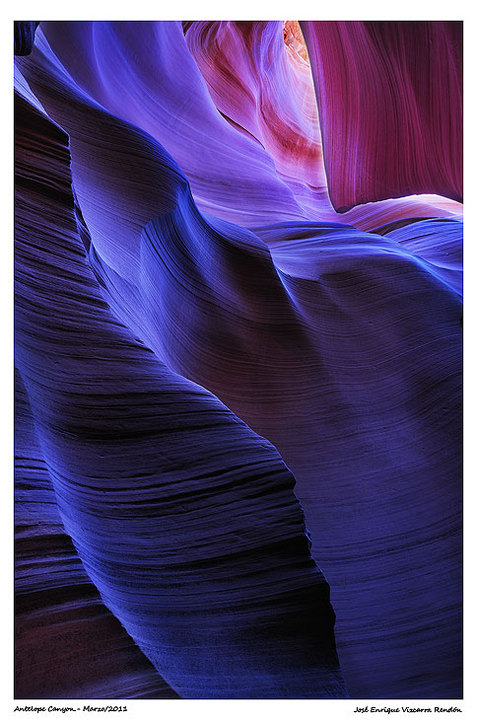
Beautiful tones and textures. Seem to be some halos around the URC sandstone, maybe oversharpened, but I don't see it in other areas of the image Perhaps due to some blending you may have done. Soothing!
Registered on September 17, 2010, 304 Posts, 3507 Comments
Comment posted by dean hebert on May 3, 2011 at 4:34 PM
Ditto Harry's comment. Love the deep tones.
Registered on August 4, 2010, 70 Posts, 1132 Comments
Comment posted by Pete D on May 3, 2011 at 4:41 PM
I didn't see the original post, but except for the haloing that Harry mentions, this is great. The colors are serene and dreamy, but this is some tension set up (I think) because the bright area pulls one into the frame against the waves in the bluish area.
Pete D.
Registered on November 1, 2003, 590 Posts, 1794 Comments
Comment posted by Gary Crabbe on May 3, 2011 at 4:48 PM
I like the composition and leading lines from lower to upper corner. Personally I find the Blue too deep and rich, but that's just me.
Registered on November 1, 2003, 182 Posts, 1840 Comments
Comment posted by Chip Phillips on May 3, 2011 at 5:43 PM
A very moody image with lots of repeating lines to enjoy. The blue is a matter of preference for sure, but if it were mine I might try warming up mostly the upper right portion a touch. I like how the image reads bottom left to upper right. Fantastic comp. Chip
Registered on November 26, 2007, 128 Posts, 1436 Comments
Comment posted by Patricia Brundage on May 3, 2011 at 7:46 PM
Nice series of canyon shots... each different and one of a kind, but all just a delight to view. Thanks for sharing them.
Registered on March 23, 2006, 1111 Posts, 6531 Comments
Comment posted by Eva McDermott on May 3, 2011 at 8:52 PM
I personally like the blue mood Enrique. A bit different than most Antelope Canyon images. Wonderful series.
Registered on January 4, 2009, 1015 Posts, 13229 Comments
Comment posted by Michael J Greene, on May 4, 2011 at 11:04 AM
Beautiful comp Enrique. I love the transition of color from cool to warm. The light is stunning. As previously mentioned, the haloing in the upper right hand corner is noticeable. If it were mine, I'd consider reducing the saturation just a tad, at least for print. Buenas Dias.
Michael
Registered on June 18, 2009, 86 Posts, 2317 Comments
Comment posted by Enrique Vizcarra on May 4, 2011 at 7:04 PM
Harry Lichtman
Thanks for your observation, I had not noticed, I'm going to correct
dean hebert
Thank you very munch
Pete
Thank you very munch
Gary Crabbe
Thank you very munch
Chip Phillips
thank you very much
Patricia Brundage
thank you very much
Eva McDermott
thank you very much
Michael J Greene
Thank you very munch Michael , or I should say?
Muchas gracias?
veo que vas mejorando tu español:)
The next time I'm not going to have to speak English :)
Registered on September 10, 2009, 223 Posts, 393 Comments

Comments
9 commentsPete D.
Michael
Thanks for your observation, I had not noticed, I'm going to correct
dean hebert
Thank you very munch
Pete
Thank you very munch
Gary Crabbe
Thank you very munch
Chip Phillips
thank you very much
Patricia Brundage
thank you very much
Eva McDermott
thank you very much
Michael J Greene
Thank you very munch Michael , or I should say?
Muchas gracias?
veo que vas mejorando tu español:)
The next time I'm not going to have to speak English :)