Nature Photographers Network
This is the preserved archive of the original Nature Photographers Network. The community continues at naturephotographers.network.
Movie Oaks
‹ PreviousLandscape GalleryNext ›

Movie Oaks

by Craig Myers

Gallery: LandscapePosted April 9, 2011253 views8 comments
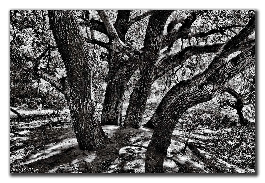
I'm still trying to improve my B&W techniques. I made this conversion using the controls in LR3. This cluster of oaks is located in a local park at the base of the foothills here in Simi Valley. The park used to be the site of Corriganville movie ranch which was a real weekend attraction back in the 1950's thru early 60's. The city took over the property and tore down all the old sets and now the park is returning slowly to its natural state. The oaks pictured are in a part of the park that is called Sherwood Forest due to the fact that the Errol Flynn version of Robin Hood was filmed in these woods.

Canon EOS 5DMk2; 1 sec @ f/16; ISO 50; -2 EV; 33mm; 16-35 2.8L; tripod; cable release.

Comments

8 comments
Comment posted by Tony Siciliano on April 9, 2011 at 1:58 AM
Fabulous composition!! Well done.

On my screen and to my eye it looks over sharpened and too contrasty....always a subjective choice though.
Registered on May 21, 2007, 48 Posts, 33 Comments
Comment posted by Harley Goldman on April 10, 2011 at 8:11 PM
My thoughts echo Tony's. I really like the composition, but I find the contrast a bit too intense for my tastes, especially in the tree trunks.
Registered on November 19, 2003, 586 Posts, 11271 Comments
Comment posted by Craig Myers on April 10, 2011 at 11:39 PM
Tony, Harley,

Is it because of the white that's on the trunks? Because that light coloration is on most of the trunks in this grove. I don't know what it is, but it is characteristic of all the trees at this locale. I'll try to make it less intense through local adjustments. Let me know if I'm going down the wrong trail.

C
Registered on September 1, 2008, 85 Posts, 757 Comments
Comment posted by Tony Siciliano on April 11, 2011 at 1:38 AM
I think the scene just has a lot of dynamic range; in fact, my first impression was that it was an HDR image. Try globally decreasing the contrast and sharpness and see what happens. If there are blown highlights on the histogram you could also try getting rid of them using the various techniques available in Photoshop.
Registered on May 21, 2007, 48 Posts, 33 Comments
Comment posted by Harley Goldman on April 11, 2011 at 12:06 PM
For my eye, the back highlights are not really bothering me. I am seeing the heavy blacks and whites on the tree trunks and that is not looking right to me. The background and ground highlights look right for the time of day and the image.
Registered on November 19, 2003, 586 Posts, 11271 Comments
Comment posted by Craig Myers on April 11, 2011 at 12:46 PM
Thanks very much for the insights. I'll give this another go.
Registered on September 1, 2008, 85 Posts, 757 Comments
Comment posted by Preston Birdwell on April 11, 2011 at 11:58 PM
Craig,

I like the comp: it hasa nice flow. Looking at the tonalities in the image, I see good whites and rich blacks; it's the midtones and separation in the midtones that's wanting, I think. This image has great potential and is worth exploring other processing options.

--P
Registered on November 1, 2003, 471 Posts, 5188 Comments
Comment posted by Paul Duval on April 12, 2011 at 8:54 PM
Composition is good as well as the story behind the image, but the dark is a little too dark and the light a little too light on the trunks. It is a toughlight situation though with the filtered light and shade.

Paul
Registered on June 30, 2009, 508 Posts, 1907 Comments