Nature Photographers Network
This is the preserved archive of the original Nature Photographers Network. The community continues at naturephotographers.network.
North Lake Storm/ W Edit
‹ PreviousLandscape GalleryNext ›

North Lake Storm/ W Edit

by Chris Chamberlain

Gallery: LandscapePosted March 31, 2011467 views20 comments
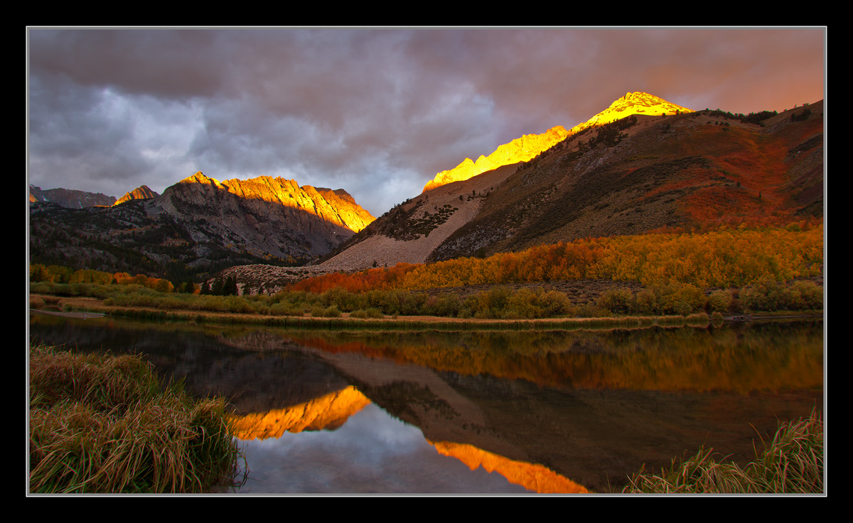
Thought I'd give ya a break from all my winter images. I just stitched this up. It's pretty much the best I can do with what I know about processing. I think the brightest area of the peaks is too bright, and maybe too yellow. But any attempt to change is a move in the worse direction IMO. Also the far shoreline is distorted. I fixed it about as much as lens correction was able to. I tried doing a little more with crops but didn't really help any more than this. So, Do you agree with my issues about the image? Are these issues nits, or bigger problems? Or, do you think it's good to go as is?

D200,
18-70mm,
GND,
2sec, F/9.5

Thanks,
Chris

Comments

20 comments
Comment posted by Peter Cross on March 31, 2011 at 2:13 AM
Beautiful imager Chris but I agree with you: the far mountain is way to bright and too yellow. I'm not a PP person so can't give advice on that. But if it could be fixed, it would be a real winner. The composition is great, sky pretty dramatic, great reflection in the water. Lot going for it.

Peter
Registered on April 3, 2010, 271 Posts, 1342 Comments
Comment posted by Andreas Resch on March 31, 2011 at 2:22 AM
I love the overall warm mood here and the light on the peaks. I would agree that you could try to get back just a hint of structure on the bright mountains (check the RGB channels - sometimes you'll find some structure in one of them). I'm also surprised that the LLC seems to have a lot of CA's while the LRC seems OK. But if you tried your best, what can you do about it.
Registered on November 14, 2007, 322 Posts, 6101 Comments
Comment posted by Ryan Dyar on March 31, 2011 at 3:31 AM
Love it! The bright peaks dont bother me as much as the distorted shoreline. The peaks are just a matter of maybe burning the highlights down. For the shoreline, I might try going into Edit > Transform > Warp, and then trying to even it out a little.

Either way, a very intriguing image. :toast:
Registered on November 8, 2008, 22 Posts, 129 Comments
Comment posted by Michael J Greene, on March 31, 2011 at 12:44 PM
Outstanding conditions Chris. I'd like to see a repost with the others' suggestions. I do think this looks good as presented too. I wouldn't mind seeing the highlights on the peaks pulled back just a bit if I had to suggest something. Have a great day.

Michael
Registered on June 18, 2009, 86 Posts, 2317 Comments
Comment posted by Nick Bristol on March 31, 2011 at 1:15 PM
That is a beautiful scene, Chris. I like the light, reflection and your comp. I don't really have the processing skills to help much otherwise, but I think the suggestions made are good ones.

Nick Bristol
Lone Rock, WI
Registered on February 1, 2004, 752 Posts, 14140 Comments
Comment posted by Koveh Tavakkol on March 31, 2011 at 1:40 PM
Clouds and light look fantastic here Chris. The lens bend is a little distracting, but as you said you did the best you could.
Registered on September 1, 2009, 41 Posts, 608 Comments
Comment posted by Phil Pogledich on March 31, 2011 at 4:21 PM
I pretty much agree with your issues. It's a good image even with the lens distortion and the overly bright yellow light on the peaks, but perhaps those issues can be fixed with some of the suggestions that have been offered. As-is, I'd say that you've got a lot of other work that is stronger even though, as I said, it's certainly a good image..
Registered on August 24, 2009, 123 Posts, 3099 Comments
Comment posted by Sebastian Kraus on March 31, 2011 at 5:37 PM
In my opinion light on top is bit to bright, part of that is greate photo! :toast:
Registered on March 17, 2011, 30 Posts, 132 Comments
Comment posted by Vance Gese on March 31, 2011 at 5:53 PM
Fantastic light and reflection, Chris. The curving shoreline sort of throws me, and I have no idea how one fixes that. But other than that, this is really nice in my book. Love the color as well.
Registered on November 13, 2008, 298 Posts, 6629 Comments
Comment posted by Morris McClung on March 31, 2011 at 6:20 PM
I see why you want to do what you can to improve the points you made about the issues. This has a ton of potential, and I think the suggestions so far will take you closer to where you are trying to go with this one. The color, except for the bright peaks being too yellow as you and others point out, is beautiful and you have caught some very nice detail in the shadows. Be sure and repost when you get through with it.
Registered on May 7, 2007, 670 Posts, 19650 Comments
Comment posted by Eva McDermott on March 31, 2011 at 7:16 PM
This does have a lot of potential Chris with beautiful light. With regards to the lens correction, did you apply lens correction to each image before stitching? I have never stitched images but I am trying to think about reasons for the distortion.
Registered on January 4, 2009, 1015 Posts, 13229 Comments
Comment posted by Tony Kuyper on March 31, 2011 at 11:51 PM
The light is so spectacular here that it's hard to see any problems, Chris. The comp and light are great.
Registered on November 1, 2003, 364 Posts, 22328 Comments
Comment posted by Chris Chamberlain on March 31, 2011 at 11:59 PM
Thanks so much for the suggestions! I never even knew about the transform/warp function. That's great, thanks Ryan. Also removed the CA's in the lower left corner, thanks Andreas. Tried to remove some yellow, and light intensity on the brightest peak some more. Finally a little color balance adjustment and a slight boost in global color. Watyathink????

Chris
Registered on March 13, 2007, 500 Posts, 8365 Comments
Comment posted by Bill Chambers on April 1, 2011 at 9:54 AM
I think the repost is better than the original, but I think one in between the two would be even better. For me however, the image is all about the gorgeous reflection and the trees, etc. on the distant bank. Beautiful.
Registered on April 10, 2005, 753 Posts, 21216 Comments
Comment posted by Mark Metternich on April 1, 2011 at 2:33 PM
Sweet! Nice light and nice reflection! :toast:
Registered on June 19, 2009, 276 Posts, 6240 Comments
Comment posted by David Edwards on April 1, 2011 at 7:32 PM
Wonderful color in this image, Chris. I love the warm quality of the light washing over the whole scene. I don't mind the bright mountain top so much as the heavy distortion, which you've fixed quite well in the repost with a manual warp. The color boost has also given it a bit more pop, but maybe bordering on a bit much. Perhaps just a boost to the sky and fall color might give a bit more separation.
Registered on December 6, 2008, 142 Posts, 2623 Comments
Comment posted by David Chauvin on April 1, 2011 at 7:33 PM
The corrected horizon is a big improvement to me. The light here is gorgeous. :cool:
Registered on August 5, 2004, 1007 Posts, 5595 Comments
Comment posted by Stan Rose on April 1, 2011 at 8:50 PM
I dont mind the yellow--looks ok to me. The shoreline distortion is a bit annoying, but its a nice comp and great conditions--a keeper for sure! :wavey:
Registered on September 15, 2005, 836 Posts, 17099 Comments
Comment posted by Zack Clothier on April 2, 2011 at 9:46 AM
Chris, first of all beautiful light and wonderful composition. The distortion was a big problem for me in the first version, repost with the shoreline corrected looks great. It looks like you had some blown highlights in the mountain in the middle and right hand side and by trying to burn them down it gave them a flat, dull look. Perhaps go a bit lighter on the burning in those areas to somewhere in between the two.
Registered on January 28, 2010, 343 Posts, 2257 Comments
Comment posted by Lon Overacker on April 2, 2011 at 1:45 PM
Chris,

Beautiful and semi-dramatic autumn scene from North Lake - I remember all the wonderful images from last fall. The original is distorted too much for me, but the repost certainly takes care of that. As far as the highlights and saturation, I think those need to be toned down a bit for the mountain tops. Perhaps even brightening the midtones and contrast of the remaining landscape could work too.

I think this would be a perfect image for Tony's Triple Play in bringing down those mountain top highlights. Give it a try. But the repost is most definite improvement.

Lon
Registered on November 24, 2006, 521 Posts, 19147 Comments