Keyhole REPOST
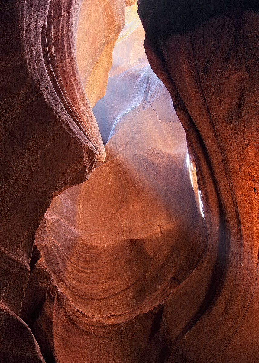
by Jason Risinger
I'm really on the fence about this one, especially regarding the composition, but also the processing. What do you think, is this one worth saving?
Any and all credit for processing goes to Tony Kuyper and his Photoshop actions. Any blame goes back to yours truly!
Canon 20D
Tokina 12-24

Comments
20 commentsChris
Wonderfull ligths and wonderfull composition
- Dan.
Like others have commented, I don't think I would be on the fence with this one. I think it's a great capture from the slots. The composition is excellent with very nice lines and flow; a very pleasing and almost calming perspective.
Processing wise I think you did very well to contain the range here. I think this is a perfect image to take Tony's techniques even further. With your permission can I post a revision? I could just picture this as an image Tony would use to demonstrate one of his techniques.
I think it's a wonderful image and certainly worth keeping and working on more.
Lon
I would suggest that you darken the bright white color mid right. Never-
theless, well done, Jason.
It's kind of funny, the natural colors and toned-down saturation have much more to do with failing to post the correct version than any intent on my part
Lon, not only do I give my permission, I would be honored if you would do as you propose. I eagerly look forward to seeing your take.
Thanks again folks, sincerely.
Actually your repost looks much better, so I'm not sure my rework is any better or not, especially just working from a small jpg. The color/sat and contrast is much better with your repost, but it's also a slightly different crop? Is this just a different crop, or a different exposure all together?
Anyway, if you're on Tony's distribution you should have received notice about his new tutorial and actions. He calls it the "Triple Play." I used this new technique and actions on your image. It's a bit difficult to compare with the web version and not having a PS file to compare side by side or turning off and on, but one thing I think that will show here is the increased detail in both the highlights and shadow areas. Don't confuse it with sharpness (remember I'm re-saving and re-compressing and re-sharpening a jpg.) Just compare the med shadow area on the right and the highlights up top and I think there's a bit of a difference. All I did was use his new actions. Well, I guess I better post this and see how it looks....
edit: Ok, posted now and I can see a difference. Ignore the oversharpening and the saturation is a bit different, but that's variable anyway between togs. The highlights up top have been toned down AND it appears to have more detail or definition. Especially in the orange face up top just left of center.
Drop me a note if you have any questions. I see you don't have your email link available. Hope this helps.
Lon
Gary.