Winter Elegance/ With Edits
by Chris Chamberlain
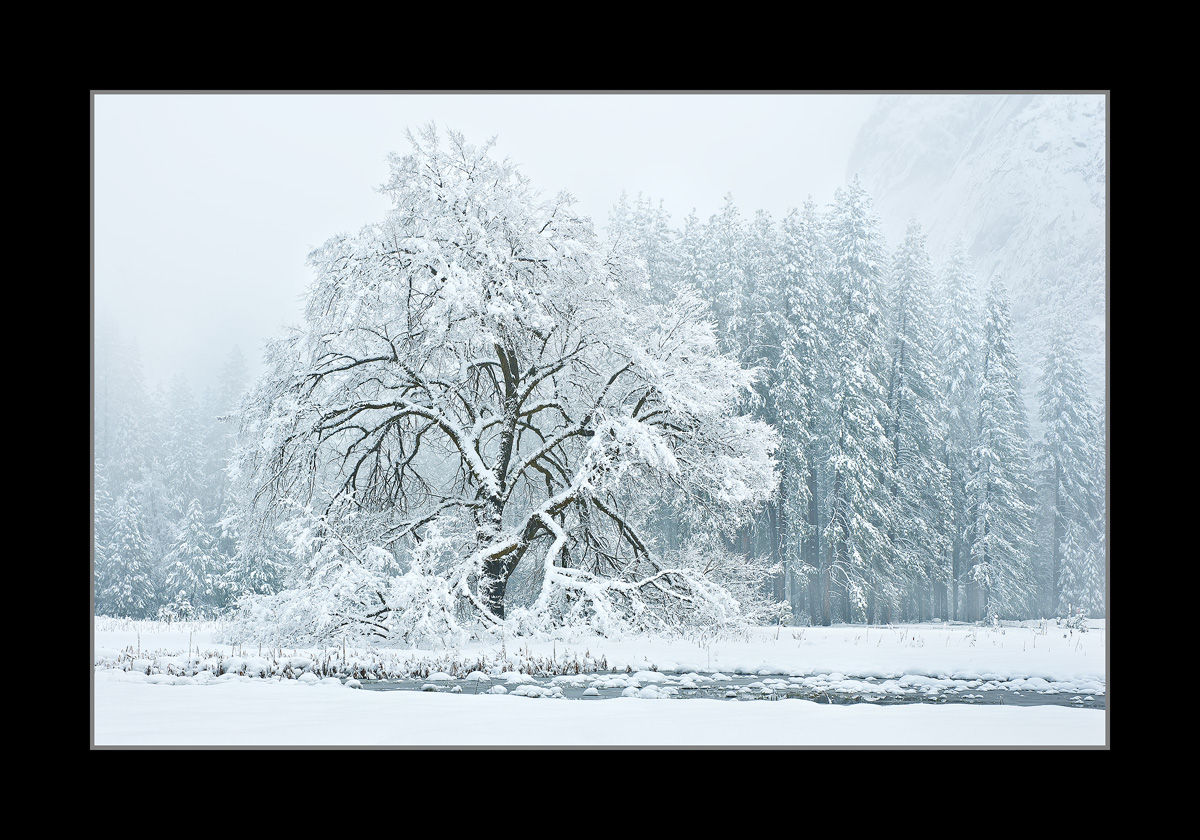
I was in awe of the absolute perfection of the scene in front of me on this morning. I hope I have captured in a way that presents that. It's neat to stand in 27 degree temps as the snow comes down around you, and never give the cold a second though. I like being distracted by beauty! I guess 27 isn't all that cold relatively speaking. I'd love to hear your thoughts. Large version included.
D200,
18-70mm,
1/4sec, F/11,
Thanks
Chris

Comments
40 commentsMono-chromatically perfect like that one note from a precisely tuned instrument that resonates through the air, time, space and memory with a singularity of beauty that is priceless. It's the opposite hushed end of the scale of those crashing beach cobbles at Pescadero, eh? You having a winter for the ages Ansel, Galen and John must be peeking over your shoulder as you make these images.
Paul
Oh that would be Adams. Clark and Muir, probably no room for George...George Fiske....familiar with him Chris? He was a contemporary of Carleton Watkins and lived in Yosemite. Winter images were his specialty as he lived in the valley year round. Wet Plate Photographer.
Oh, and 27 is definitely warm for a snowy scene like that!
light and details in the trees despite the falling snow.
I considered a conversion, and tried it. But with no real intense contrast in the scene, it seemed to loose something in translation. It seemed to go flat. I thought I could live with a slight color cast if there was one. To my eye, I wasn't sure.
Thanks,
Chris
- Dan.
Nick Bristol
Lone Rock, WI
Peter
Phenomenal! Perhaps the MOST photographed tree in all of Yosemite and you've pulled off a beauty. Although b&w would certainly be appropriate, I love the color version; the hint of green from the pines is a very nice touch of color. The foreground meadow makes for a wonderful and solid foundation. I have nothing to criticize or suggestion except to say, d*mn you!
Your friend,
Lon
To be honest, I don't really see a color cast. If I can't see it, I can't really correct it. I have posted a very subtle adjustment to the color balance. Cyan/Reds +5 toward red. Magenta/Greens -5 toward magenta, and Yellow/Blues +5 toward blue. It makes a slight difference. I'm also posting a B&W conversion further below.
Thanks
Thanks
The difference is subtle, but I can perceive it. The image is "colder" now, I like it more. I prefer the color version to the b&w, because it has more contrast between the branches of tree and the background.
Gary.
27 isn't bad at all until the wind comes and the faster it get the worse it is!