Nature Photographers Network
This is the preserved archive of the original Nature Photographers Network. The community continues at naturephotographers.network.
Transitions
‹ PreviousLandscape GalleryNext ›

Transitions

by Stan Rose

Gallery: LandscapePosted January 10, 2011224 views23 comments
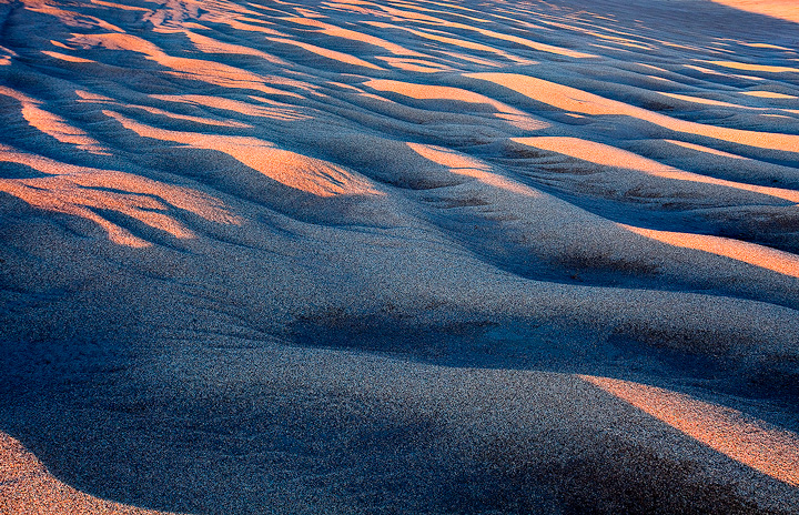
Great Sand Dunes, last week.
Usually i like the sharp deep shadows created by thee dunes at low light angles, but here the sun and dune crests were aligned in such a way the the shadows werent too deep, so it was more the color pattern here that caught my eye.
5Dmkii; 17-40; 1s at f/16
C&C Welcome!

Comments

23 comments
Comment posted by Hamed Musharbak on January 10, 2011 at 1:00 PM
nice contrast here Stan :smile:

is this a low angle ?
Registered on June 1, 2009, 372 Posts, 2282 Comments
Comment posted by Eva McDermott on January 10, 2011 at 1:04 PM
I like the abstract patterns created by the light and shadow play Stan. I also like the mix of warm and cool colors and texture throughout.
Registered on January 4, 2009, 1015 Posts, 13229 Comments
Comment posted by Nick Bristol on January 10, 2011 at 1:05 PM
Great light, Stan. It really created an interesting look with patterns. Very nice.

Nick Bristol
Lone Rock, WI
Registered on February 1, 2004, 752 Posts, 14140 Comments
Comment posted by Stan Rose on January 10, 2011 at 1:15 PM
Hamed--guess it depends on what is 'low', i think im maybe a couple feet off the ground here, but the dune is rising in front of me so that makes the angle lower i guess!
Registered on September 15, 2005, 836 Posts, 17099 Comments
Comment posted by Bill Chambers on January 10, 2011 at 1:16 PM
This is very nice Stan. The warm/cool colors and the great texture make this very attractive. I might have cropped downward a bit to take the hot URC out though.
Registered on April 10, 2005, 753 Posts, 21216 Comments
Comment posted by Wayne Simpson on January 10, 2011 at 1:22 PM
Very cool shot Stan! Love the colour and grainy feel to the shot.
Registered on December 11, 2006, 303 Posts, 924 Comments
Comment posted by Raymond D Smith on January 10, 2011 at 2:03 PM
Stan I like that it's hard to tell the scale here. The colour combination is all so great. Nobody does these dune photo's better then you. I do wonder if a small crop off the top would help a bit, In the upper left corner there are some ripples that hold my eye a touch long. Nice photo. Cheers
Registered on January 22, 2009, 12 Posts, 479 Comments
Comment posted by Barbara Graham on January 10, 2011 at 2:06 PM
Really, really nice. From this image it seems that the photographer was part of the dunes.
Registered on July 27, 2010, 1310 Posts, 5035 Comments
Comment posted by Dietrich Gloger on January 10, 2011 at 3:36 PM
Another interesting take on the Dunes. I yet have to see a shot of your dunes where I think you start replicating your own ideas. So far it has not happened.
Registered on January 26, 2007, 360 Posts, 9876 Comments
Comment posted by Ian Haskell on January 10, 2011 at 5:07 PM
Like the patterns and feel to this Stan. Nice warm colours too.

Ian
Registered on October 30, 2008, 24 Posts, 673 Comments
Comment posted by Steve Sieren on January 10, 2011 at 6:10 PM
you weren't at GS again were you Stan! It's a sea of sand and I like all of that grain.
Registered on January 2, 2008, 360 Posts, 5321 Comments
Comment posted by Emmanuel Coupe on January 10, 2011 at 7:27 PM
Nice one Stan, feels like Ocean waves on sand.
Registered on March 17, 2007, 83 Posts, 341 Comments
Comment posted by Chris Chamberlain on January 10, 2011 at 7:40 PM
Yeah, I like it too! Nice one. :smile:

Chris
Registered on March 13, 2007, 500 Posts, 8365 Comments
Comment posted by Dan Baumbach on January 10, 2011 at 8:43 PM
Great color and textures, Stan.

- Dan
Registered on November 1, 2003, 473 Posts, 7980 Comments
Comment posted by Tony Kuyper on January 10, 2011 at 10:15 PM
Oooooo, this might be my favorite one yet. It's hard to tell the difference between ripples and shadows, but it works great in the abstract. URC :confused:
Registered on November 1, 2003, 364 Posts, 22328 Comments
Comment posted by Kah Kit Yoong on January 10, 2011 at 11:22 PM
Very nice abstract. I like that the top right and bottom left corners seem to complement each other, giving symmetry to what is overall an asymmetrical composition.
Registered on September 27, 2006, 636 Posts, 10682 Comments
Comment posted by Vance Gese on January 11, 2011 at 1:39 AM
Gorgeous, Stan. Love the textures and the light and shadow.
Registered on November 13, 2008, 298 Posts, 6629 Comments
Comment posted by Lon Overacker on January 11, 2011 at 1:45 AM
Stan,

This one has me pretty engaged. I wonder about the texture and scale; like Steve S. commented, it's like a sea of sand.... And the scale is deceptive - could be an aerial or a macro? I'm really enjoying the play of light and shadow as well as the colors too. Although the UL is a bit purple for me, but that's minor.

On the fence about the URC. I can see the counter-balance with the LLC, but I'm wondering if the top left is a shade or two, too bright?

Anyway, as I ramble on with comments, I'm still engaged.

Lon
Registered on November 24, 2006, 521 Posts, 19147 Comments
Comment posted by Doug Roane on January 11, 2011 at 2:34 AM
Hey Stan,
If you're going more for a graphic abstract here, then this is great as it is. The blue-gold contrast is a little too extreme for a realistic intimate landscape (but I wasn't there:wink: ) , and it feels a little oversharpened.
I do like the comp and the wonderful patterns
Registered on December 12, 2008, 213 Posts, 2226 Comments
Comment posted by Luis Argerich on January 11, 2011 at 2:55 AM
It's a good concept but the foreground is too dark and that kills the view for me.
With the foreground lit by the warm light it would be a different story!
Registered on December 22, 2009, 91 Posts, 1349 Comments
Comment posted by Peter Richter on January 11, 2011 at 12:34 PM
Stan, I did not even think about the scale at first sight, as I perceived and enjoyed it as a pure abstract. In that sense, great work for me!

Peter
Registered on November 10, 2010, 218 Posts, 2723 Comments
Comment posted by Stan Rose on January 11, 2011 at 12:37 PM
Thanks folks! I left the urc mainly because i didnt want to crop any of the top (i like the depth there) but also for the reasons KK mentions (to balance the other corner). Its definitely grainy (sand usually is :wink: ) but the sharpening/compression probably makes it look more grainy than it was--i could back off on the sharpening i suppose.
Doug--you really must come visit the dunes--give me the heads up when you do! The warm-cool contrasts there are one reason its such a special place! :smile:
FWIW, scale here is 7 m wide, 50 m long, approximatley.
Registered on September 15, 2005, 836 Posts, 17099 Comments
Comment posted by Matt Anderson on January 11, 2011 at 9:32 PM
Stan this is one of those images, where I saw the thumbnail and didn't see enough to click on it. I'm glad I finally did. Lovely shape, tone, and texture. A nice edition to your tremendous catalog of images.
Registered on September 6, 2007, 346 Posts, 2696 Comments