Nature Photographers Network
This is the preserved archive of the original Nature Photographers Network. The community continues at naturephotographers.network.
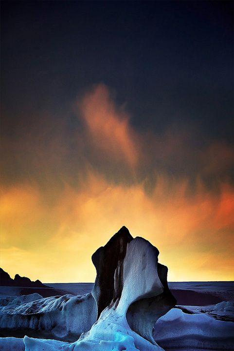
Dancing flames above Ice
‹ PreviousLandscape GalleryNext ›

Dancing flames above Ice

by Alexandre Deschaum

Gallery: LandscapePosted January 9, 2011348 views20 comments
Hello.

I wanted to show you this one because it's a bit experimental ; maybe too much for some of you . And I want your opinion.

This was a very delicate work to oppose the warm and cold white balance tone . I've corrected the balance using 3 different bracketed images on the field . .

this was done with 70-200 F4 L IS and Lee graduated filters .. during our last trip to Iceland in September 2010

I enjoyed the 'painted' sky with the flame just above the big ice rock and the visible struggle with warm and cold tones .

thank you for your help.
wishing you an ethereal year 2011

© Alexandre Deschaumes
http://www.alexandredeschaumes.com



Comments

20 comments
Comment posted by richard remington on January 9, 2011 at 10:25 AM
Alexandre,

The image works well but IMHO the lone cloud above the rock seems out of place. The contrast between the dark sky and clouds would be more prominent without it.

Rick
Registered on March 12, 2010, 105 Posts, 368 Comments
Comment posted by Chris Chamberlain on January 9, 2011 at 10:55 AM
Impressive! This has a kind of unique look to it in the contrast that i like a lot. I think the dark top is very effective with the gright powerful colors below. I do think you could crop from the top to about a 4x5 ration and still have the seame impact.

Chris
Registered on March 13, 2007, 500 Posts, 8365 Comments
Comment posted by Doug Roane on January 9, 2011 at 11:00 AM
Hey Alexandre,
Kudos for trying something different. However, the image does not work very well for me for several reasons. The drastic variation in WB is working against the image in my opinion, and makes the sky seem out of place. The ND grad effect here also seems to obvious. Compositionally, the central placement of the large ice formation really draws attention, but makes the image feel too static.
Registered on December 12, 2008, 213 Posts, 2226 Comments
Comment posted by mark cillo on January 9, 2011 at 12:20 PM
The wisp of cloud above the rock makes this one, it creates a sort of mirrored pattern. Awesome low light work as usual :wavey:
Registered on July 27, 2008, 143 Posts, 1483 Comments
Comment posted by Richard Teller on January 9, 2011 at 1:34 PM
Nice comp and color. I think if this were mine I would crop out most of the dark sky so the focus was on the color in the sky and the extension of the wispy cloud about the ice panicle.
Registered on August 23, 2010, 1162 Posts, 6692 Comments
Comment posted by Aaron Feinberg on January 9, 2011 at 2:43 PM
I think i'm going to be in the crop the top category...played around a bit with it and seems to help lessen the effect of the centered comp...just a bit too much sky up top. Good experiment :)

aF
Registered on October 26, 2009, 399 Posts, 2789 Comments
Comment posted by Danny Laureys on January 9, 2011 at 2:54 PM
Excellent, its good to do things differently and experiment, only nit is that I would crop the top a bit more. :toast: :toast: :toast:
Registered on January 5, 2008, 590 Posts, 1261 Comments
Comment posted by Tony Kuyper on January 9, 2011 at 3:55 PM
Has a very arty character for sure. I think the contrasting color work well.
Registered on November 1, 2003, 364 Posts, 22328 Comments
Comment posted by Lorna Taylor on January 9, 2011 at 4:29 PM
I would leave it as is JUST STUNNING, love the center crop on this with the wisp of cloud on top the images is perfectly balanced . I Love the heat of the reds and oranges with the contrast of the colder tones of blue. My only pick is the little dark out crop of land on the left side keeps pulling my eye over there then back to the center. Wonderful artistic image, would love to have one of these in my files.
Registered on November 12, 2010, 254 Posts, 3083 Comments
Comment posted by Robert Dayton on January 9, 2011 at 8:02 PM
Beautiful colors of an interesting formation, accompanied by excellent light.
Registered on November 11, 2008, 281 Posts, 3958 Comments
Comment posted by Eva McDermott on January 9, 2011 at 8:19 PM
I to think a crop from the top works better..... at least for me. Beautiful contrasts in the bottom 4X5 portion of your image.
Registered on January 4, 2009, 1015 Posts, 13229 Comments
Comment posted by James Fougère on January 9, 2011 at 8:28 PM
Vary Vivid! I like the cold to hot transitions here :smile: The horizon could be slightly off, but a minor issue. Maybe a slight crop of the top. I am wondering how this would have looked with a bit more of a wide angle lens? :cool:
Registered on October 25, 2010, 41 Posts, 831 Comments
Comment posted by Pramod Viswanath on January 9, 2011 at 9:50 PM
Great work Alexandre! Amazing image. Just love the play of cooler and warmer tones in the image. Very impressive.
Registered on December 4, 2008, 60 Posts, 697 Comments
Comment posted by Yan Zhang on January 9, 2011 at 9:51 PM
An effective image. The contrast between foreground and sky is very interesting. I might consider to eliminate a little bit of the top sky.
Registered on April 10, 2010, 28 Posts, 292 Comments
Comment posted by Kah Kit Yoong on January 10, 2011 at 3:24 AM
I can see why a crop from the top might be nice but honestly the presentation is so good that I might be tempted to leave it be. Striking for sure. There's some colour noise which I would clean up if it were mine.
Registered on September 27, 2006, 636 Posts, 10682 Comments
Comment posted by Dan Baumbach on January 10, 2011 at 8:33 AM
I like the dark space at the top. I think it adds to the drama. This image is very evokative. It's abstract and not abstract at the same time.

- Dan.
Registered on November 1, 2003, 473 Posts, 7980 Comments
Comment posted by Rick Dunn on January 10, 2011 at 8:12 PM
Yep, Dan nailed it with "evocative". And creative. I would definitely leave it uncropped. I think it helps to view it against a white background instead of the black one here. I agree about cleaning up the color noise. No other nits. One of the more interesting images I've seen in quite a while. Great work.
Registered on February 22, 2004, 35 Posts, 1311 Comments
Comment posted by dean hebert on January 11, 2011 at 1:35 PM
Always good to experiment and I would consider this a success. That said, the comp appears to place the cloud as the main subject.The ice and snow are so cool that I would love to see some more leading up to the pinnacle. :toast:
Registered on August 4, 2010, 70 Posts, 1132 Comments
Comment posted by Jim Hackley on January 11, 2011 at 2:33 PM
Very creative and very interesting composition, I like everything about the overall presentation and I might be inclined to lighten the dark sky just a little to bring more in balance with the ice. Way to go.
Registered on September 17, 2009, 302 Posts, 5535 Comments
Comment posted by Albert Darmo on January 12, 2011 at 10:33 PM
Hi Alexandre :wavey: Magnifique !!!:toast: :toast:
Albert Darmo.. Canada
Registered on November 25, 2008, 1386 Posts, 11978 Comments