Nature Photographers Network
This is the preserved archive of the original Nature Photographers Network. The community continues at naturephotographers.network.
A Delicate Balance
‹ PreviousLandscape GalleryNext ›

A Delicate Balance

by Michael J Greene,

Gallery: LandscapePosted December 9, 2010288 views25 comments
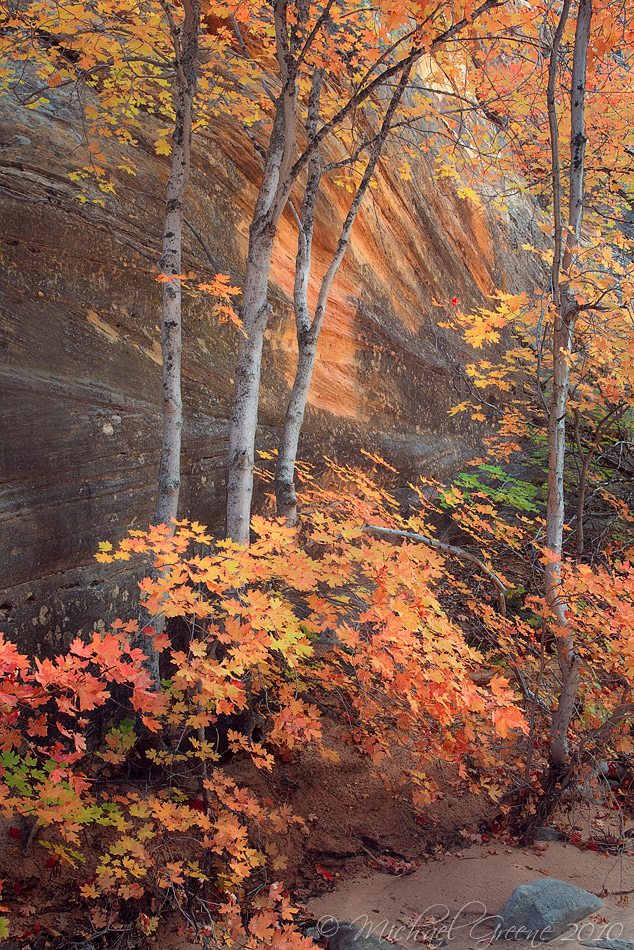
Zion National Park, UT

I found this little grove of maples a couple minutes after sinking into quicksand up to my knees while exploring the eastern reaches of the park. It caught me totally off guard and I banged up my shin pretty good, not to mention I just about ruined my camera.

I am wondering what you all think about this image.

Thanks for your time and comments.


5DMK2
28-70 f/2.8
f/16
2.5 seconds

Comments

25 comments
Comment posted by Bill Chambers on December 9, 2010 at 3:12 PM
Very pretty Michael. Lovely color - I like the way the orange spot on the wall complements the leaf color.
Registered on April 10, 2005, 753 Posts, 21216 Comments
Comment posted by Julian Barkway on December 9, 2010 at 3:13 PM
What do I think? I love it!

Not quite so sure of the bit of sand and rock in the LRC, though. I'd be tempted to crop it out, to be honest.
Registered on January 18, 2007, 344 Posts, 1961 Comments
Comment posted by Michael J Greene, on December 9, 2010 at 3:27 PM
Thanks Bill and Julian. I was on the fence about the rock too Julian....Although, I think I like it because it gives the image some breathing room and a better sense of scale. Enclosed is a cropped version. I'll be interested to read what others' think....

Registered on June 18, 2009, 86 Posts, 2317 Comments
Comment posted by Raymond D Smith on December 9, 2010 at 3:54 PM
Very nice Micheal, The complementary colour on the rock wall is superb. What a nice find, too bad about the camera. I could go either way on the crop, the second photo almost puts the foreground too much in your face I think. I love how the canopy of the tree's help's keep your eyes in the frame.Cheers
Registered on January 22, 2009, 12 Posts, 479 Comments
Comment posted by Robert Stough on December 9, 2010 at 3:59 PM
I prefer the original version too for the greater depth it gives you but either way this is very nice. Beautifully seen and captured.
Registered on November 20, 2010, 26 Posts, 273 Comments
Comment posted by Nick Bristol on December 9, 2010 at 4:16 PM
Very nice, Michael. I like this comp with the trees and leaves in front of the rock wall. I like the color, and prefer the original post. Glad you made it out of the quicksand without to much damage.

Nick Bristol
Lone Rock, WI.
Registered on February 1, 2004, 752 Posts, 14140 Comments
Comment posted by Peter Richter on December 9, 2010 at 4:35 PM
I would suggest to crop the bottom just above the rock in the foreground - so another version just in between. Its amazing, how the rock wall repeats the colors of the trunks an leafes. I appeciate the originality of your view.

Peter
Registered on November 10, 2010, 218 Posts, 2723 Comments
Comment posted by Rick Gomez on December 9, 2010 at 4:54 PM
As I was looking at this, I thought of making a crop suggestion, then I scrolled down and saw that you already made one. The repost is perfect. I really like this.
I hope your shin feels better.
Registered on March 3, 2007, 206 Posts, 1853 Comments
Comment posted by Kurt Budliger on December 9, 2010 at 5:09 PM
I love the cropped version, funny because I was thinking the same thing as I scrolled down to read the comments and then, there it was. The color is exceptional and the strong graphic element provided by the tree trunks is great.
Registered on June 11, 2006, 113 Posts, 2116 Comments
Comment posted by Harley Goldman on December 9, 2010 at 5:14 PM
Really nice image, Michael. Excellent colors and great complimentary background. I prefer the original post.
Registered on November 19, 2003, 586 Posts, 11271 Comments
Comment posted by Guy Tal on December 9, 2010 at 5:53 PM
This is excellent, Michael! I have a much different composition of this same tree and admittedly I like your view better.

Guy
Registered on November 1, 2003, 566 Posts, 15507 Comments
Comment posted by Richard Wong on December 9, 2010 at 5:57 PM
I like how the canyon walls are leading the eye in a subtle way through the colorful frame. I'd be tempted to crop a little off the bottom to just above the rock?
Registered on February 2, 2006, 79 Posts, 2629 Comments
Comment posted by Lori Kincaid on December 9, 2010 at 7:26 PM
I really enjoy the soft light and color pallette here. Very nice work. :toast:

Lori
Registered on November 15, 2003, 90 Posts, 2033 Comments
Comment posted by Jeremy Kessler on December 9, 2010 at 7:50 PM
Beautiful work Michael, your killing it with these forest scenes, I much prefer the cropped version.
Registered on September 13, 2007, 36 Posts, 1283 Comments
Comment posted by Dan Baumbach on December 9, 2010 at 9:23 PM
Sweet image. I like both crops.

- Dan.
Registered on November 1, 2003, 473 Posts, 7980 Comments
Comment posted by Jimmy Gekas on December 9, 2010 at 11:07 PM
Nice! I like the original with the rock, but just a little off the left of the frame where there are a few leaves in the lower left corner sticking out. :toast:
Registered on July 26, 2007, 244 Posts, 2807 Comments
Comment posted by John Williams on December 9, 2010 at 11:14 PM
I'll vote for the crop too. Love the colors and the different elements mix together beautifully.
Registered on September 6, 2007, 221 Posts, 5985 Comments
Comment posted by Floris van Breugel on December 9, 2010 at 11:26 PM
Lovely trees and colors, Michael! I like the orange detail on the wall too. I prefer a comp without the rock, but I do see how it becomes a little more claustrophobic. Perhaps darkening the sand in the uncropped one will make the rock stand out less.
Registered on December 19, 2008, 306 Posts, 4840 Comments
Comment posted by Lon Overacker on December 10, 2010 at 1:39 AM
Michael,

Gorgeous little intimate canyon scene. I even think you have room to pop the saturation and contrast a bit, but that's of course a personal choice.

I very much enjoy this as presented, but must be honest and say that the rock is a bit of an eye magnet; not like a bright patch of sky, but an element that pulls me unnecessarily away from the beauty of the scene. I would opt for a crop between your original and repost, along the lines of Peter's comment.

Regardless though, this is a great find and a beautiful capture.

Lon
Registered on November 24, 2006, 521 Posts, 19147 Comments
Comment posted by Dean Sauskojus on December 10, 2010 at 2:34 AM
Cropped version much better Michael. The rock and sand seem to pull me away from the flow of the trees, leaves and such. I really like the back wall and the orange color it adds too the image. Great fall shot!
Registered on September 29, 2009, 137 Posts, 2659 Comments
Comment posted by Michael Anderson on December 10, 2010 at 5:23 AM
I love the way you oriented the camera to get maximum benefit from the sandstone against the autumn leaves.
Registered on January 31, 2006, 228 Posts, 3072 Comments
Comment posted by Adam Gibbs on December 10, 2010 at 12:53 PM
Very pretty scene Michael. I like the similarities between the color of the sandstone and the autumn leaves, works very well.
Registered on November 1, 2003, 168 Posts, 870 Comments
Comment posted by Morris McClung on December 10, 2010 at 5:24 PM
Gorgeous subtlety and understatement with colors that could have been overdone. I admire your restraint and commend your work!
Registered on May 7, 2007, 670 Posts, 19650 Comments
Comment posted by Jared Atencio on December 10, 2010 at 10:17 PM
From the thumbnail it looked like there was some movement blur behind the trees, but like the orange spot and lines even more. I like the rock in the first and the breathing room that crop provides, but there are very slight distractions that may be aided with a slight tighter crop or cloning if you're so inclined. I also think if you were able to make the leaves stand out more against the background it might help, but either way, nicely seen and shot. Quicksand sure isn't fun
Registered on June 23, 2009, 21 Posts, 422 Comments
Comment posted by Vance Gese on December 11, 2010 at 2:58 PM
Fantastic find, Michael, and fantastic image. Do prefer the tighter composition of your repost. Really celebrates the autumn tones and the warm and contrasting tones of the sandstone better to me. Beautiful work.
Registered on November 13, 2008, 298 Posts, 6629 Comments