Nature Photographers Network
This is the preserved archive of the original Nature Photographers Network. The community continues at naturephotographers.network.
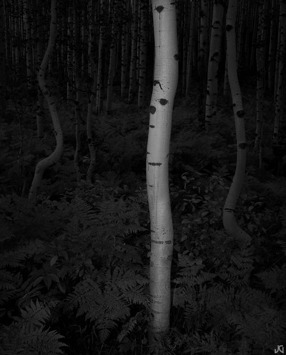
Adoration *w/edit*
‹ PreviousLandscape GalleryNext ›

Adoration *w/edit*

by Jimmy Gekas

Gallery: LandscapePosted December 8, 2010235 views22 comments
Gunnison National Forest, Colorado

Back in 2009, I shot something similar and loved the outcome. This was on my mind for a majority of the trip this past fall. Not sure if it comes close to my other one, as sometimes the originals are not meant to be duplicated.

Canon 5Dmk2, Zeiss 35-70.

Comments

22 comments
Comment posted by Raymond D Smith on December 8, 2010 at 2:34 PM
I have been staring at this awhile Jimmy . I am totally speechless. This is my type of image, hats off too you. Wish it was mine. Cheers
Registered on January 22, 2009, 12 Posts, 479 Comments
Comment posted by Jason Kim on December 8, 2010 at 2:47 PM
I don't know if there's anything as difficult as trying to replicate a treasured image... Replicate might not be the right word, but you know what I'm saying?

This has a nice haunting quality to it, but I do wish there was a tiny bit more detail in the very foreground ferns and maybe a touch more in the background. It could be my screen, though. I like this feel of this, it leaves you feeling very different than a typical Fall aspen image.
Registered on July 1, 2006, 60 Posts, 1233 Comments
Comment posted by Philip Hodgkins on December 8, 2010 at 3:48 PM
Dark for my tastes. I would like to see some more in the white and better detail on the ferns.
Registered on July 24, 2006, 2741 Posts, 12349 Comments
Comment posted by Bill Chambers on December 8, 2010 at 4:21 PM
Love the concept and composition, but it does appear just a tad dark for my tastes. The BG appears about right, but the main subject is just a little on the dark side.
Registered on April 10, 2005, 753 Posts, 21216 Comments
Comment posted by Jimmy Gekas on December 8, 2010 at 4:22 PM
Maybe too dark for some. Oh, well... not an epic failure. Here's a repost that may work better.
Registered on July 26, 2007, 244 Posts, 2807 Comments
Comment posted by Kurt Budliger on December 8, 2010 at 4:39 PM
Pretty cool, I think I know what image you're speaking of and it's one of my favorites of yours. Not sure if this is on par but I like the lighter version.
Registered on June 11, 2006, 113 Posts, 2116 Comments
Comment posted by Kah Kit Yoong on December 8, 2010 at 5:05 PM
Nice but when you compare with the previous one, there's no comparison.
Registered on September 27, 2006, 636 Posts, 10682 Comments
Comment posted by Harley Goldman on December 8, 2010 at 6:18 PM
I definitely prefer the repost. Good solid image.
Registered on November 19, 2003, 586 Posts, 11271 Comments
Comment posted by Tony Kuyper on December 8, 2010 at 10:20 PM
Repost better. Lone bole feels a bit isolated but the black and white sort of makes the starkness OK.
Registered on November 1, 2003, 364 Posts, 22328 Comments
Comment posted by Floris van Breugel on December 9, 2010 at 1:42 AM
Lots of wonderful mystery here, Jimmy. I like the repost much better for the additional detail and depth, though I can help but think it looks like the scene was hit with a heavy front flash the way the lighting looks (personally, that's not really my thing). Your one from last year had two aspens? I like that a little more :smile:
Registered on December 19, 2008, 306 Posts, 4840 Comments
Comment posted by Gabi Lach on December 9, 2010 at 9:13 AM
I vote for the repost as well. Also the background plays a nice role there. Decent and delicate photograph. I like your toning too.
Registered on May 1, 2007, 101 Posts, 3187 Comments
Comment posted by Jimmy Gekas on December 9, 2010 at 11:57 AM
Thanks for all the feedback. I don't think I succeeded in getting what I wanted....like Floris mentioned, it has a flash look to it, even though I used a flashlight to paint it. It's nice to get some real feedback and critiques on images. :smile:
Registered on July 26, 2007, 244 Posts, 2807 Comments
Comment posted by Bill Chambers on December 9, 2010 at 4:50 PM
Definitely like the repost better - very nice!
Registered on April 10, 2005, 753 Posts, 21216 Comments
Comment posted by Rick Gomez on December 9, 2010 at 6:54 PM
Not one of your greatest IMHO, but I like the twisted aspens. I think it is the artificial lighting that throws it off. The repost is much better.
Registered on March 3, 2007, 206 Posts, 1853 Comments
Comment posted by Chris Chamberlain on December 9, 2010 at 7:32 PM
This is awesome! I love the mystery in the darker first version. I think i'd like a lighter version too, just not to the extent of the repost. Really nice!

Chris
Registered on March 13, 2007, 500 Posts, 8365 Comments
Comment posted by Ben Horne on December 9, 2010 at 10:25 PM
I believe there is a lot of potential here. The dancing trunks on either side of the foreground trunk really help to give a dynamic feel. The one thing that draws my attention too much is the shadow (down low) where you illuminated the trunk. It gives me the feel that a built in flash was used since there is such an abrupt transition. I think you're on to something with using a flash light for this, but maybe painting it with a bit of side light as well as some from the front would give it some dimension, and avoid the flat light on the ferns.
Registered on August 27, 2009, 51 Posts, 959 Comments
Comment posted by Lon Overacker on December 10, 2010 at 1:43 AM
Jimmy,

Love the scene, but sorry to say that the original looks like either a. bad film development or b. processing that looks like bad development. The repost looks much better in that department, but looks a little like artificial lighting now (which I've now read ahead a little so I understand.)

I think the capture has huge potential if processed in a way that keeps it real.

Lon
Registered on November 24, 2006, 521 Posts, 19147 Comments
Comment posted by Michael Anderson on December 10, 2010 at 5:25 AM
I love the dark processing on this Jimmy. Very elegant!
Registered on January 31, 2006, 228 Posts, 3072 Comments
Comment posted by Mark Metternich on December 10, 2010 at 1:20 PM
Wow! :toast:
Registered on June 19, 2009, 276 Posts, 6240 Comments
Comment posted by Fabio Giarrizzo on December 10, 2010 at 2:24 PM
Awesome shot- On my opinion, darker version worked surely better (dark BG enhances the bright trunk, the strongest element in the composition)- great job, Fabio
Registered on December 3, 2010, 90 Posts, 1614 Comments
Comment posted by Dean Sauskojus on December 10, 2010 at 4:11 PM
I think Aspen Affection is my fav of yours Jimmy, but I do like those crooked trees in this one. Adds some nice flavor to the image. Great work with the aspens once again..
Registered on September 29, 2009, 137 Posts, 2659 Comments
Comment posted by Morris McClung on December 10, 2010 at 5:12 PM
How do you find these tree comps! Another outstanding image and I like the conversion and darker mood. I do like the repost better.
Registered on May 7, 2007, 670 Posts, 19650 Comments