Gallery: LandscapePosted December 8, 2010320 views23 comments
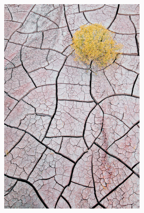
Cracked mud and desert scrub, Utah Wilds.
Thanks for your comments, Joe.
Comments
23 comments
Comment posted by Julian Barkway on December 8, 2010 at 1:52 PM
Utterly, utterly delicious, Joe! A wonderful combination of texture and colour.
Registered on January 18, 2007, 344 Posts, 1961 Comments
Comment posted by Marc Adamus on December 8, 2010 at 1:59 PM
Joe, this is great. Totally a fascinating study in contrasts. You could loose the whole bottom half and it would still work great.
Registered on September 17, 2005, 780 Posts, 8091 Comments
Comment posted by Kurt Budliger on December 8, 2010 at 2:01 PM
Very nice Joe, love the cracked mud and contrast it provides.
Registered on June 11, 2006, 113 Posts, 2116 Comments
Comment posted by Jimmy Gekas on December 8, 2010 at 2:03 PM
Super-licious. I love it.
Registered on July 26, 2007, 244 Posts, 2807 Comments
Comment posted by Bill Chambers on December 8, 2010 at 2:09 PM
Very nicely composed Joe. I love the subtle color variations in the mud.
Registered on April 10, 2005, 753 Posts, 21216 Comments
Comment posted by Raymond D Smith on December 8, 2010 at 2:30 PM
I agree with Marc A a crop would work for sure. I do hate to crop my own pictures though and I can see why you gave the scrub all that space. The colour and tones in the mud are fascinating, great picture Joe. Oh I could also see this in black and white too. Cheers
Registered on January 22, 2009, 12 Posts, 479 Comments
Comment posted by Joseph Rossbach on December 8, 2010 at 2:48 PM
Thanks guys! here is the BW for comparison.
Registered on November 25, 2005, 484 Posts, 1377 Comments
Comment posted by Jason Kim on December 8, 2010 at 2:48 PM
Wonderfully composed and very interesting to look at!
Registered on July 1, 2006, 60 Posts, 1233 Comments
Comment posted by Jason Miles Kirk on December 8, 2010 at 2:51 PM
I prefer the color image - by far.
Registered on January 9, 2007, 7 Posts, 55 Comments
Comment posted by Luis Argerich on December 8, 2010 at 2:57 PM
Hi Joseph!
Very very nice Jospeh, it's like a puzzle! I like the camera angle and the detail.
It rocks! (pun intended)
Registered on December 22, 2009, 91 Posts, 1349 Comments
Comment posted by Anne K. Rusk on December 8, 2010 at 3:18 PM
The colors, the textures, the title, the total feel of this is outstanding. Nothing to add, just envy!
The conversion isn't nearly as powerful for me. Totally prefer the color version!
Registered on October 10, 2010, 65 Posts, 904 Comments
Comment posted by Koveh Tavakkol on December 8, 2010 at 4:20 PM
Joe, I really liked this shot when I saw it on your website. I would go with the color without a doubt.
Registered on September 1, 2009, 41 Posts, 608 Comments
Comment posted by Joseph Rossbach on December 8, 2010 at 4:29 PM
I definitely prefer the color version as well! Thanks for all the feedback so far gang!!
Registered on November 25, 2005, 484 Posts, 1377 Comments
Comment posted by Kah Kit Yoong on December 8, 2010 at 5:01 PM
Prefer the colour by a long shot. Great intimate.
Registered on September 27, 2006, 636 Posts, 10682 Comments
Comment posted by Harry Lichtman on December 8, 2010 at 5:14 PM
Great shot, definately prefer the color. The tree gets lost to me in the B&W conversion. If you could selectivly darken the tree, it would stand out a bit better.
Registered on September 17, 2010, 304 Posts, 3507 Comments
Comment posted by Kory Lidstrom on December 8, 2010 at 6:18 PM
Very nice, Joe. Love the red color in the mud. Very much reminds me of a Guy Tal image, and that's certainly a compliment.
Registered on November 19, 2008, 49 Posts, 1035 Comments
Comment posted by Derek Yow on December 8, 2010 at 9:15 PM
Add another vote for the color version.
Absolutely amazing!
Registered on May 18, 2010, 26 Posts, 655 Comments
Comment posted by Jared Atencio on December 8, 2010 at 10:03 PM
This is fantastic Joe, no comparison btwn color or b&w, love the reds coming out of those cracks!
Registered on June 23, 2009, 21 Posts, 422 Comments
Comment posted by Tony Kuyper on December 8, 2010 at 10:18 PM
Simple. Beautiful. I like it.
Registered on November 1, 2003, 364 Posts, 22328 Comments
Comment posted by Bill Maile on December 8, 2010 at 10:26 PM
Nicely done.
Registered on March 2, 2009, 984 Posts, 2518 Comments
Comment posted by Sam Chrysanthou on December 9, 2010 at 12:34 PM
These images always succeed best when the photographer carefully watches where a pattern intersects an image frame. No complaints from me! Masterfully done.
Registered on December 18, 2007, 71 Posts, 1191 Comments
Comment posted by Ben Horne on December 9, 2010 at 9:28 PM
I'm really liking those cranks within the larger cranks. The soft palette of pastels also makes for pleasing color. Great placement with the bush. Well done.
Registered on August 27, 2009, 51 Posts, 959 Comments
Comment posted by Rick Gomez on December 10, 2010 at 10:23 AM
Love it! What more can I say?
Registered on March 3, 2007, 206 Posts, 1853 Comments

Comments
23 commentsVery very nice Jospeh, it's like a puzzle! I like the camera angle and the detail.
It rocks! (pun intended)
The conversion isn't nearly as powerful for me. Totally prefer the color version!
Absolutely amazing!