Nature Photographers Network
This is the preserved archive of the original Nature Photographers Network. The community continues at naturephotographers.network.
Ablaze-zing
‹ PreviousLandscape GalleryNext ›

Ablaze-zing

by Jim Greenwood

Gallery: LandscapePosted December 5, 2010402 views18 comments
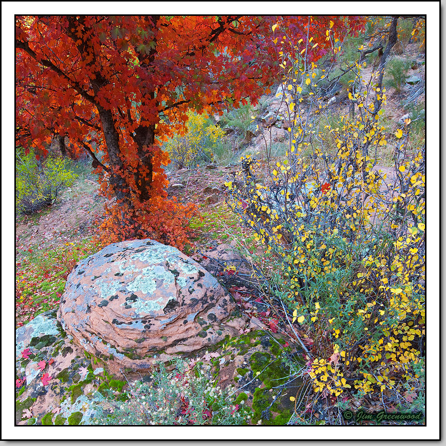
This Bigtooth Maple might be a familiar tree to those who have visited Zion. It’s very easy to spot (especially in autumn) and get to, just off the Canyon Road. I’ve photographed it on a few occasions over the years, under various conditions. But I never really came away with a decent composition until this year. The better than average autumn colors this year, combined with the light and the lack of wind this time, seemed to come together nicely. Still, the original image didn’t excite me all that much at first. It wasn’t until I cropped off the bottom third of the original full-frame image to get this square format that the composition came to life. I have not increased the red saturation (I swear!). I did increase the overall saturation a little, but I decreased the red saturation by the same amount.

Canon 5DII
Canon 16-35mm f/2.8L II
24mm, f/13, 0.6 second, ISO 50

Comments

18 comments
Comment posted by Justin Reznick on December 5, 2010 at 8:14 PM
I definitely know that spot Jim! What a great collection of elements in your comp!
Registered on November 24, 2009, 79 Posts, 515 Comments
Comment posted by Jeremy Kessler on December 5, 2010 at 8:30 PM
Stunning! Really reminds me of an impressionist painting. :toast:
Registered on September 13, 2007, 36 Posts, 1283 Comments
Comment posted by Mark Pelton on December 5, 2010 at 9:17 PM
Beautiful arrangement of colors and shapes, Jim.
Registered on November 25, 2003, 380 Posts, 4647 Comments
Comment posted by Tony Kuyper on December 5, 2010 at 10:21 PM
Complex image but really stunning colors. Am a little surprised at the paucity of comments.
Registered on November 1, 2003, 364 Posts, 22328 Comments
Comment posted by Harley Goldman on December 5, 2010 at 10:39 PM
I have a wide gamut monitor. I am assuming this was saved for web without an imbedded sRGB profile, as the colors appear on my screen as if 80 points of saturation have been added. This technology stuff..... they don't make it simple, that is for sure. I really like the comp and I am guessing the colors look great, but I really can't tell.

Should you be so inclined, feel free to post a version with the imbedded profile.

Cheers,

harley
Registered on November 19, 2003, 586 Posts, 11271 Comments
Comment posted by Gary Yeoh on December 5, 2010 at 10:42 PM
Very lovely color palette. Like the square crop as well.
Registered on September 1, 2009, 588 Posts, 8184 Comments
Comment posted by Floris van Breugel on December 5, 2010 at 11:09 PM
Fantastic, Jim! Your composition is fantastic, I love all the elements, and how cleanly arranged they are. One of the more exciting Zion images I've seen this season.
Registered on December 19, 2008, 306 Posts, 4840 Comments
Comment posted by Robert Dayton on December 5, 2010 at 11:48 PM
A beautiful find in Zion, Jim! For me this is all about color and realy works.
The FG rock is a nice anchoring point.
Registered on November 11, 2008, 281 Posts, 3958 Comments
Comment posted by Preston Birdwell on December 5, 2010 at 11:54 PM
I really like the comp, Jim. It has a lot elements, but is nicely balanced. I agree with Harley, the saturation on my wide gamut monitor is way up there. I just checked and the image does not have an imbedded profile. If I convert to sRGB, the saturation looks much better. Ireally like the boulder and the maple tree.

Nice work, Jim!

--P
Registered on November 1, 2003, 471 Posts, 5188 Comments
Comment posted by Wade Hardy on December 6, 2010 at 8:22 AM
A wonderful combination of elements and that maple is on fire - beautiful. Great shot!
Registered on May 2, 2006, 121 Posts, 1824 Comments
Comment posted by Chris Chamberlain on December 6, 2010 at 10:01 AM
That's gorgeous! So much to looka t in terms of color, texture, and details. Nice compositon too.

Chris
Registered on March 13, 2007, 500 Posts, 8365 Comments
Comment posted by Jason Kim on December 6, 2010 at 2:21 PM
You sure did a great job making bringing this cornucopia of colors and elements together, the composition is really nice. The light is perfect for this scene, really nicely done!
Registered on July 1, 2006, 60 Posts, 1233 Comments
Comment posted by Lon Overacker on December 6, 2010 at 9:18 PM
Jim,

This has nearly the same exact kaleidoscope of color effect that Dan B's recent image did. A diverse range of colors all divided up in little specs scattered throughout the scene. This one though isn't quite as abstract. But certainly this is an excellent, well balanced composition and the maple certainly attracts its just due. this is quite delightful. Well seen and captured.

Lon
Registered on November 24, 2006, 521 Posts, 19147 Comments
Comment posted by Albert Darmo on December 6, 2010 at 10:22 PM
Hi Jim :wavey: The palette of colors and the composition are amazing. :eek: awesome capture :toast:
Albert Darmo. Canada
Registered on November 25, 2008, 1386 Posts, 11978 Comments
Comment posted by Barbara Lee on December 7, 2010 at 1:27 AM
When I saw this photo in the gallery, even before reading your comment, I said to myself "this is Zion". I was right! I am just back form my first trip there, and I really appreciate what it took for you to get this terrific composition. It is tough to create order from chaos, and sometimes it is good to just go with the chaos. So you have some of each here. My eye keeps moving around in thre frame, from one lovely element to the next. I like the range of color and the square crop is great. I do wonder if that rock was really as pinkas it appears here? This is lovely, Jim. Thanks so much for posting it.
Registered on December 4, 2010, 12 Posts, 11 Comments
Comment posted by Dietrich Gloger on December 7, 2010 at 12:57 PM
Amazing color and amazing composition. I really like the design here.
Registered on January 26, 2007, 360 Posts, 9876 Comments
Comment posted by Stan Rose on December 7, 2010 at 1:15 PM
Love the comp! Could be the sRGB issue, but the color sats seem pretty funky--too much cyan. If its not the color priofile, you could probably reduce the cyan and everything would look warmer, wit a WB tweak you probably wouldnt have to raise the sat at all. Sometimes its advantageous to have a good warm-cool mix, but here i think warm is the way to go.
Registered on September 15, 2005, 836 Posts, 17099 Comments
Comment posted by Ed Williams on March 19, 2018 at 2:28 PM
Wow, I really love the highly variable colors and shapes in this one. Great colors and really nice composition.
Registered on December 28, 2010, 636 Posts, 3499 Comments