Gallery: FloraPosted November 28, 201028 views10 comments
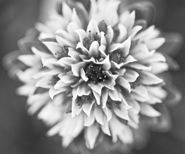
Found this miniature bouquet among the wildflowers at Herman Gulch this summer. All C&C welcome!
Thanks for looking,
Anne
D200, 105mm
ISO200, f4, 1/125sec
Comments
10 comments
Comment posted by Jeffrey Sipress on November 28, 2010 at 2:25 PM
Hi Anne,m
I've been hoping to see some more B&W here, and this is very nice. I'm starting to like the OOF elements in many of the flower closeups I see, but it's taken me a while coming from a landscape and architectural discipline. Sure does focus the eye on the spot, though!
Registered on February 17, 2004, 236 Posts, 1197 Comments
Comment posted by Pat Sampson on November 28, 2010 at 7:46 PM
Beautifully done Anne. Love your dof decision. Makes me feel like this is coming at me and in my face. I like that of course. (smile) I also like the conversion.
pat
Registered on May 19, 2007, 953 Posts, 15989 Comments
Comment posted by Bill Fach on November 28, 2010 at 10:35 PM
Anne: I'm pretty challenged when it comes to B&W so don't feel real comfortable commenting. I really don't see a clear POF and my uneducated eye likes a bit more contrast. I do like the subject and would like to see the original color version just to see where you started. >=))>
Registered on November 1, 2003, 1805 Posts, 26981 Comments
Comment posted by Krunal Janani on November 28, 2010 at 11:35 PM
Great POV & DOF Anne, the B/W conversion is spot on as well
Registered on September 16, 2010, 60 Posts, 1370 Comments
Comment posted by Gary Yeoh on November 28, 2010 at 11:52 PM
Anne:
This is a challenging image - a very shallow DOF and taking away all the colors! Kudos for attempting this but I am finding hard to stay interested because of my short attention span.
Registered on September 1, 2009, 588 Posts, 8184 Comments
Comment posted by Phil Pogledich on November 29, 2010 at 4:04 PM
Interesting presentation and nice B&W conversion . . . very effective and different. I like the DOF as well.
Registered on August 24, 2009, 123 Posts, 3099 Comments
Comment posted by Anne K. Rusk on November 29, 2010 at 10:15 PM
Here's the color version for comparison. I really like the color option as well, but thought there was more impact for me in B&W. What's your vote?
Registered on October 10, 2010, 65 Posts, 904 Comments
Comment posted by Bill Fach on November 29, 2010 at 10:39 PM
Anne: I must say I much prefer the color version. I find the colors provide more separation of the individual elements of the flower and the palette is lovely. >=))>
Registered on November 1, 2003, 1805 Posts, 26981 Comments
Comment posted by Gary Yeoh on November 29, 2010 at 11:03 PM
Anne:
Thumbs up for the color version!
Registered on September 1, 2009, 588 Posts, 8184 Comments
Comment posted by Albert Darmo on November 30, 2010 at 7:02 PM
Hi Anne Bill said it all! when seeing the color version " the colors provide more separation of tne individual elements of the flower and the palette" The color version it is!!! :smile
Albert Darmo. Canada:
Registered on November 25, 2008, 1386 Posts, 11978 Comments

Comments
10 commentsI've been hoping to see some more B&W here, and this is very nice. I'm starting to like the OOF elements in many of the flower closeups I see, but it's taken me a while coming from a landscape and architectural discipline. Sure does focus the eye on the spot, though!
pat
This is a challenging image - a very shallow DOF and taking away all the colors! Kudos for attempting this but I am finding hard to stay interested because of my short attention span.
Thumbs up for the color version!
Albert Darmo. Canada: