Nature Photographers Network
This is the preserved archive of the original Nature Photographers Network. The community continues at naturephotographers.network.
REPOST - tulipe avec des couleurs
‹ PreviousFlora GalleryNext ›

REPOST - tulipe avec des couleurs

by Carol Hyman

Gallery: FloraPosted September 22, 2010117 views22 comments
Amazing, an image posted with color from moi!!! :jump:

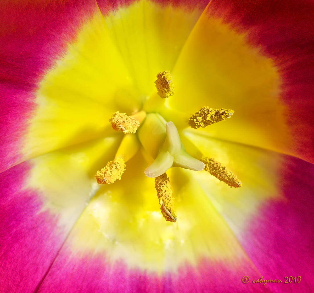
I shot this image (actually 2 images long ago before I knew how to shoot a stack). As I recall I used Live View and moved the focal point from one anther to another. There may have been 5 or 6 images but only 2 have survived and surprisingly my current version of Helicon Focus combined the images well.

Both images were shot at f/11 for 2 seconds at ISO 400.

When processing I added some grain to the circular red area on the outside portion of the petal (the Gaussian noise seemed to make the red color sparkle), and used NR on the yellow portion of the petal.

At the moment the image looks awfully bright to me, but I'm so used to B/W, I'm not surprised.

Would sure like to have some feedback from all of you.

Thanks,

Carol

Comments

22 comments
Comment posted by Andrew Finlayson on September 22, 2010 at 3:55 PM
Nice shot Carol, a really crisp explosion of colour. Great work. :)
Registered on July 29, 2010, 26 Posts, 404 Comments
Comment posted by Phil Pogledich on September 22, 2010 at 4:09 PM
Wow, the color really has an impact here. I like the shot quite a bit . . . very bright and cheery.
Registered on August 24, 2009, 123 Posts, 3099 Comments
Comment posted by Mauro Pasquero on September 22, 2010 at 4:46 PM
Impressive DOF and colors, Carol. I think the bright as it is, is fine, no nits.
I just wonder how would it be, a bit darker.
Mauro
Registered on January 21, 2010, 650 Posts, 2500 Comments
Comment posted by jamie pringle on September 22, 2010 at 6:16 PM
I have a similar image, but mine does not show the depth that your shows. I like the focal range and colors. Hard to stay away from color too long isn't it? :toast:
Registered on August 10, 2005, 323 Posts, 1216 Comments
Comment posted by Bob Duff on September 22, 2010 at 6:20 PM
Good work on the reprocessing through helicon. The anthers are nice and sharp. The image looks very nice and bright (which tulips should as a harbinger of spring and coming out of the darkness of winter).

Only nit would be nice to have the same amount of red surrounding the whole image. i.e. the top matches the bottom in a perfect world.
Registered on April 21, 2010, 160 Posts, 1675 Comments
Comment posted by Morris McClung on September 22, 2010 at 6:28 PM
Well, when you bring the color, you really bring it, don't you! Fantastic image.
Registered on May 7, 2007, 670 Posts, 19650 Comments
Comment posted by Pat Sampson on September 22, 2010 at 7:24 PM
The sharpness from the stack is superb Carol and I think your noise and smoothing were both very effective. The colors are very eye catching of course. (smile) I sort of like the radial gradient in the red. I like the shadows as well. Compositionally, I think it would be a touch stronger if the stigma wasn't slightly in front of the one anther. Very minor though. I like the image as posted but I also think it would be interesting in black and white. C'est bonne.

Pat
Registered on May 19, 2007, 953 Posts, 15989 Comments
Comment posted by Mark Windom on September 22, 2010 at 8:19 PM
Hi Carol,
I've been away from the forums for awhile and this is a nice surprise on my return....seeing you using Helicon. I tend to agree with you, I think it looks a little bright but otherwise it looks good.
Registered on November 1, 2003, 176 Posts, 2302 Comments
Comment posted by Craig Strand on September 22, 2010 at 9:46 PM
Amazing DOF and rich vibrant colors, everything working really well Carol, I love this!
Registered on March 30, 2008, 416 Posts, 2885 Comments
Comment posted by Carol Hyman on September 22, 2010 at 10:17 PM
OK, I'm giving in.

This is Expresso, Dark Chocolate, and Mocha, all rolled into one.

Ironically this Tulip and it's mate--a view from the rear, were intended to be in B/W until I started playing with color. I didn't quite have this in mind but I think I like it better than the initial version.

Thanks for all of your comments and thank you too for taking a second look at this beauty.

:wavey:

Carol
Registered on January 18, 2007, 597 Posts, 8062 Comments
Comment posted by Andrew Finlayson on September 22, 2010 at 10:36 PM
Oooh nice, not what I was expecting. It has such a soft milky feel to it. I'm not sure which I prefer more as they are both so different, completely different feel. The colour is vibrant and brash and the mono is subtle and smooth. Nice work on both.
Registered on July 29, 2010, 26 Posts, 404 Comments
Comment posted by Wayne Jones on September 22, 2010 at 10:48 PM
Startling IMPACT, and yet such wonderful details! The brightness is very appropriate for this -- It is jumping off the screen, and I just feel like basking in its light.
Registered on April 18, 2007, 953 Posts, 6435 Comments
Comment posted by Muhammad Zaid Wani on September 23, 2010 at 2:14 AM
This is really nice, Carol. The colors look amazing.
Registered on August 18, 2005, 23 Posts, 1406 Comments
Comment posted by Debashis Bandyopad on September 23, 2010 at 8:42 AM
Interesting image Carol.. I prefer the colour version to the coffee/toffee one :cool:
Registered on June 24, 2007, 130 Posts, 1309 Comments
Comment posted by Krunal Janani on September 23, 2010 at 9:45 AM
Loved both the versions!
Striking images!
Which flowers are these BTW
Registered on September 16, 2010, 60 Posts, 1370 Comments
Comment posted by Ian Wolfenden on September 23, 2010 at 12:03 PM
Carol : the colours are amazing and the stack superb - and I do prefer the colour version to the chocolate one. It is maybe a bit bright for me in the centre and, compositionally, I would like to have seen the circle either given a touch more room or shot from a slight angle ( maybe echoing Pat's comment ). As is, it's an image which hits you in the eye - and I like that !!
Registered on May 18, 2007, 1108 Posts, 7647 Comments
Comment posted by Brigitte Lorenz on September 23, 2010 at 1:51 PM
wonderful work, Carol...I like them both and prefer the chocolate one, really nice

Brigitte
Registered on January 10, 2009, 187 Posts, 1507 Comments
Comment posted by Albert Darmo on September 23, 2010 at 7:13 PM
Hi Carol :wavey: Love them both :eek: But the first one is like so many i see. superb color and detail. but not original. the second one is more inspired. more original. very artistic and daring ! TRES JOLI! !!:toast:
Albert Darmo. Canada
Registered on November 25, 2008, 1386 Posts, 11978 Comments
Comment posted by Pat Sampson on September 23, 2010 at 11:09 PM
Love the second one Carol. To my eye it's much more interesting and vivid with the chocolate.

Pat
Registered on May 19, 2007, 953 Posts, 15989 Comments
Comment posted by Miro Susta on September 24, 2010 at 4:22 AM
Excellent vibrant colors. You must have a very good macro lens Carol. Can you give details? DOF is superb. No space for any criticism. Nicely done. :smile:
Registered on August 18, 2006, 719 Posts, 3736 Comments
Comment posted by Giuseppe Guadagno on September 24, 2010 at 3:42 PM
Carol, I love all in this composition: the geometric design, simplicity, order; two circles perfectly inscribed in a square figure with a stark centre. What do you think about completing the vignetting?
Just now I have seen the colored version: I like it even better.
Cheers.
Registered on February 3, 2007, 827 Posts, 5052 Comments
Comment posted by Bill Fach on September 25, 2010 at 11:00 PM
Carol: Explosive! I'm a color junkie so I do prefer the original but the conversion is pretty darn good. I'll have one of each please. >=))>
Registered on November 1, 2003, 1805 Posts, 26981 Comments